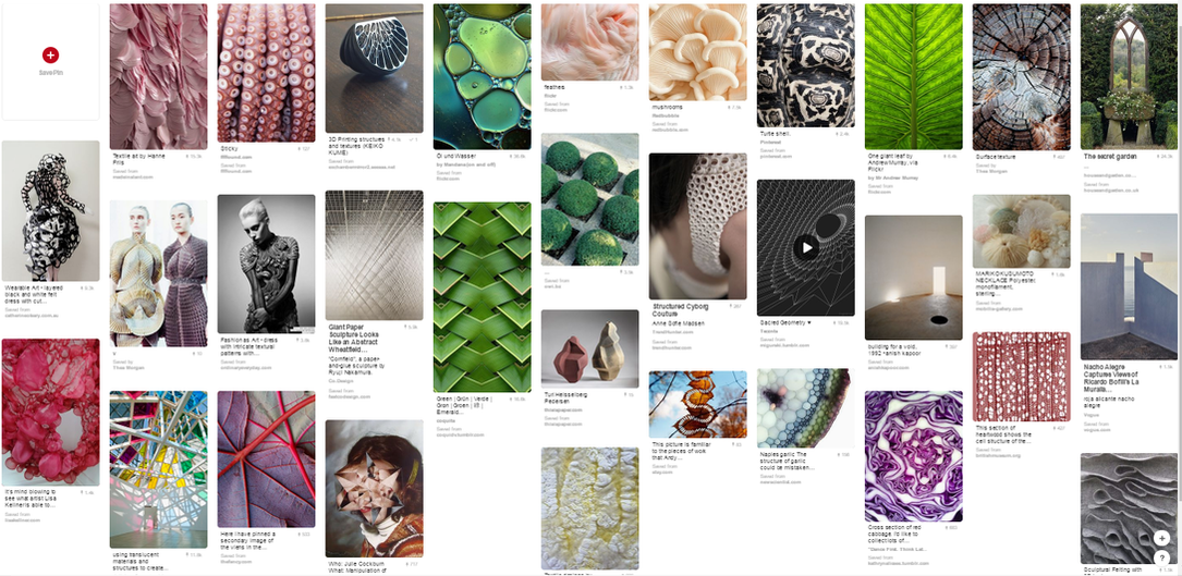
Structure in nature
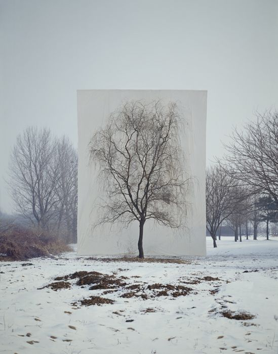
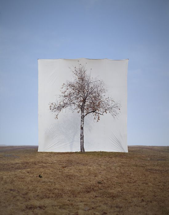
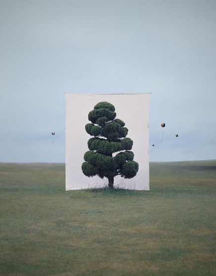
Myoung Ho Lee
Myoung Ho Lee is a Korean photographer who isolates trees in nature using a white background to separate the tree from the rest of it's environment. This makes the tree the subject of the photo whilst removing it from it's environment.
Myoung Ho Lee is a Korean photographer who isolates trees in nature using a white background to separate the tree from the rest of it's environment. This makes the tree the subject of the photo whilst removing it from it's environment.
|
|
|
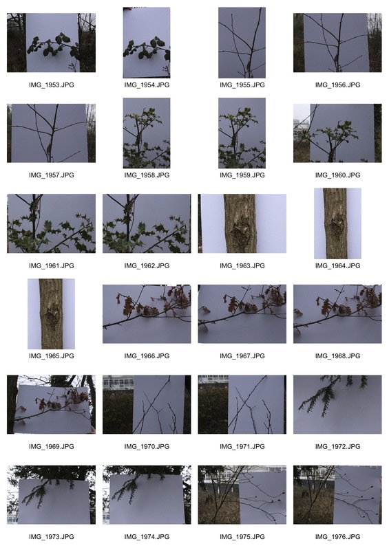
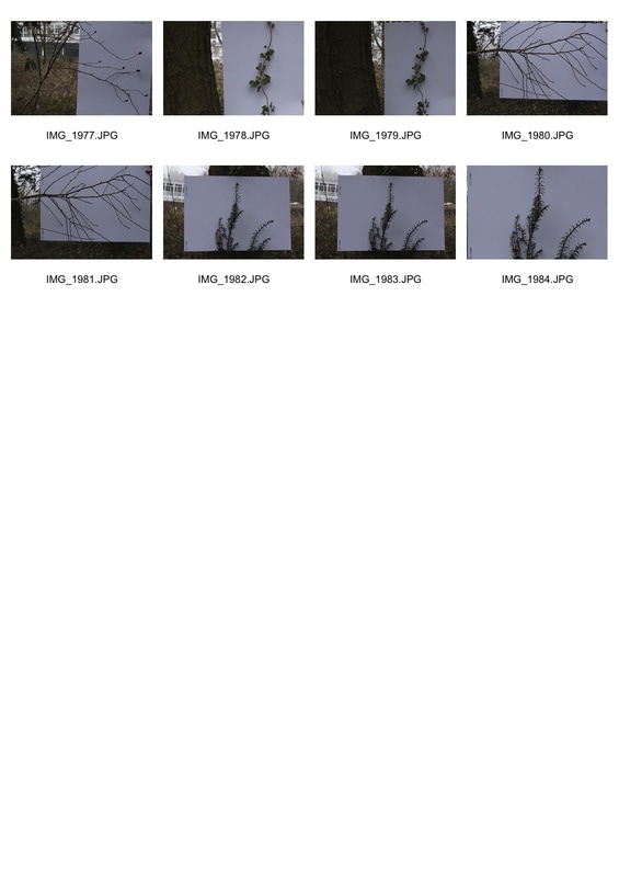
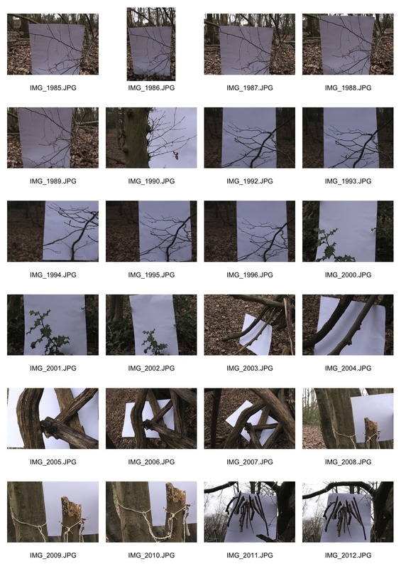
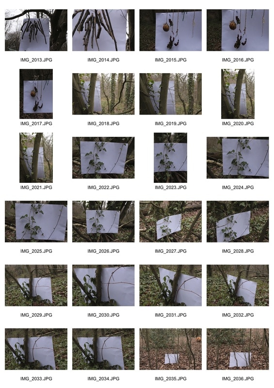
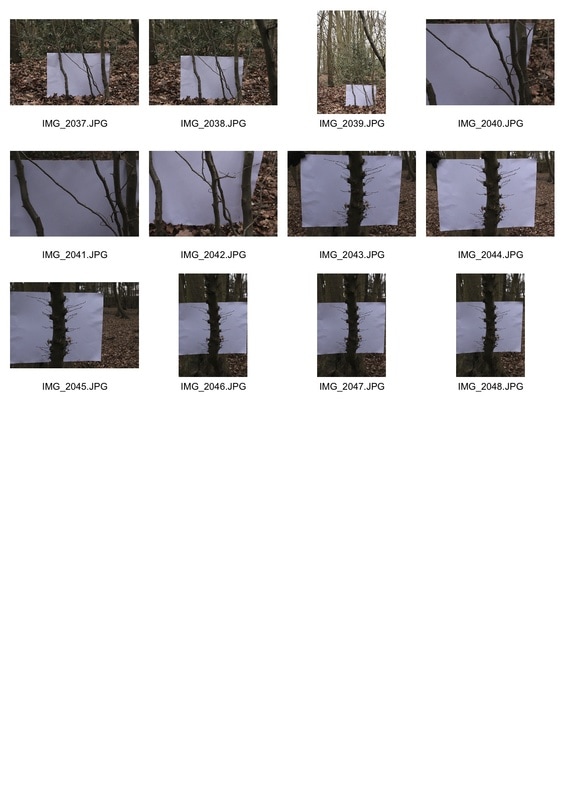
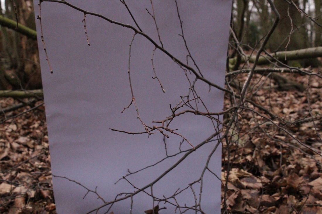
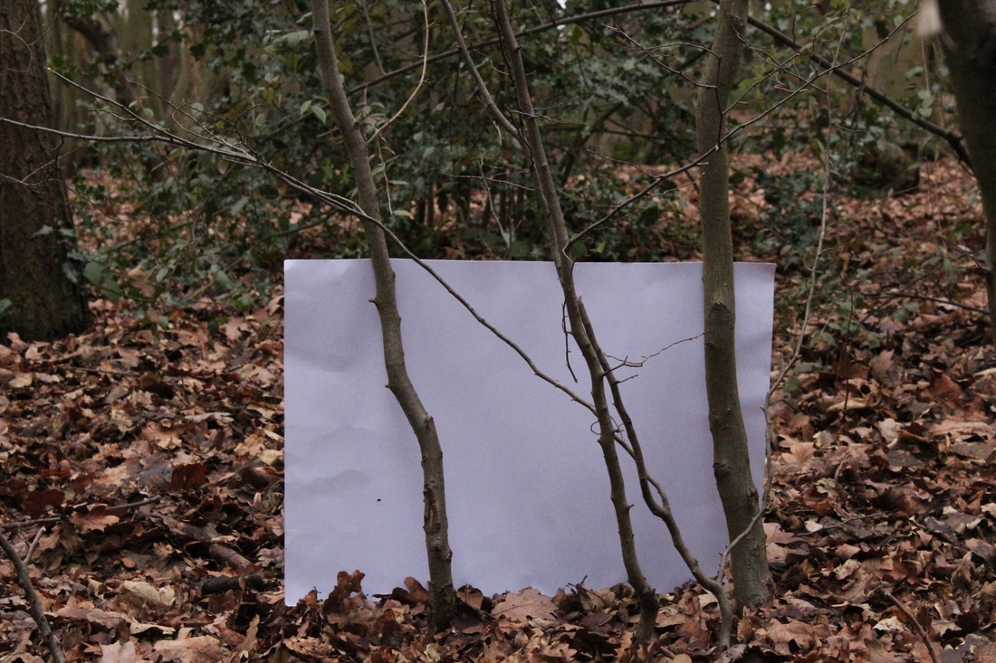
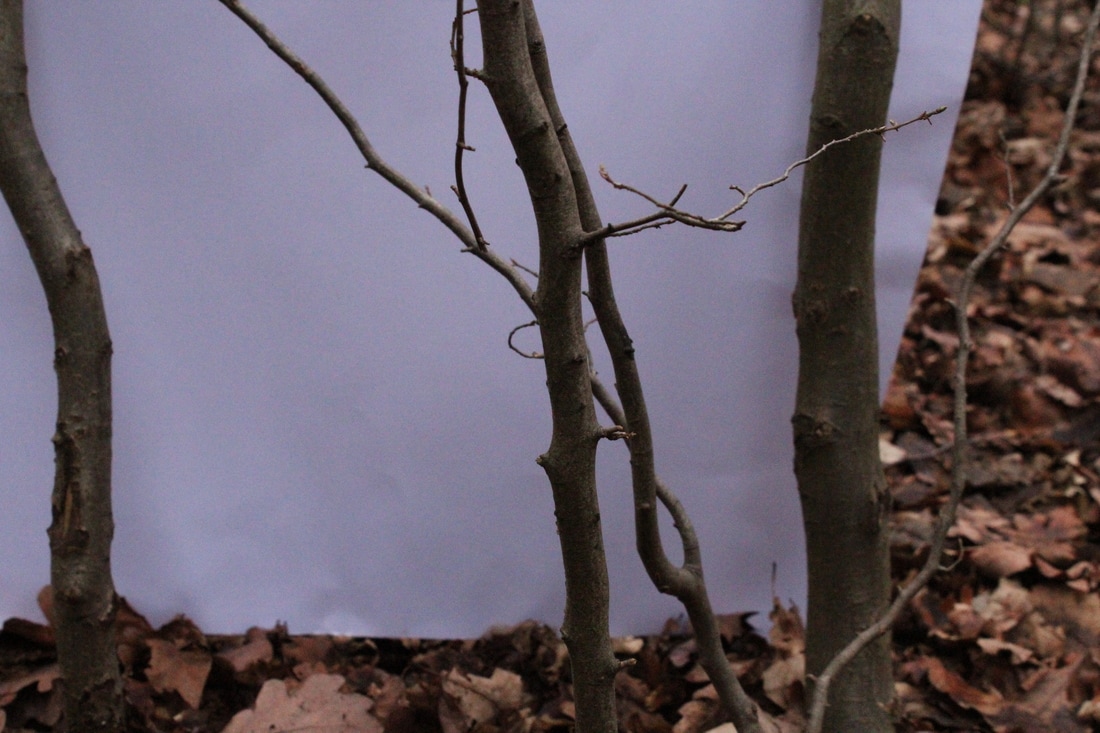
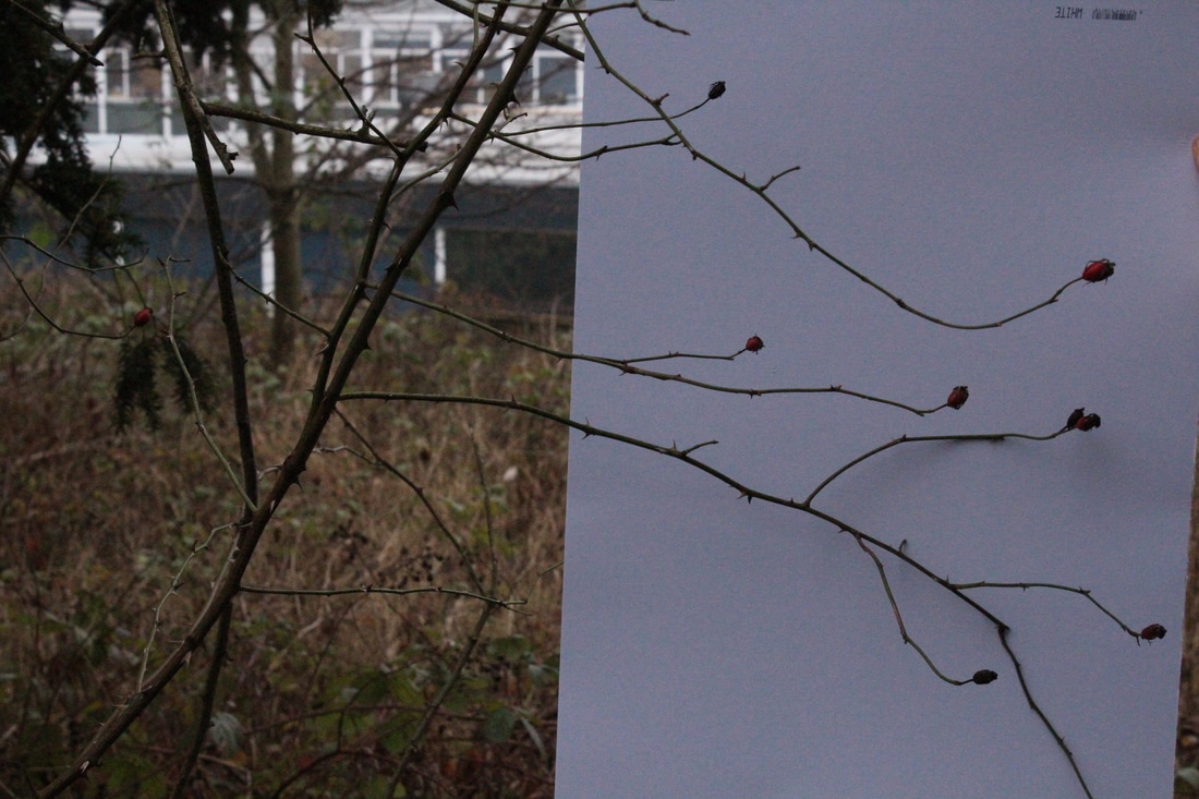
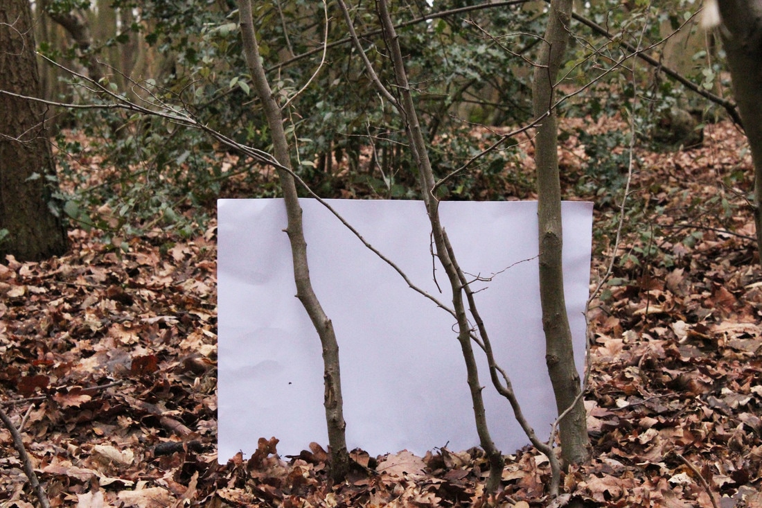
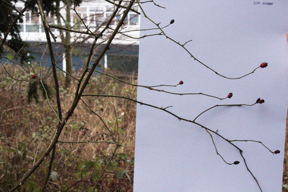
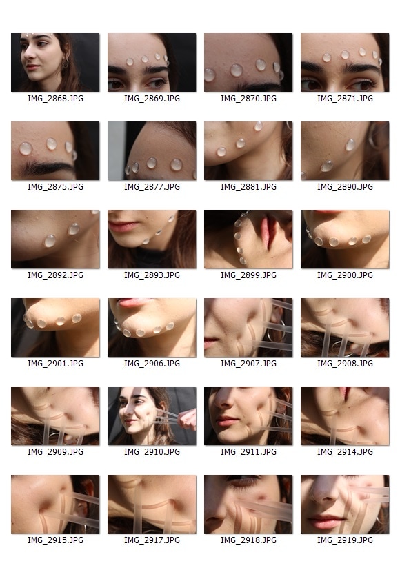
In response to Myoung Ho Lee's work I recreated the same idea on a smaller scale, by having my partner hold a white piece of paper behind plants or parts of them. I left the background visible in most of the photos to isolate the plants from their environment and context like Myoung Ho Lee has done. I tried to focus of a variety of interesting structures and shapes of different segments of the plants. The first series were taken on the school allotment and the second was photographed in the woods behind school.
|
|
|
|
|
|
|
|
|
It was cloudy and the trees in both locations provided a lot of unwanted shade which made the photos duller than I wanted so after choosing the ones I like most compositionally I brightened the photos and made them more vivid/have more contrast to make sure the photos were bright and to make the plants stand out more against the white.
|
|
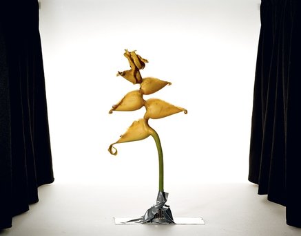
Sanna Kannisto
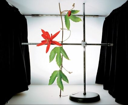
Sanna Kanisto is a Finnish photographer and artist who explores the way that nature is represented in art and science. She does this by composing her photos in an artistic and colourful way whilst using scientific equipment to present the flowers and plants in an artificial way. By removing the plants from their conetxt (their natural environment) you can more easily focus on the structure, shape and colour of the plants. The stark contrast of the living plant material with the cold hard and almost industrial ways she presents them also helps to emphasise the natural forms and shapes in which the plants have grown.
Sanna Kanisto is a Finnish photographer and artist who explores the way that nature is represented in art and science. She does this by composing her photos in an artistic and colourful way whilst using scientific equipment to present the flowers and plants in an artificial way. By removing the plants from their conetxt (their natural environment) you can more easily focus on the structure, shape and colour of the plants. The stark contrast of the living plant material with the cold hard and almost industrial ways she presents them also helps to emphasise the natural forms and shapes in which the plants have grown.
|
|
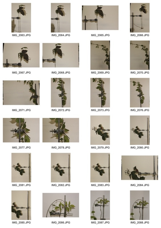
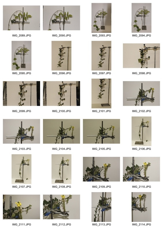
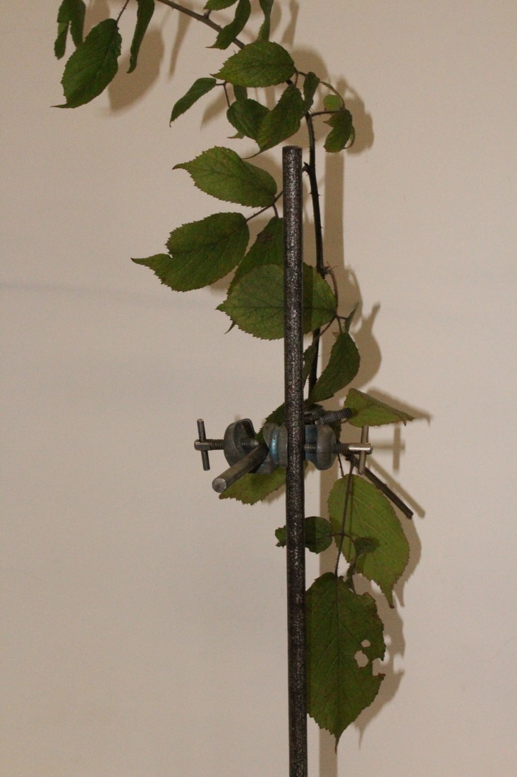
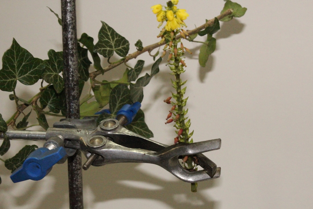
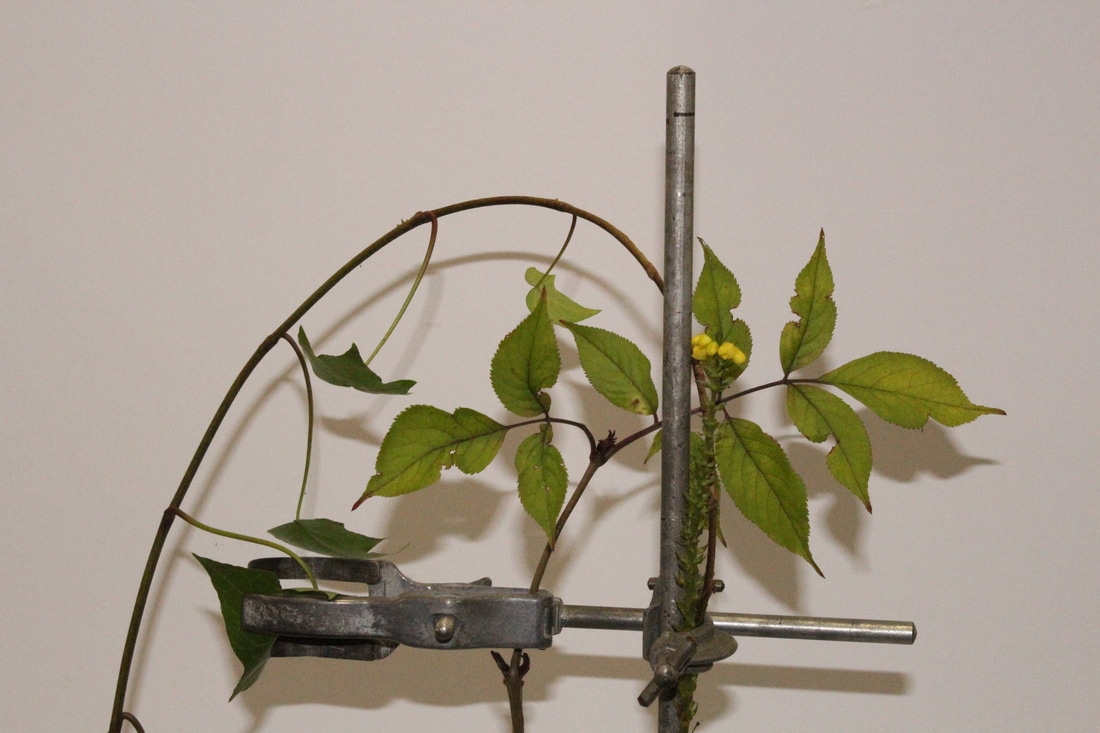
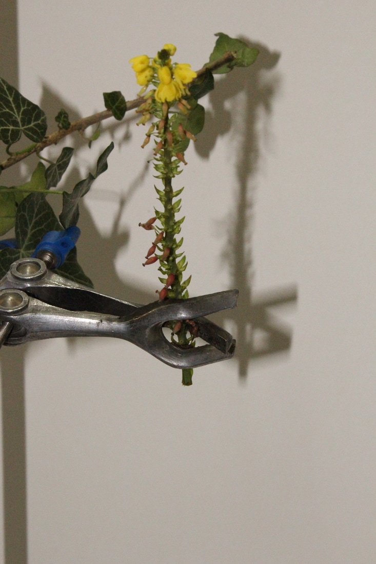
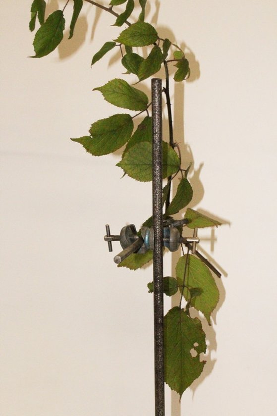
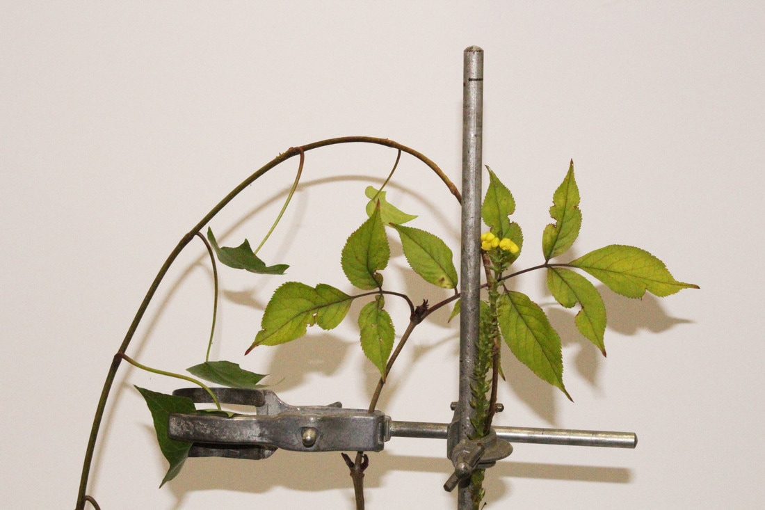
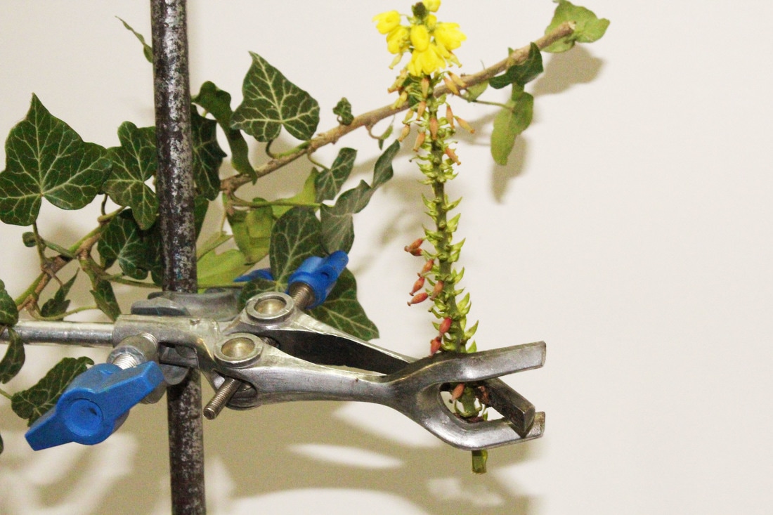
In response to Kannisto's work we collected pieces of plants from the woods and displayed them in clamps from the science labs in front of white paper. I used the flash in most of these because the lighting inside was quite dark and making the photos seem yellow. I also liked the shadow that the flash created behind the plants. I brightened the images at the end again because I wanted to make the green and the yellow more bright and the white more of a brilliant white so that they would stand out against each other. I like the use of the clamps with the plants because of the industrial and cold materials contrast with the bright and lively natural colours.
|
|
|
|
|
|
|
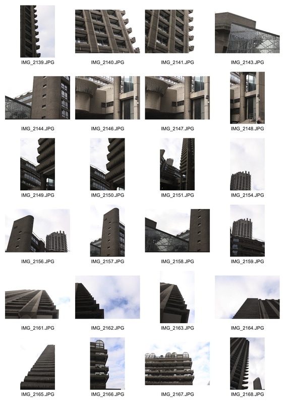
brutalist london
The Brutalist architecture movement (1950s-70s) evolved from modernist architecture. The word brutalism stems from the word 'brut' meaning raw in french. Brutalist structures are usually very large in size, have lots of sharp and unforgiving angles and have exposed concrete or brickwork without any 'finish'. They often show the way that the buildings are structured inside by following the shape of the buildings on the inside.
Simon Phipps
Simon Phipps is a British photographer who is most well known for his photos of Brutalist London. Rather than printing them as 'normal' photographs he had them produced as monochrome images directly onto an aluminium substrate to represent the natural and raw materials often used in Brutalist structures and because 'aluminium resonates with concrete as a material in it’s visual neutralness'. He likes to focus on Brutalist buildings because he wants to document British architecture which 'fits into the idea of the social contract'; they were built to serve a purpose for the people living in Britain and this is reflected in the way they are constructed with function over form and materials being used in the most basic way possible.
Simon Phipps is a British photographer who is most well known for his photos of Brutalist London. Rather than printing them as 'normal' photographs he had them produced as monochrome images directly onto an aluminium substrate to represent the natural and raw materials often used in Brutalist structures and because 'aluminium resonates with concrete as a material in it’s visual neutralness'. He likes to focus on Brutalist buildings because he wants to document British architecture which 'fits into the idea of the social contract'; they were built to serve a purpose for the people living in Britain and this is reflected in the way they are constructed with function over form and materials being used in the most basic way possible.
|
|
|
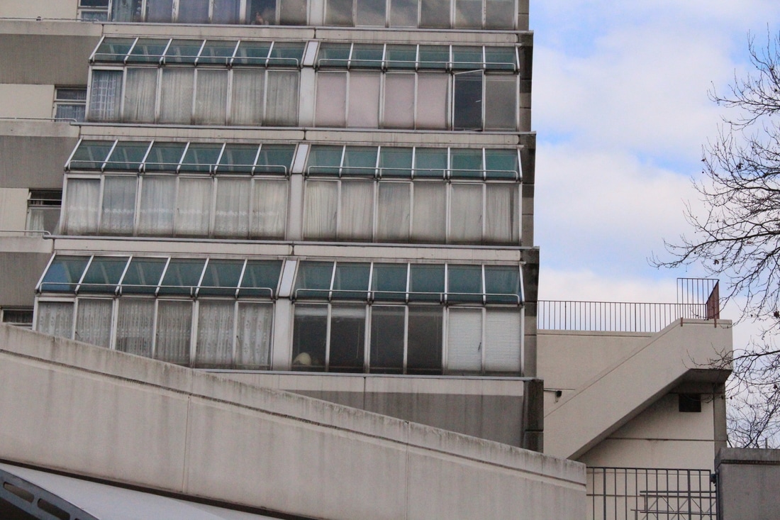
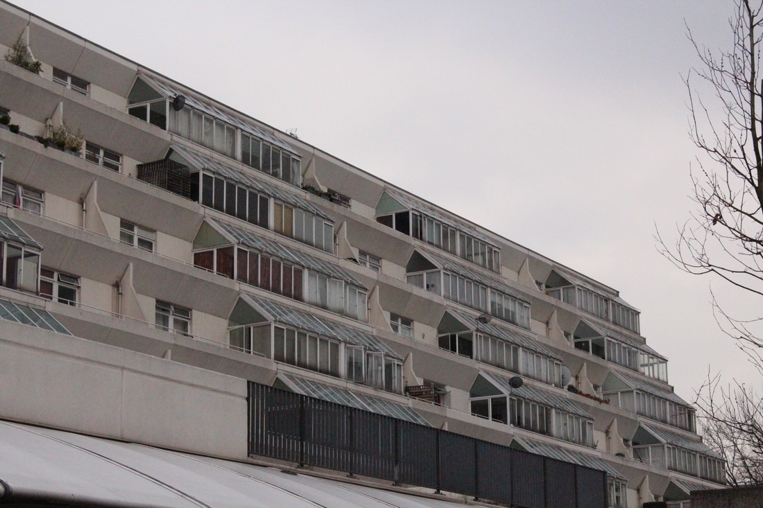
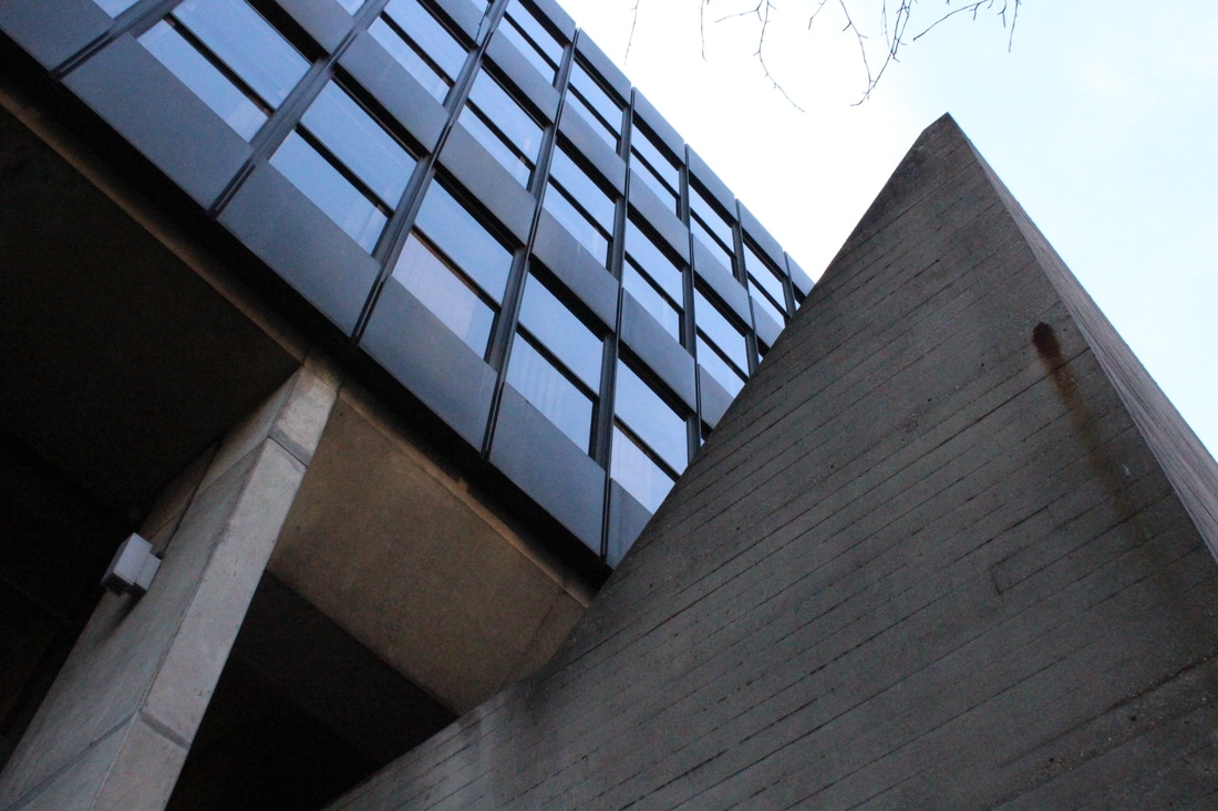
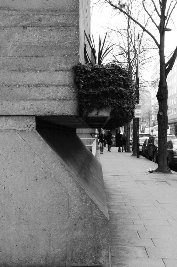
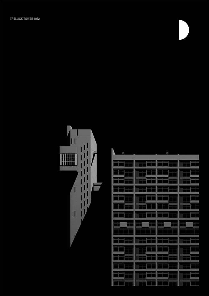
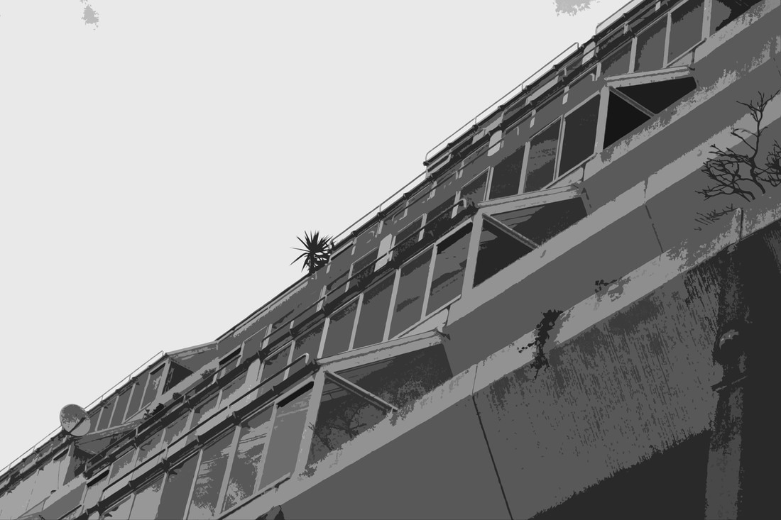
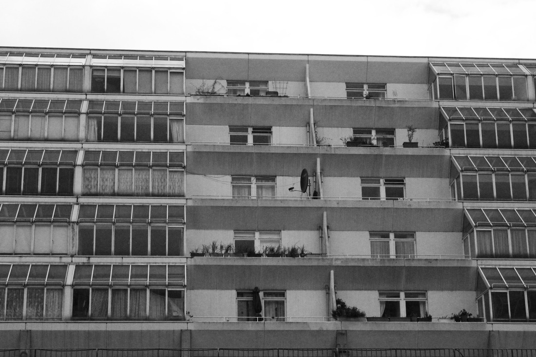
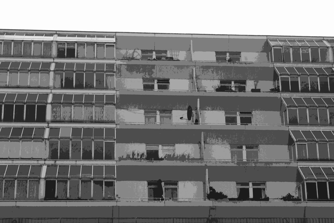
Brunswick centre
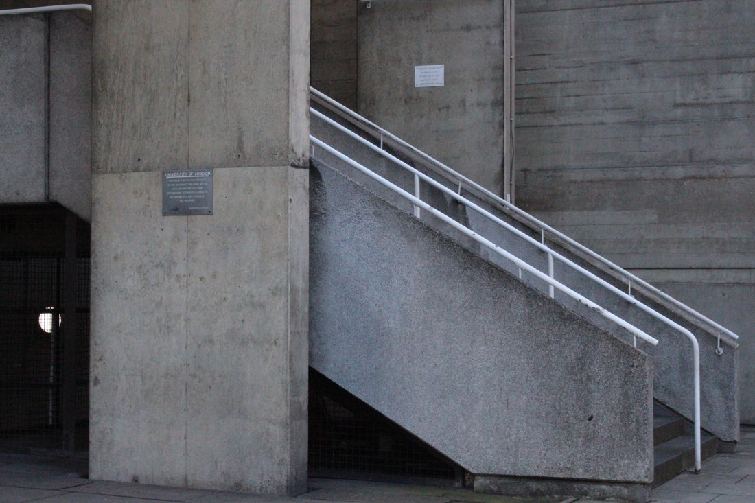
The first building I visited in response to Simon Phipps' work is the Brunswick (shopping) Centre in Camden. It was built in 1972 and the tiered flats surrounding it were never meant to be council flats but after there wasn't enough interest from private buyers they didn't have a choice. The building was intended to be painted cream but it was never completed because Camden council couldn't afford the paint.
This was my favourite building to photograph because whilst the whole shopping centre is very modern and upper class with expensive shops and a pristine look to it but when you isolate the council flats from the rest of it, it appears urban and raw and quite run down in comparison. I like how the flats are staggered backwards because they look cramped and 'squished' together. I especially like how the photos look in black and white when I increased the contrast because it emphasises the solemn sort of feeling that the flats have, which was otherwise challenged by the bright blue sky.
|
|
|
|
|
|

|
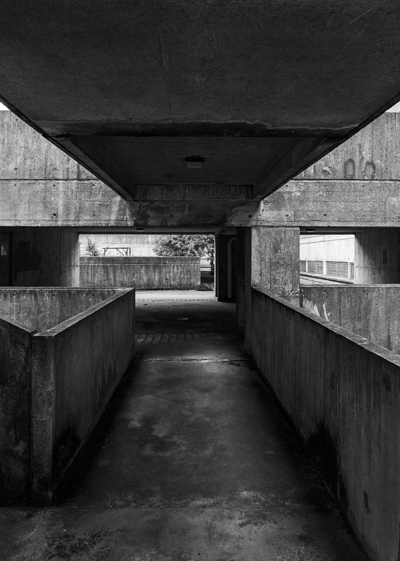
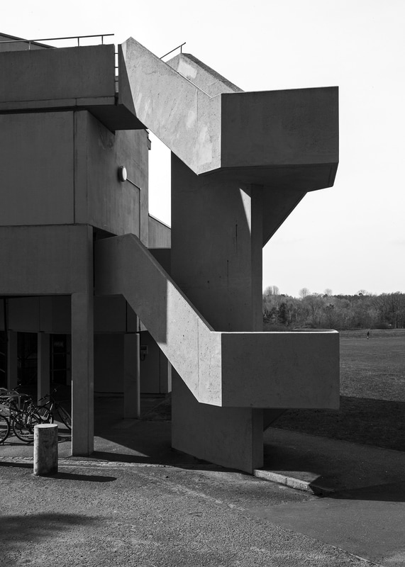
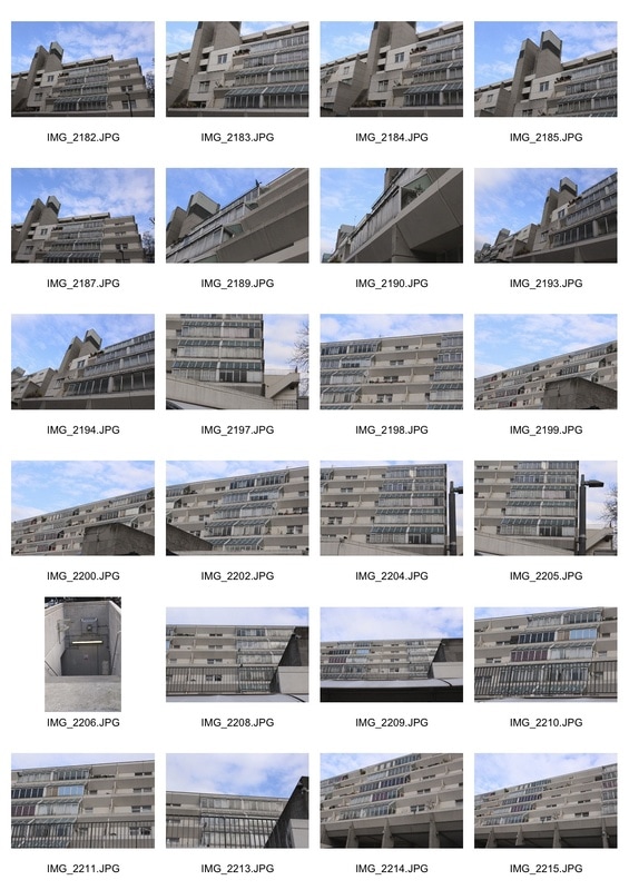
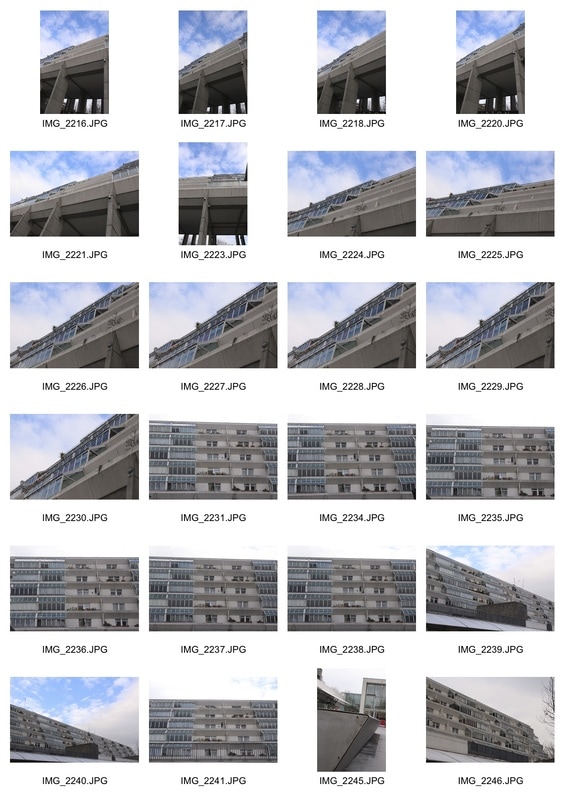
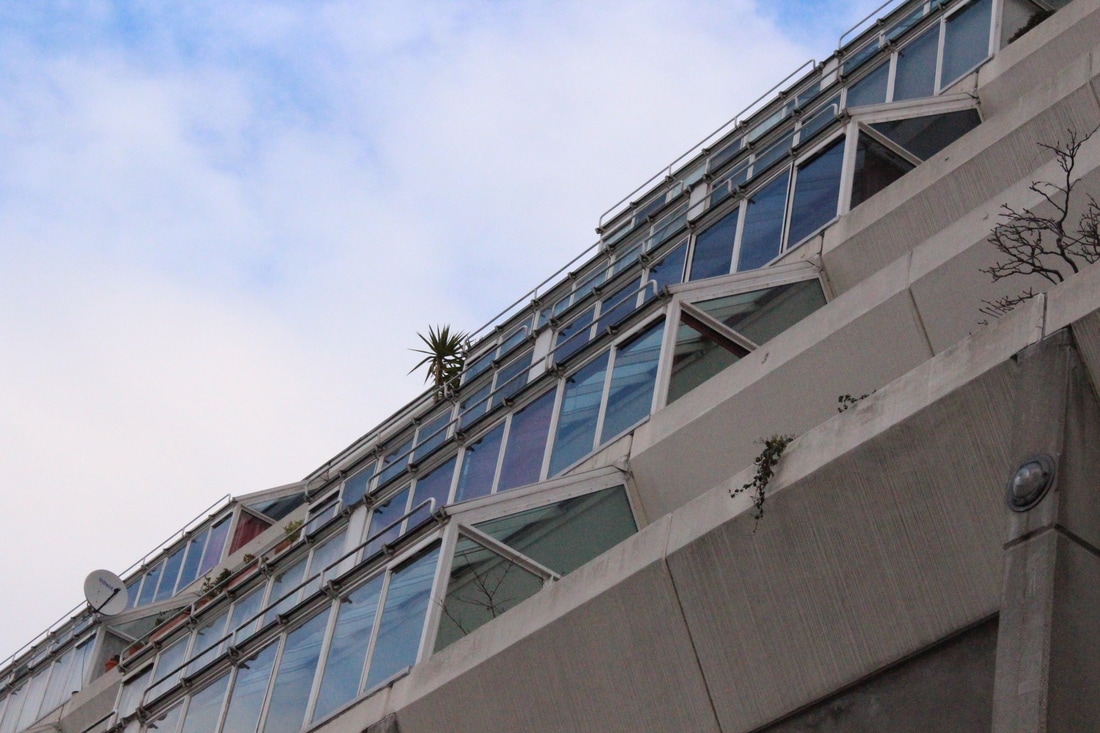
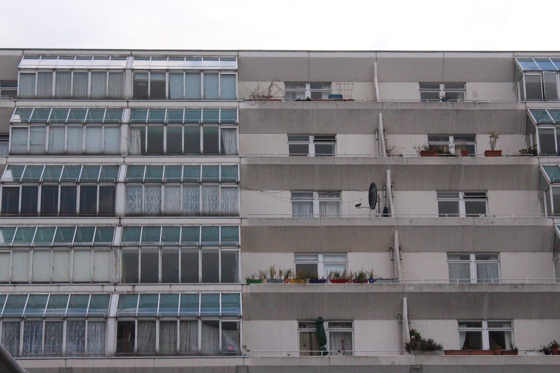
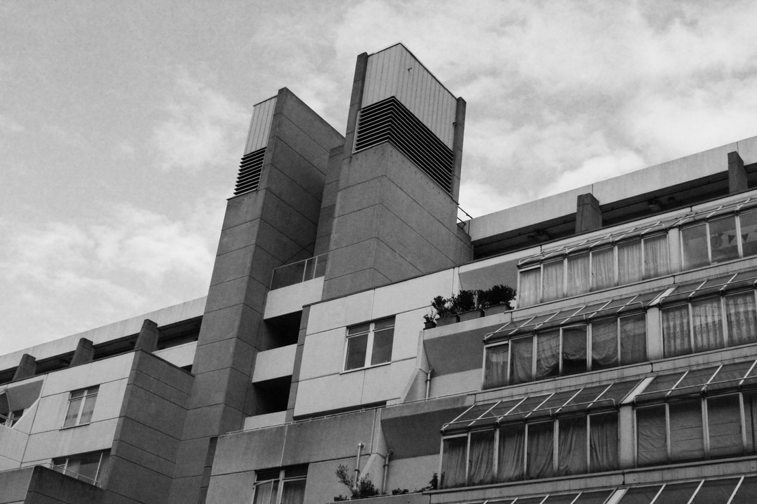
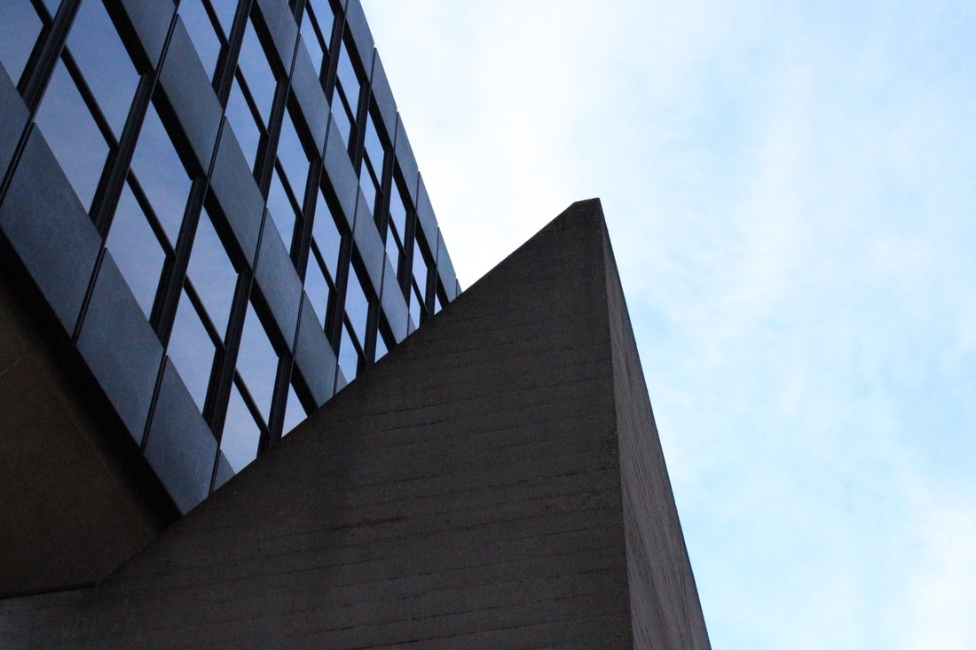
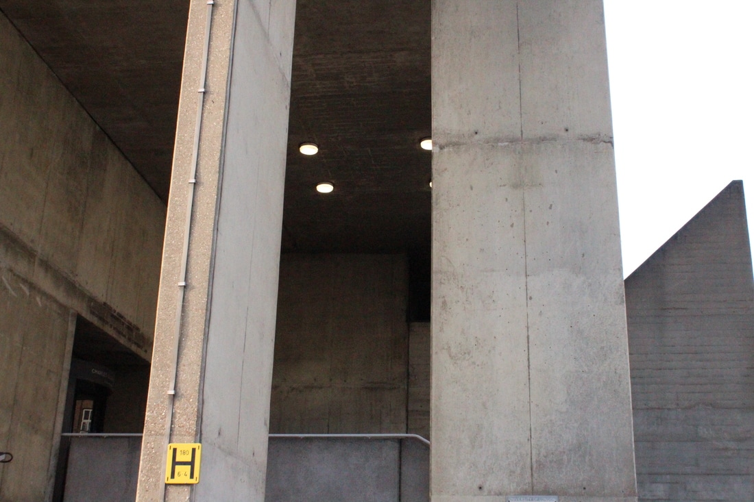
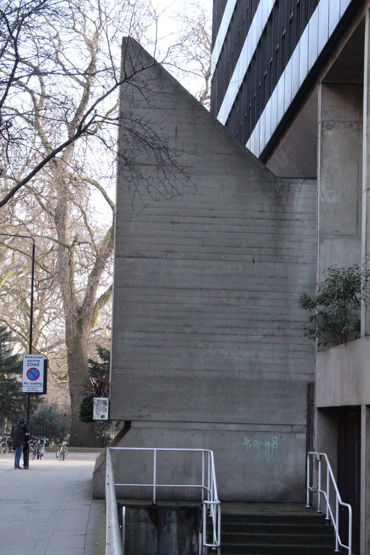
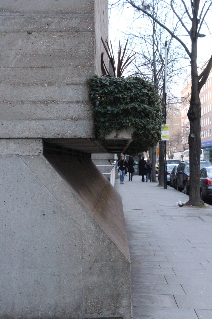
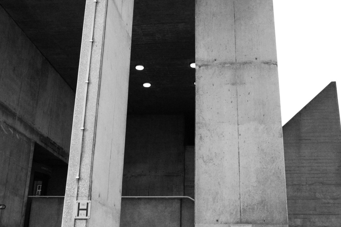
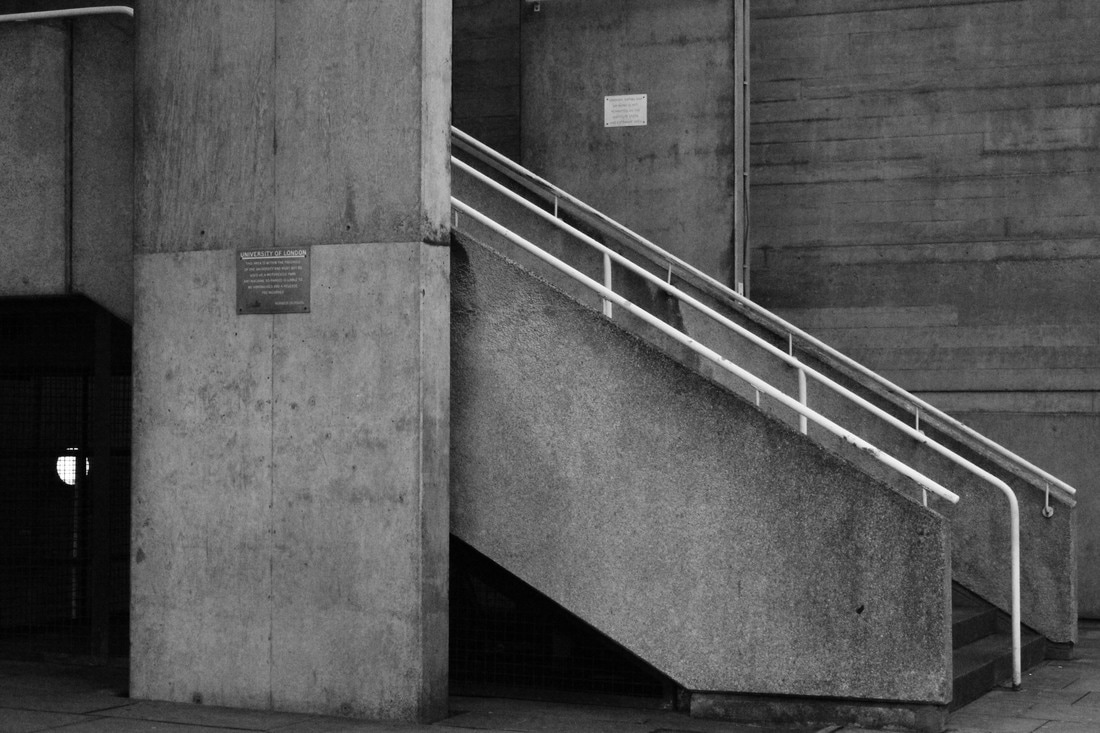
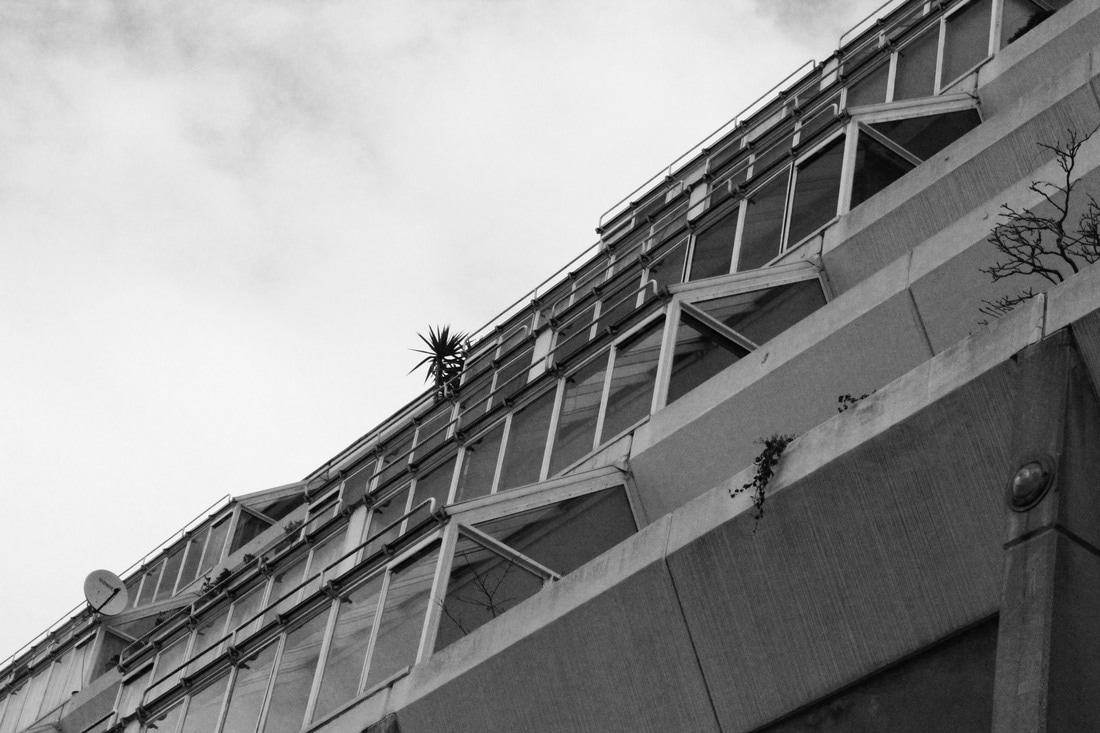
UCL Institution of Education
The UCL Institution of Education is one of the University College London's 11 constituencies which teaches Education. It specialises in research into the field of education. The IoE was established properly in 1907 and moved locations several times until it expanded eventually onto four houses on Bedford Way which were leased as a residential hall for students in 1946. In 1960 designs were created by Denys Lasdun to create a proper building for the IoE to reside in but only parts of his plan were carried out eventually, for example the removal of the library to be relocated elsewhere. The new building was finished in 1975.
I didn't enjoy photographing this building as much as the design was repetitive and I couldn't get a wide variety of different shots and angles as I fond a lot of my photos looked the same. Despite this, the pointed segments provided for some interesting compositions, and I enjoyed photographing the stair wells because they look unpleasant and dirty in comparison with the large modern establishment. The photos weren't improved much by making them black and white and increasing the contrast but it helps to show that I have taken inspiration from Simon Phipps.
|
|
|
|
|
|
|
|
|
|
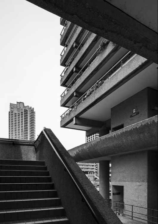
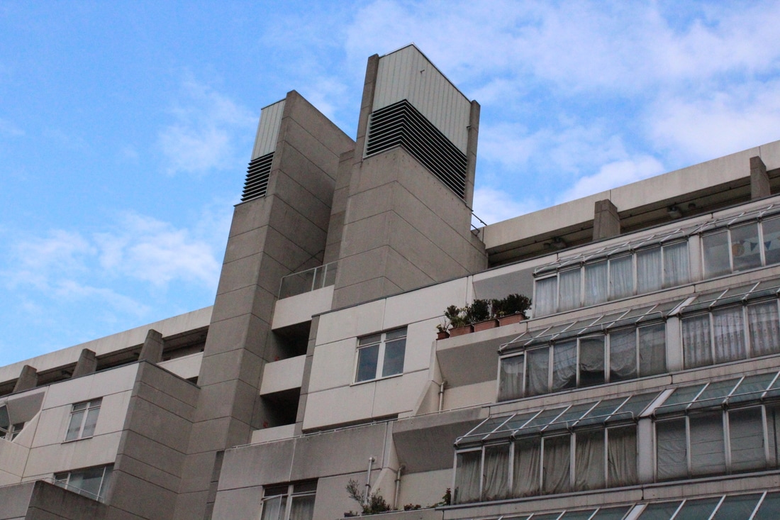
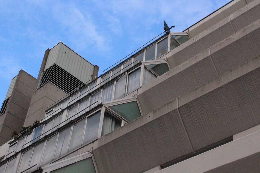
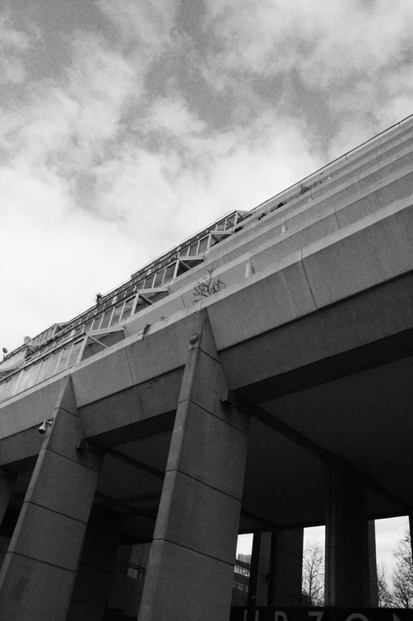
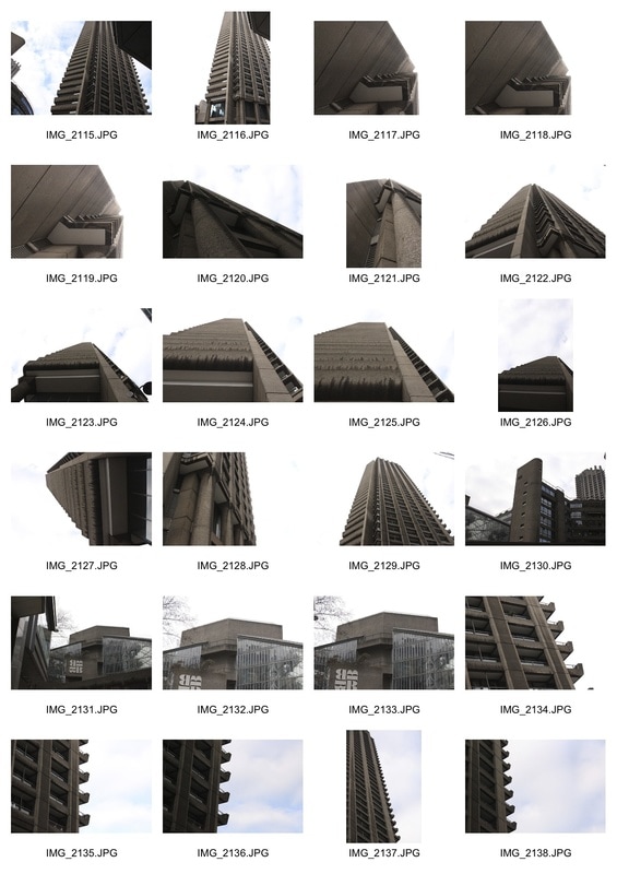
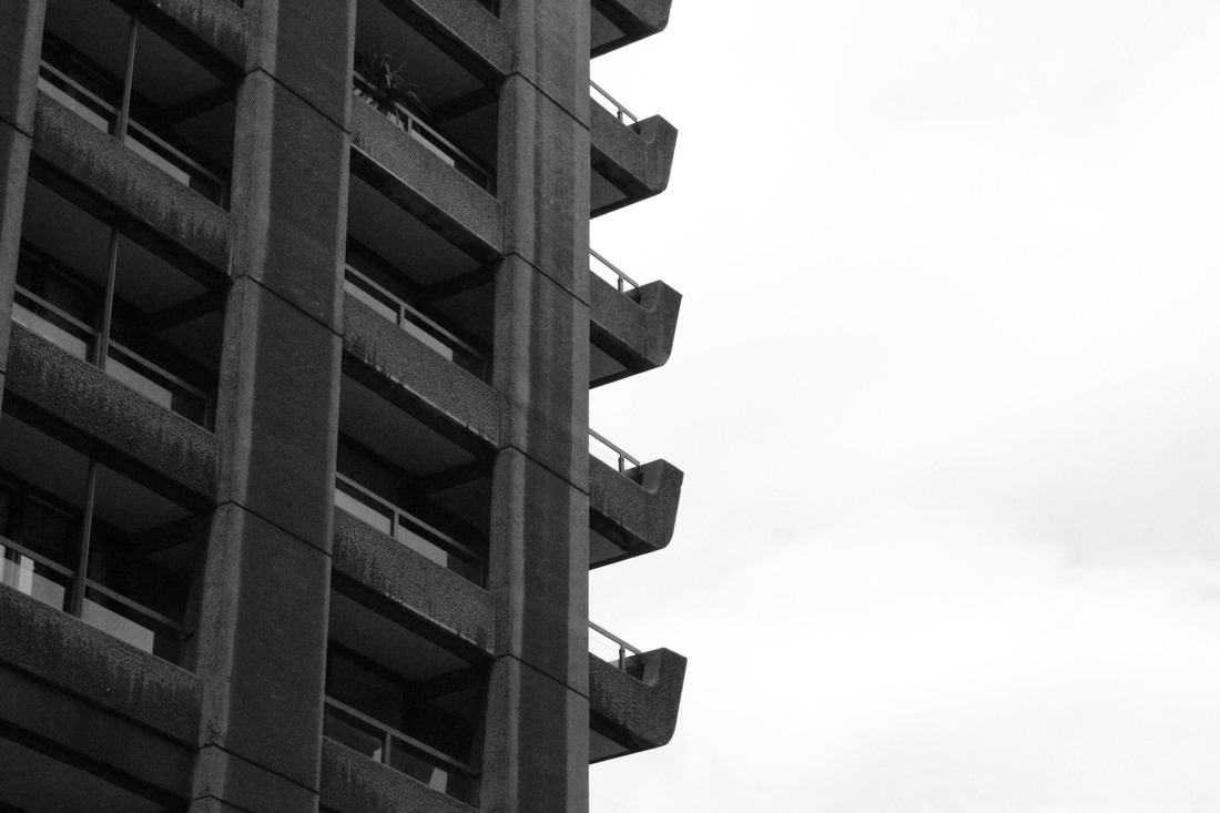
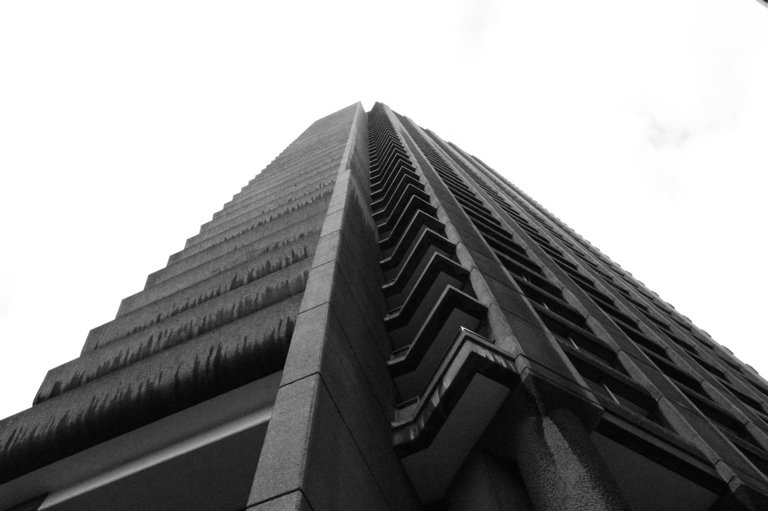
Barbican
The Barbican centre is a performing arts centre which hosts music concerts, theatre performances, film screenings and art exhibitions as well as a library and a conservatory. It was designed by Chamberlin, Powell and Bon and is located in central in an area which was badly bombed during world war two. In 2003 it was voted London's ugliest building. It has been designated a site of special architectural interest 'for its scale, its cohesion and the ambition of the project'. It has been refurbished, had decorative features and extra buildings addd to it since.
I like how these photos came out, and I think they benefitted from being in black and white because it makes the photos more harsh.
|
|
|
|
Thomas Danthony
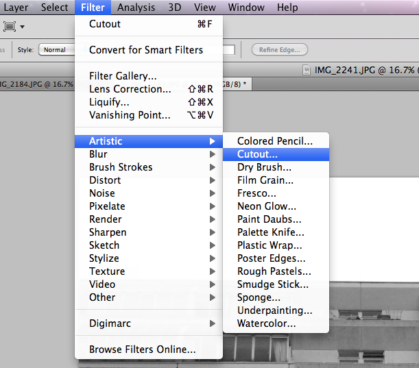
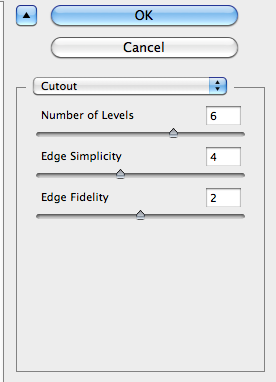
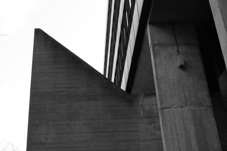
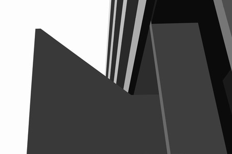
Thomas Danthony is a French artist based in London. His Brutalism project is a collaboration with Black Dragon Press which focuses on Brutalist structures in London. They are screen prints of simplified black and white photos of Brutalist buildings. In response I tried to recreate this effect with some of my favourite photos of the brutalist pictures I took. I used two different methods; using a cutout filter and using a blur filter.
Thomas Danthony is a French artist based in London. His Brutalism project is a collaboration with Black Dragon Press which focuses on Brutalist structures in London. They are screen prints of simplified black and white photos of Brutalist buildings. In response I tried to recreate this effect with some of my favourite photos of the brutalist pictures I took. I used two different methods; using a cutout filter and using a blur filter.
|

|
|
Method 1- cutout
|
The first method uses a filter which turns the photographs into a 'cutout'. I adjusted the number of levels which changes how many different tones there are in the photo, making it more or less simple. I like this filter because its accurate and very fast and simple and gives you a bit more control over how the final image comes out, however it's not an accurate recreation of the work of Thomas Danthony because it's detailed and grainy in comparison to his sharp lines and defined shapes that he managed to achieve in his work. It also looks too much like the photograph and not simplified.
|
|
|
|
|
|
|
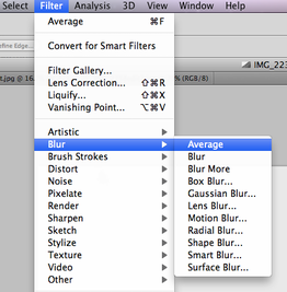
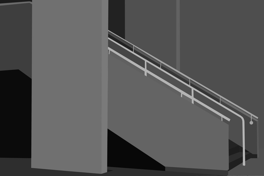
Method 2- Average
|
The second method I used was the Average Blur tool which lets you select select around the part of the photo you want to turn into a 'block' colour and then average it so it turns into one colour. This is a better method than the first one I used because it creates more even, less grainy blocks of colour and there is better definition between the different coloured segments. Although it's more time consuming it is worth it because it gave me more control over the results I was producing and looks very similar to Danthony's work, like a screen print.
|
|
|

|
|
|
|
wolfgang tillmans at tate
Wolfgang Tillmans is a German contemporary photographer currently based in Berlin. He was the first photographer and non-British person to be awarded the Tate Annual Turner Prize in 2000. Along with photographs he produces videos, digital slide projections, publications and music. He 'pushes the boundaries of the photographic form in abstract artworks that range from the sculptural to the immersive' by photographing anything and everything around him in an artistic and beautiful way.
I liked his exhibition mostly because of the way the photos were presented on the walls. Rather than having them all mounted in frames at eye level like a regular exhibition, the photos were all presented at different levels and in different sizes much like a collage and they were hung using bulldog clips and tape and weren't in frames. The lack of structure to the way they were displayed reflects the freedom and creativity of his work; he doesn't just photograph one specific thing in one style, he is flexible and open to trying everything, for example he can produce work just as fascinating in a dark room as he can with a camera.
I liked his exhibition mostly because of the way the photos were presented on the walls. Rather than having them all mounted in frames at eye level like a regular exhibition, the photos were all presented at different levels and in different sizes much like a collage and they were hung using bulldog clips and tape and weren't in frames. The lack of structure to the way they were displayed reflects the freedom and creativity of his work; he doesn't just photograph one specific thing in one style, he is flexible and open to trying everything, for example he can produce work just as fascinating in a dark room as he can with a camera.
body structure
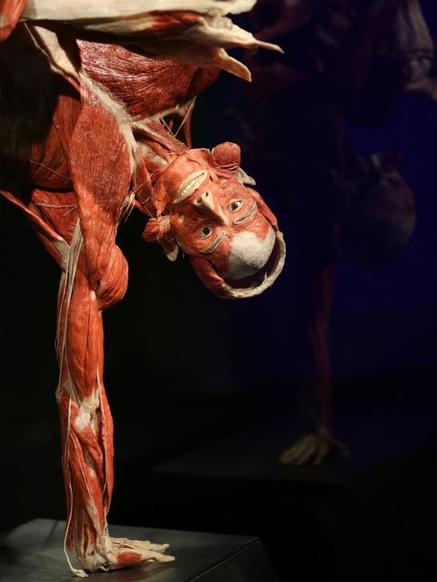
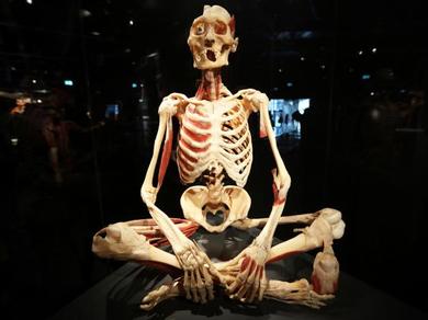
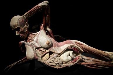
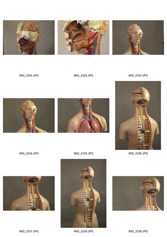
Gunther Von Hagens
Gunther Von Hagens is an anatomist who invented a type of preservation in 1977 called 'plastination'. He began by using this technique for preserving things to be studies medically but in the 90's developed the technique to preserve whole bodies and began to create real human sculptures out of body parts that had been donated to medicine. He positioned the bodies in creative and artistic ways whilst always showing the anatomy of the body, combining science and art in ways that nobody had before before him.
Gunther Von Hagens is an anatomist who invented a type of preservation in 1977 called 'plastination'. He began by using this technique for preserving things to be studies medically but in the 90's developed the technique to preserve whole bodies and began to create real human sculptures out of body parts that had been donated to medicine. He positioned the bodies in creative and artistic ways whilst always showing the anatomy of the body, combining science and art in ways that nobody had before before him.
|
|
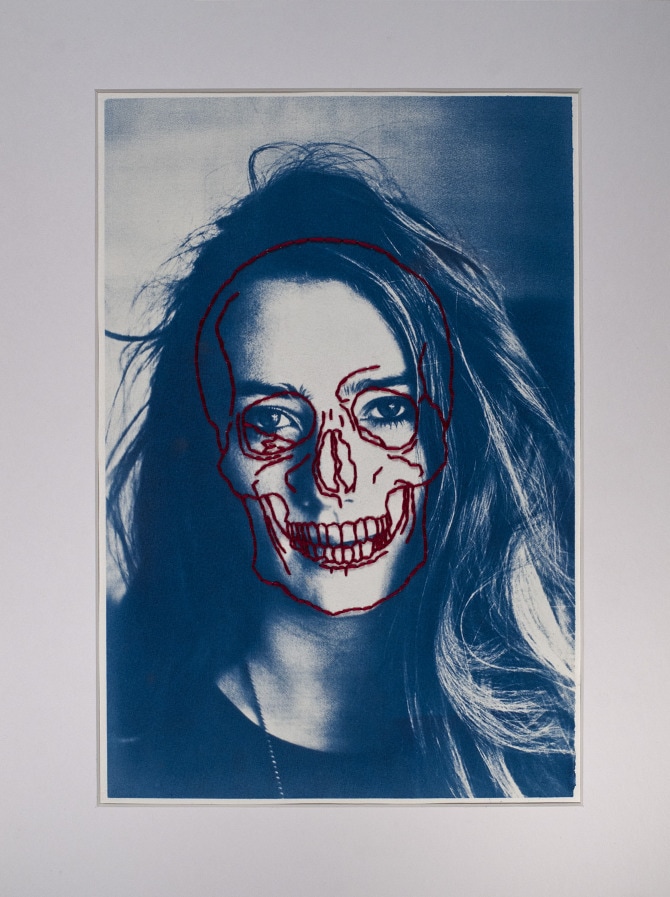
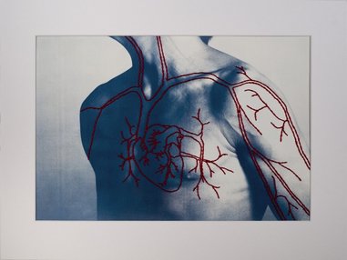
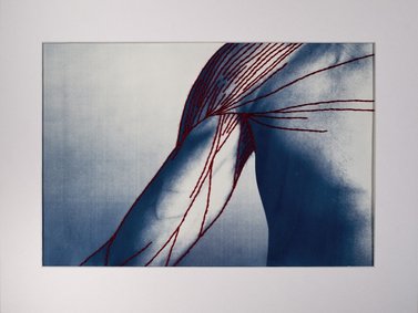
Patrick Hickley
Patrick Hickley is a artist/photographer from New Zealand. His series of photographs titled 'Complex Structures' consists of hand printed canotypes which he stitched over the top of using red thread to show the internal structure of the body.
Patrick Hickley is a artist/photographer from New Zealand. His series of photographs titled 'Complex Structures' consists of hand printed canotypes which he stitched over the top of using red thread to show the internal structure of the body.
|
|
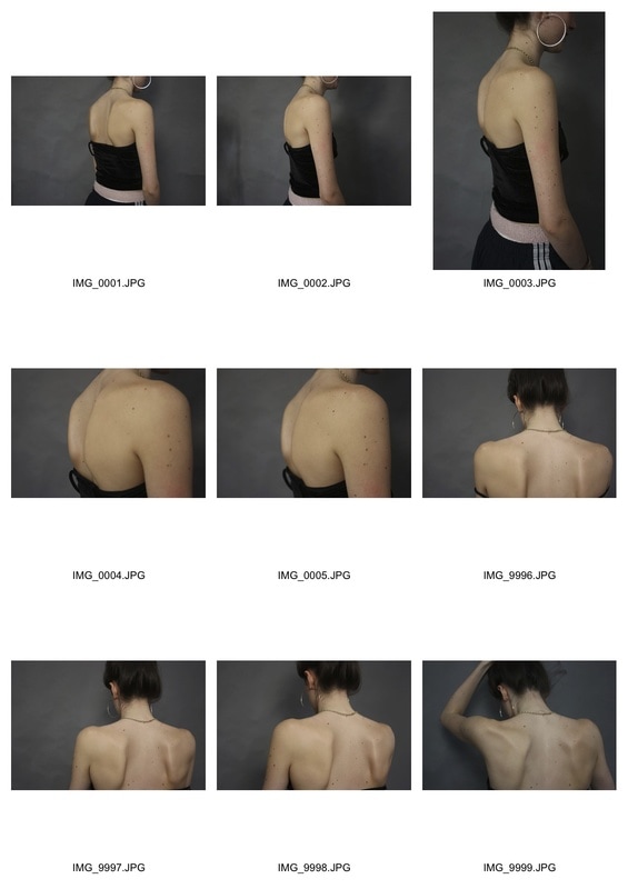
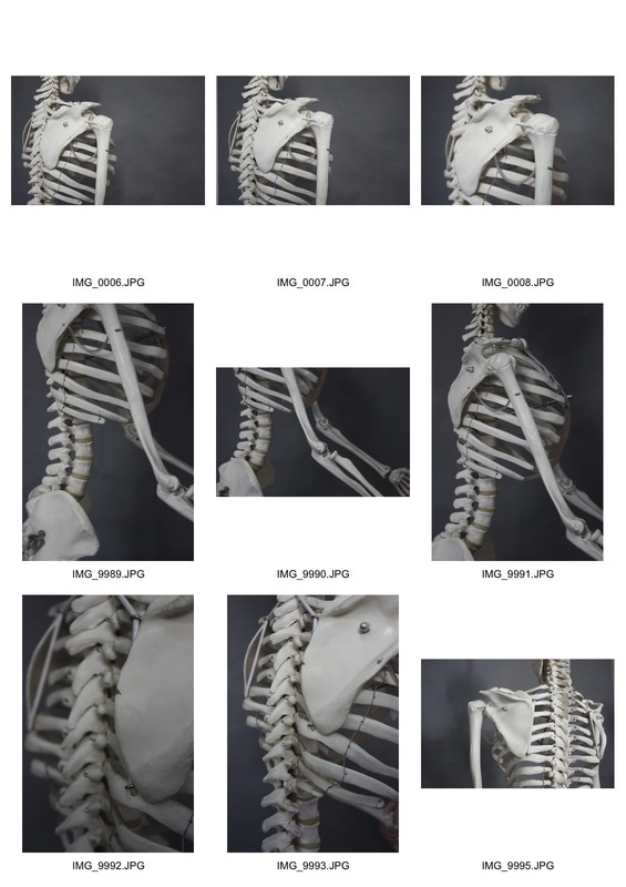
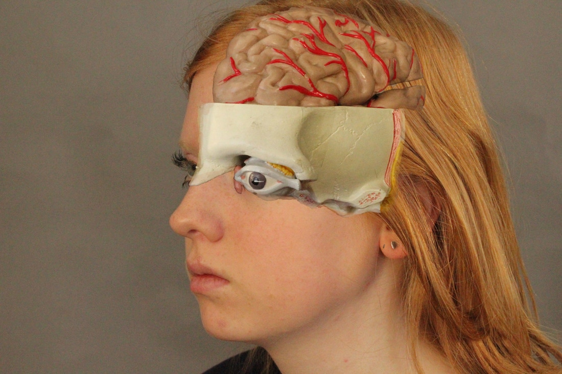
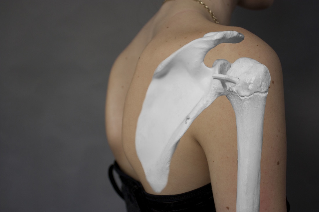
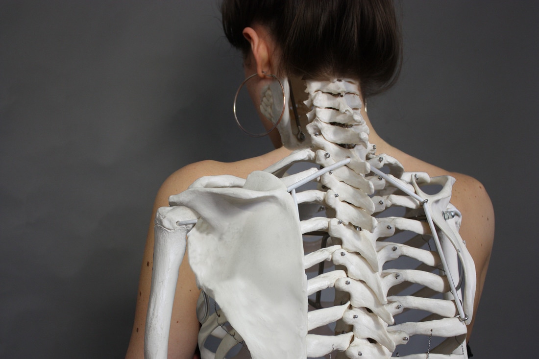
Drawing inspiration from both Gunther Von Hagens and Patrick Hickey I photographed some anatomical models of the human body and layered parts of the images on top of photos of people to show their insides on the outside. I wanted the body parts to be on top of the images because I preferred how this looks to revealing the image from underneath. My process for making these images is fairly simple; I just pasted the sections of the body where I wanted them and blurred the edges out. If the parts didn't fit exactly with my model I just resized and free transformed the parts of the anatomy I needed to fit. The photos with the skeleton looked better because I could manipulate the skeleton model physically to be in the right position and it fit the model better.
|
|
|
|
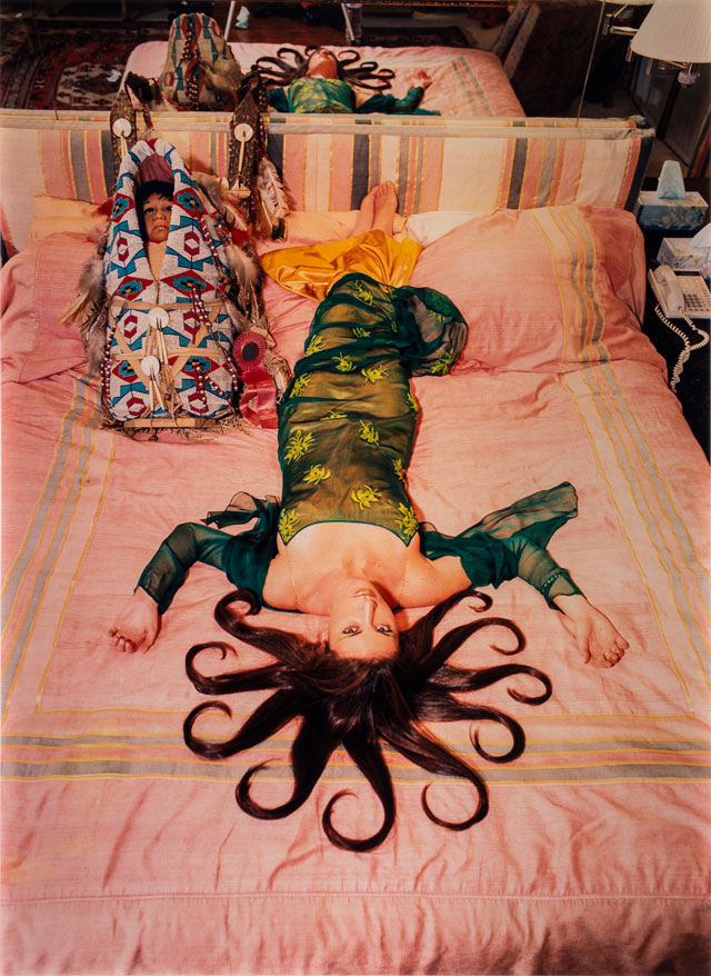
radical eye
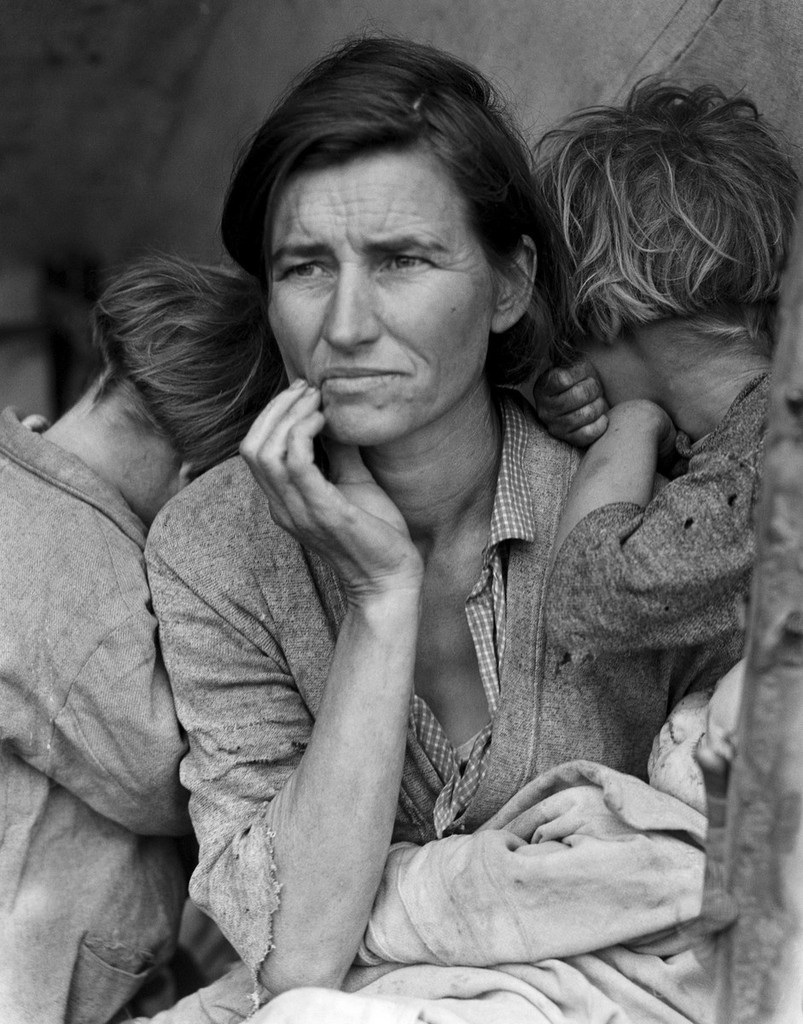
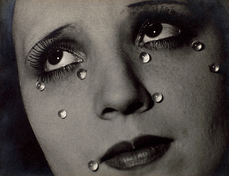
The Radical Eye is a photography exhibition in Tate Modern showing some of the photographs from Elton John's personal photograph selection. Elton John is an extremely famous and wealthy singer and composer who has a collection of over 8,000 photographs which he has bought over 25 years. Most of the collection is made up of 'key early 20th century photos' and original vintage prints of photographs. The Radical Eye exhibiton displays mostly photographs from people who are considered to be the pioneers of photography, from around the time when photography started to become popular and people become more artistic and experimental in the darkroom. Amongst the photos are some extremely famous ones such as 'Migrant Mother' taken by Dorothea Lange in 1936, 'Humanly Impossible' created by Herbert Bayer in 1932 and 'Glass Tears' by Man Ray in 1932.
What I particularly liked about the exhibition was how a lot of the photos were very small and this was mostly because Elton John collects the originals, very first prints, of the photographs. I found this fascinating because of the stark contrast between these tiny photographs with the frames that seemed almost too large for them.
What I particularly liked about the exhibition was how a lot of the photos were very small and this was mostly because Elton John collects the originals, very first prints, of the photographs. I found this fascinating because of the stark contrast between these tiny photographs with the frames that seemed almost too large for them.
|
|
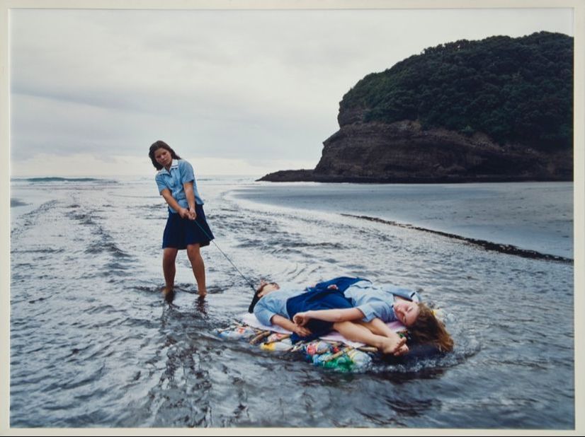
terrains of the body
Terrains of the Body is an exhibition at whitechapel gallery consisting of photos taken from the National Museum of Women in the Arts in Washington DC, displays photos of women taken by contemporary photographers from across the world. I didn't like this exhibition because I felt that the standard of photography wasn't as high as it could have been, and the point of the exhibiton seemed a bit unclear and confused. The fact that it was such a small exhibition made it more apparent that the quality of the photos wasn't that good. Despite this the photos had a feeling of realness to them and a lot of them were colourful even though the tones were muted.
|
|
three strands
Perspective
My first strand explores the way that perspective can be used to alter the way that you perceive the structure of things.
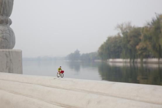
Slinkachu
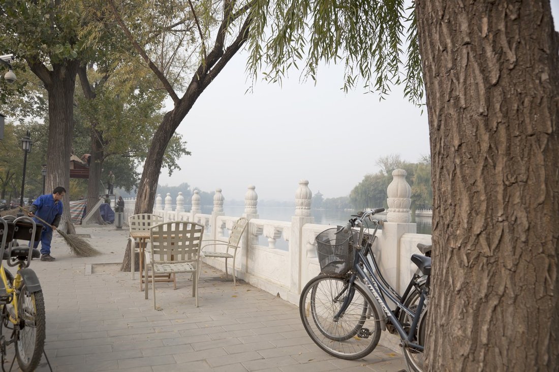
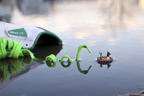
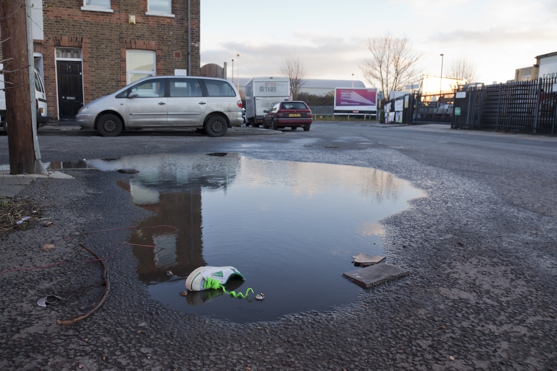
Slinkachu is a London based artist and photographer who paints and remodels figures of people figures of people from train sets and displays them as tiny sculptures all over the world as a part of his 'Little People' project which has been ongoing since 2007. He incorporates mundane and normal objects into his work in innovative ways, such as using a discarded beer bottle cap as a jacuzzi for the miniature figures. The purpose of the instalments is to encourage people to pay more attention to their surroundings, as well as to give a sense of being overwhelmed, lost and alone in a big city. What I particularly like about this instalment is the photography aspect of the work; he displays each work online as two photos, one which shows a close up of the miniature sculpture and one from far away which shows the context of the piece. The photo taken from far away helps to emphasise the sense of being lost in a huge city because you often can't see the tiny models from far away.
I like the way that he plays with perspective and structure to make things seem different than what they are.
My first strand explores the way that perspective can be used to alter the way that you perceive the structure of things.
Slinkachu
Slinkachu is a London based artist and photographer who paints and remodels figures of people figures of people from train sets and displays them as tiny sculptures all over the world as a part of his 'Little People' project which has been ongoing since 2007. He incorporates mundane and normal objects into his work in innovative ways, such as using a discarded beer bottle cap as a jacuzzi for the miniature figures. The purpose of the instalments is to encourage people to pay more attention to their surroundings, as well as to give a sense of being overwhelmed, lost and alone in a big city. What I particularly like about this instalment is the photography aspect of the work; he displays each work online as two photos, one which shows a close up of the miniature sculpture and one from far away which shows the context of the piece. The photo taken from far away helps to emphasise the sense of being lost in a huge city because you often can't see the tiny models from far away.
I like the way that he plays with perspective and structure to make things seem different than what they are.
|
|
|
|
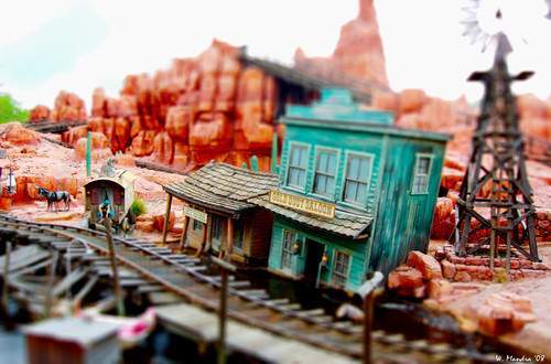
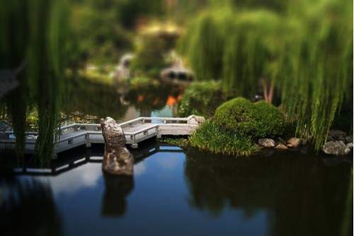
I explored this idea in another way by looking at photographers who had used tilt shift in photoshop to make normal scenes look like tiny toy structures. It's similar to Slinkachu's artwork in the way that it changes your perception of things and you have to look twice so you can understand what you are looking at. It's also easier to create this idea because it only requires a photo taken from a birds eye perspective and to be edited in photoshop, rather than many physical components and elements which need to be gathered to recreate Slinkachu's work.
|
|
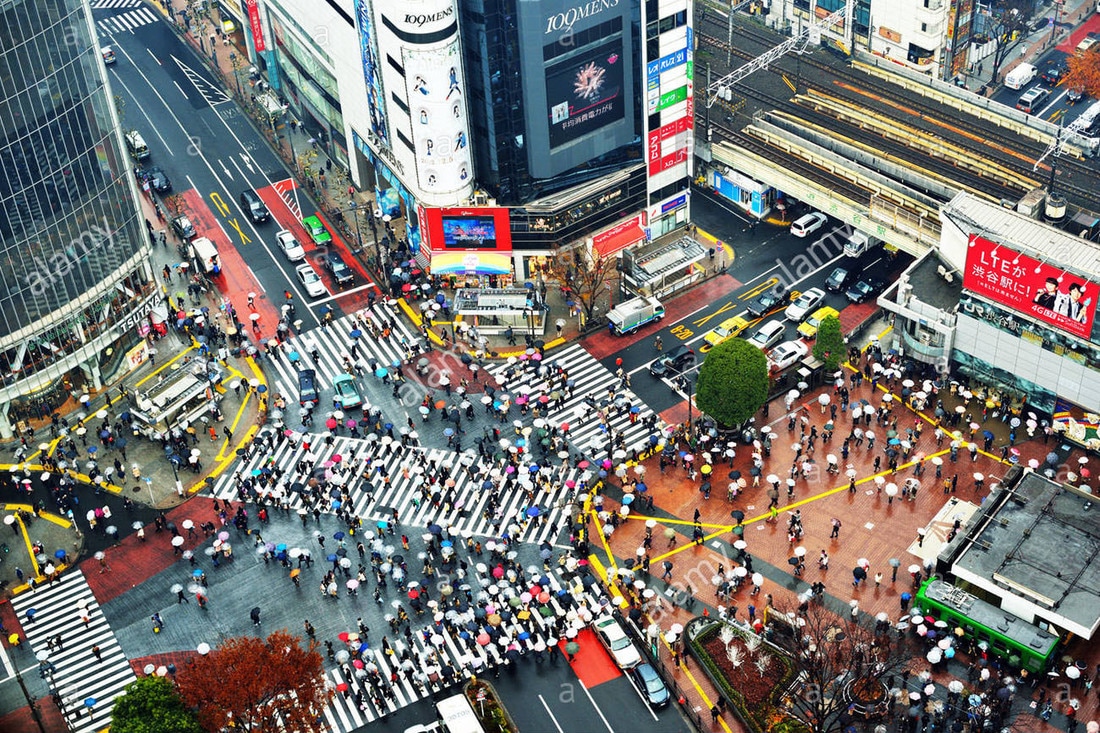
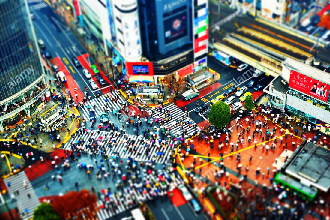
I began by testing out a method for creating the tilt shift effect on a tutorial I found online on a stock image of a busy crossroad in Japan which I found on google, just to ensure that the the method was effective and it created the effect that I was actually looking for.
|
|
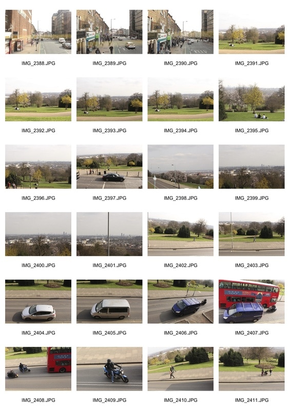
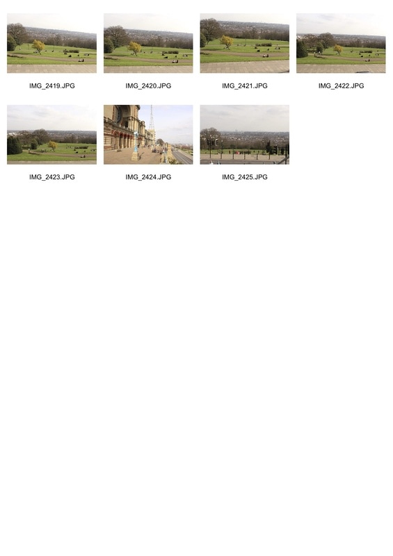
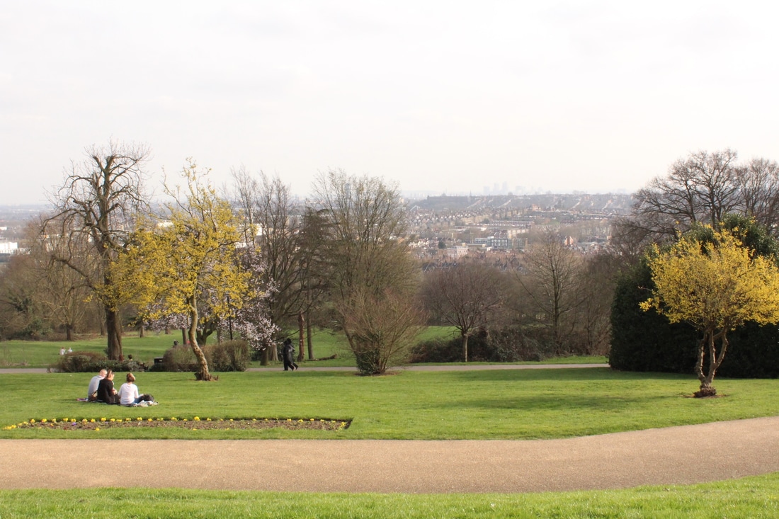
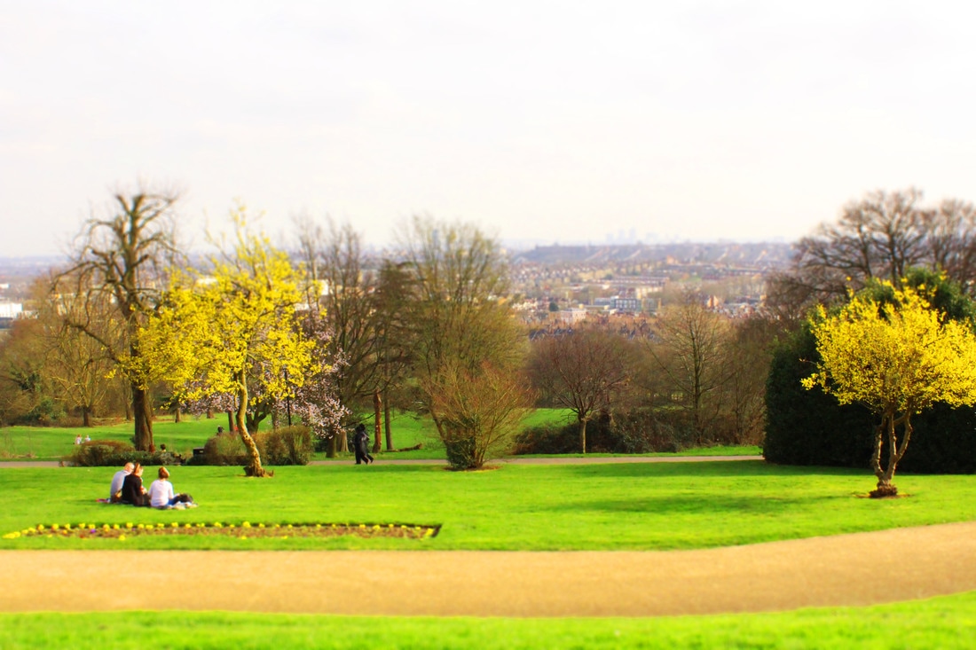
After I tested the method using a photo I didn't take and I was happy that it looked like a tiny toy city, I took some of my own photos to attempt to use tilt shift on. For it to work effectively you have to use a photo from a birds eye view, so I went to ally pally and tried to take some photos looking down over the park and over London. I also took some photos from the front of the top deck on a bus but I couldn't use these because of the reflection in the window.
|
|
|
|
I found that it was very difficult to get a photo that would have been high up enough for this effect to work fully, and it was difficult to position the line which marked where the middle of the blur gradient started well to make the photo look like toys. Although the effect worked on the trees a little bit, I don't feel that the overall effect is very strong.
I am not going to continue with the idea of manipulating structures (physically and digitally) to change the way that the eye perceives them because I don't feel that I can consistently manage to take photos from high up enough for tilt shift to work and I wouldn't know how to develop the idea after this first experiment.
I am not going to continue with the idea of manipulating structures (physically and digitally) to change the way that the eye perceives them because I don't feel that I can consistently manage to take photos from high up enough for tilt shift to work and I wouldn't know how to develop the idea after this first experiment.
Collage
My second strand looks at different ways to collage to alter the structure of things.
Gordon Magnin
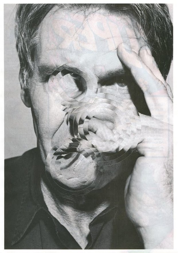
Gordon Magnin is a Los Angeles based artist who takes 'found photos' (photos that someone else has taken) and collages them to give them a different meaning. The photos he uses are commercial photos often of celebrities and female models which are intended originally 'to direct and control public perception, consumer activity, and self image'. The way that he edits them, he removes the commercial beauty from them and makes it so their faces are unidentifiable.
I like the idea of altering and collaging a structure so that it is no longer beautiful or identifiable as what it once was.
My second strand looks at different ways to collage to alter the structure of things.
Gordon Magnin
Gordon Magnin is a Los Angeles based artist who takes 'found photos' (photos that someone else has taken) and collages them to give them a different meaning. The photos he uses are commercial photos often of celebrities and female models which are intended originally 'to direct and control public perception, consumer activity, and self image'. The way that he edits them, he removes the commercial beauty from them and makes it so their faces are unidentifiable.
I like the idea of altering and collaging a structure so that it is no longer beautiful or identifiable as what it once was.
|
|
|
Abigail Reynolds
Abigail Reynolds is a Cornish artist who uses collage to change the structure of things, except she physically manipulates the images and makes a 3D piece by folding up sections of an image on top to reveal the image below. The image below is often a photo taken in the same place but at a different time, so they show what was once there which isn't anymore. I like this work as it shoes the passage of time whilst also creatively using the contrasting images to make an aesthetically pleasing piece of work.
Abigail Reynolds is a Cornish artist who uses collage to change the structure of things, except she physically manipulates the images and makes a 3D piece by folding up sections of an image on top to reveal the image below. The image below is often a photo taken in the same place but at a different time, so they show what was once there which isn't anymore. I like this work as it shoes the passage of time whilst also creatively using the contrasting images to make an aesthetically pleasing piece of work.
|
|
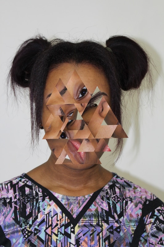
I created my own pieces inspired by both of these artists, but was heavily influenced by the work of Gordon Magnin in my experimental pieces. I took some portraits of people and collaged them on Photoshop by just selecting areas, copying them onto a new layer and moving them around to imitate the work of Gordon Magnin.
|
|
I like this strand and I think the photos I created were really successful, but I don't have confidence in the originality of this idea. I could use elements of collage further on in my project to make it more interesting but I'm not going to continue it as a strand on it's own because I want to develop a more creative and original idea.
Obscuring face structure
My final strand looks at the way that facial structure can be obscured physically.
My final strand looks at the way that facial structure can be obscured physically.
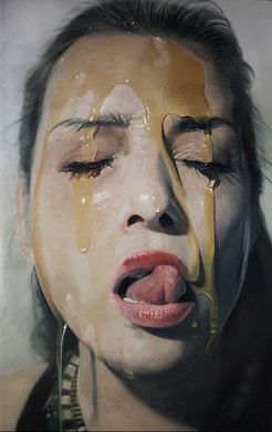
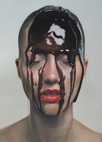
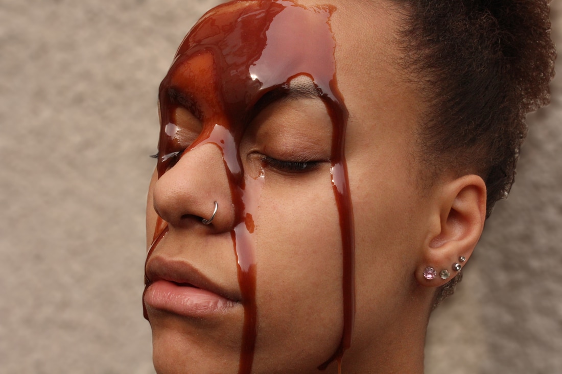
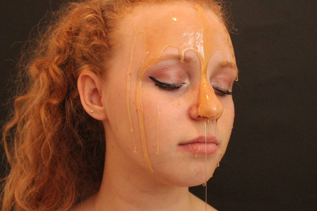
Mike Dargas
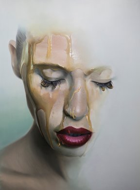
Mike Dargas is a German artist who creates hyper-realistic paintings. He is most well known for his paintings of people with things dripping down their face, mostly honey, chocolate syrup or paint, but many of his other paintings explore the way that skin can be covered or hidden such as wrapping crumpled paper and wet frabric around the face or other body parts.
Mike Dargas is a German artist who creates hyper-realistic paintings. He is most well known for his paintings of people with things dripping down their face, mostly honey, chocolate syrup or paint, but many of his other paintings explore the way that skin can be covered or hidden such as wrapping crumpled paper and wet frabric around the face or other body parts.
|
|
|

|
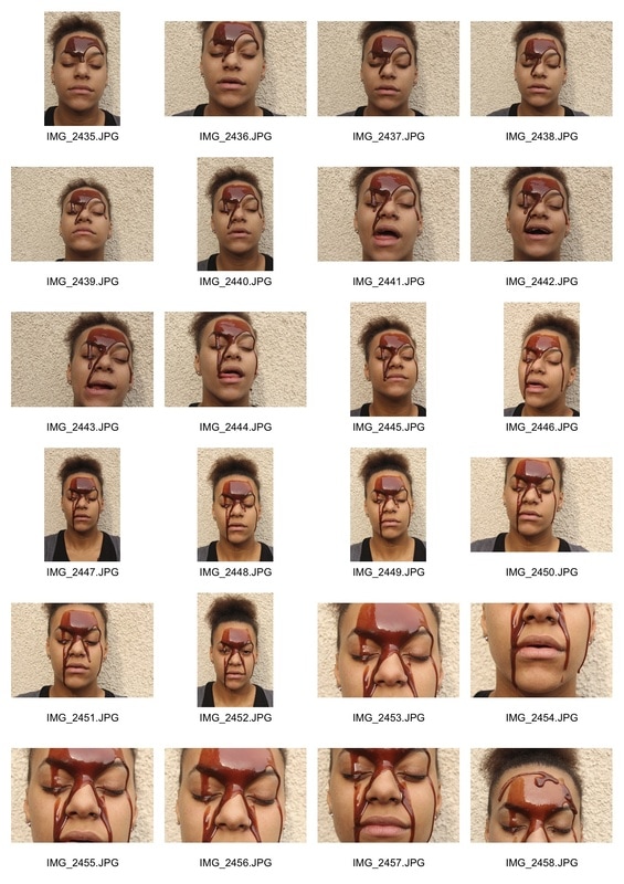
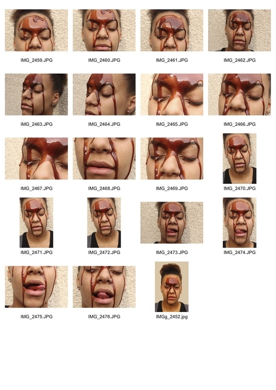
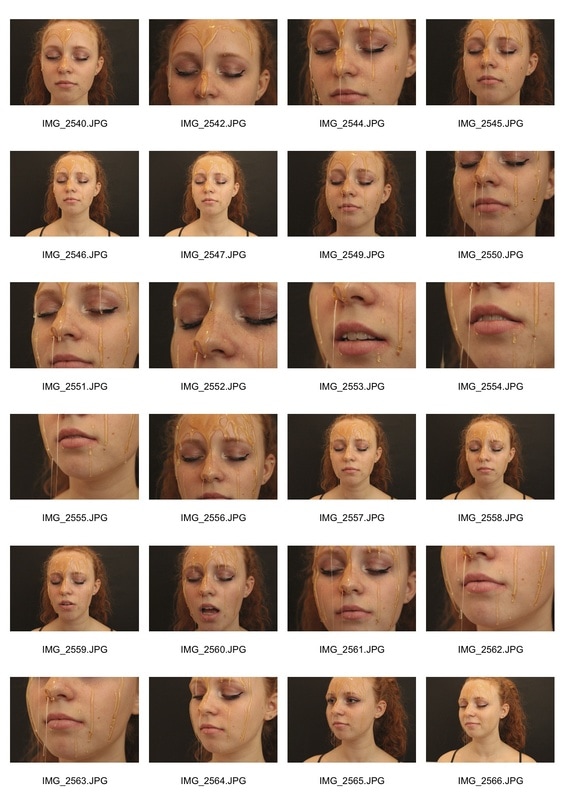
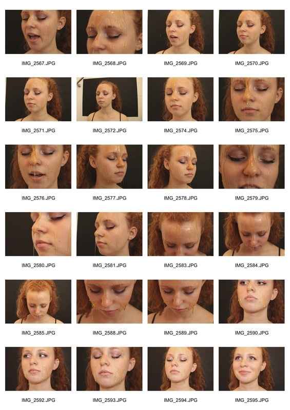
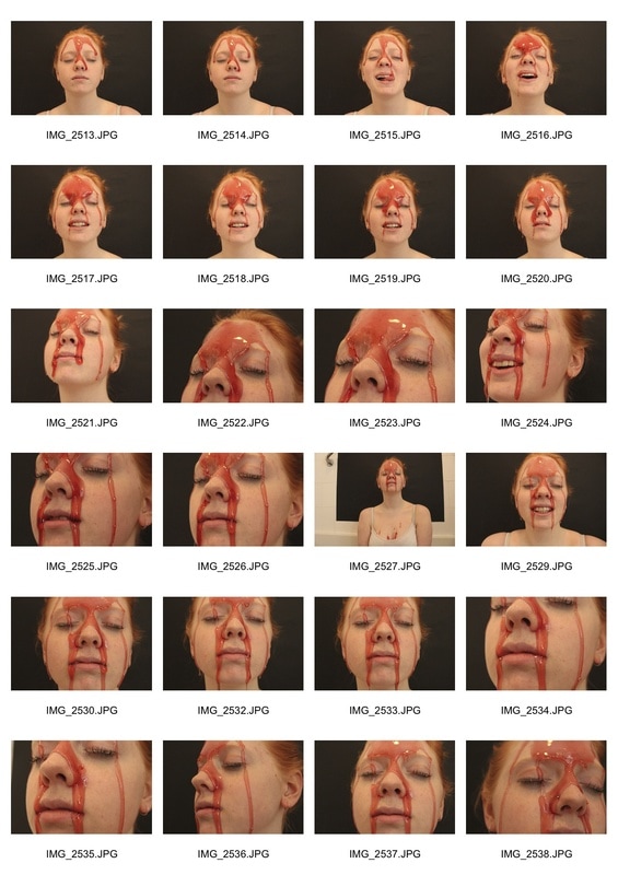
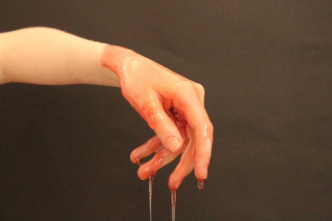
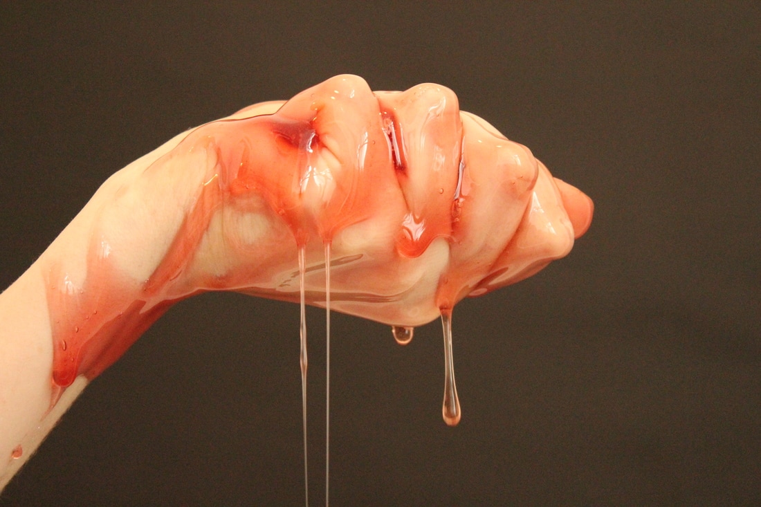
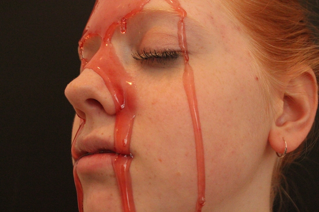
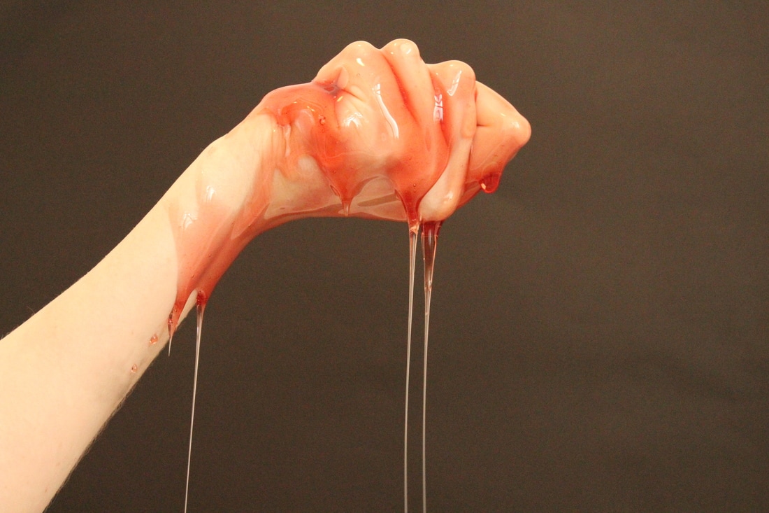
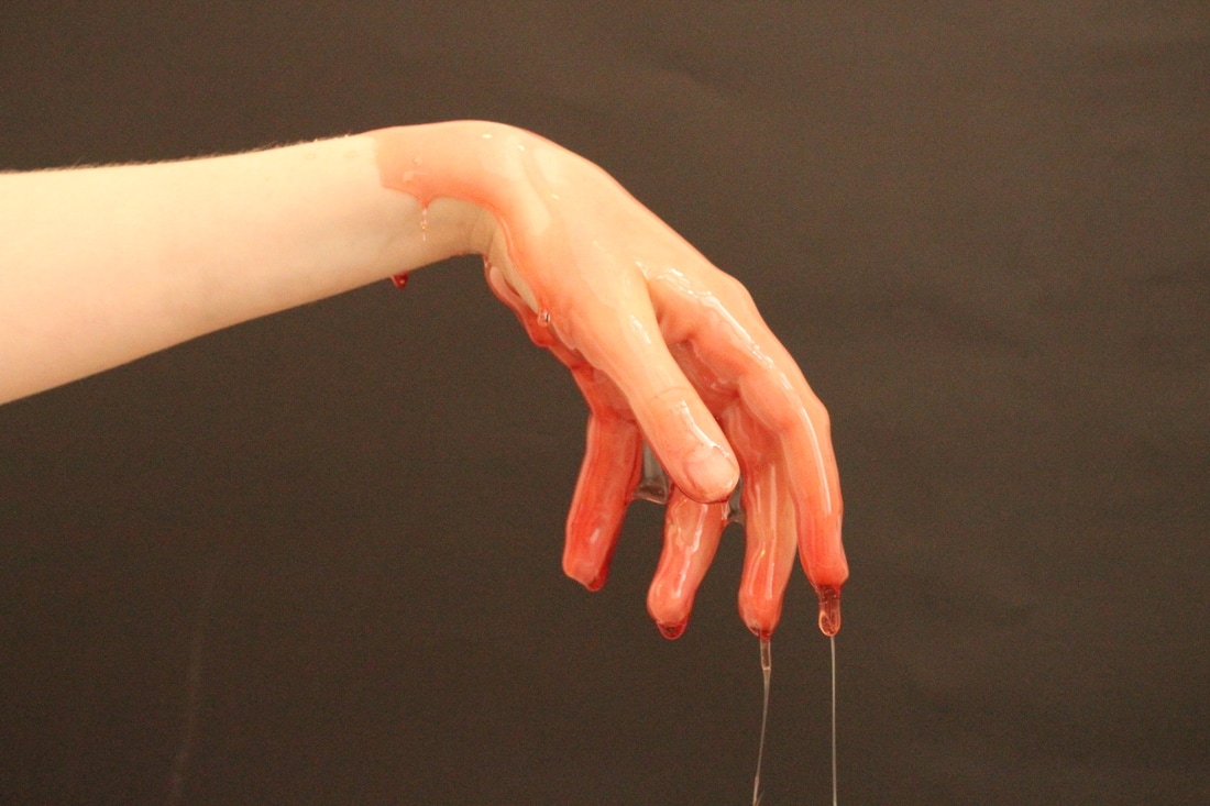
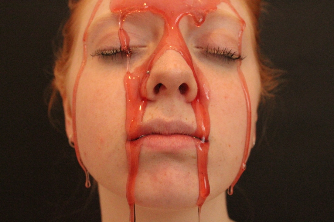
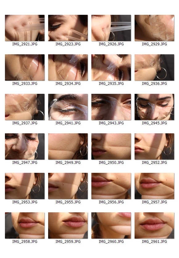
To create work inspired by Mike Dargas' artwork I bought some chocolate sauce (link on the photo) and squeezed it over my friend's forehead and let it naturally drip downwards over her face, to give the same drippy and streaky effect that Mike Dargas has in his paintings. I was interested to see how and if the chocolate sauce would alter her facial structure.
|
|
|
I didn't use a background which meant that the lighting in this series of photographs was bad and the background wasn't aesthetically pleasing so I blurred the background and made the photo brighter. I found it difficult to select around her hair, especially with the texture background so if I continue this strand I will use a piece of paper behind my model to make sure that I don't run into this problem again.
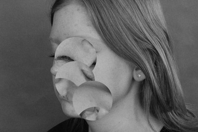
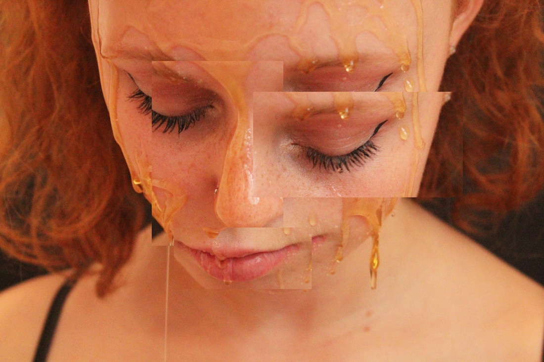
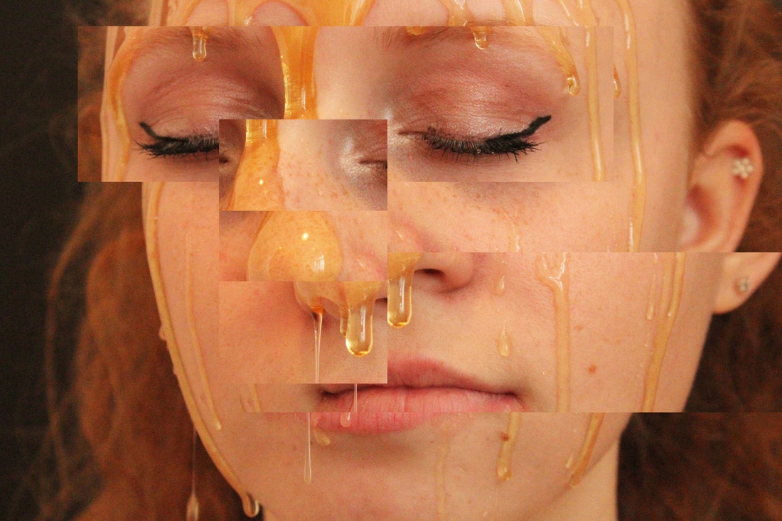
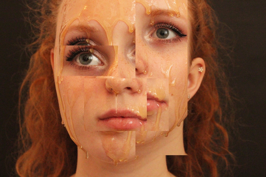
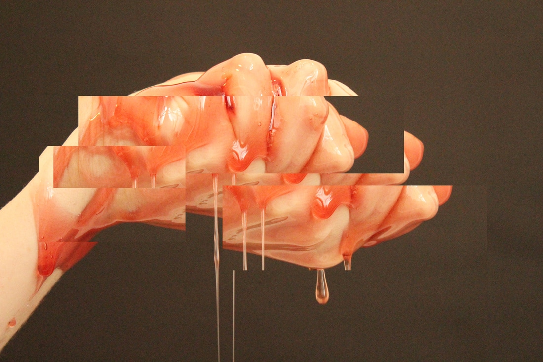
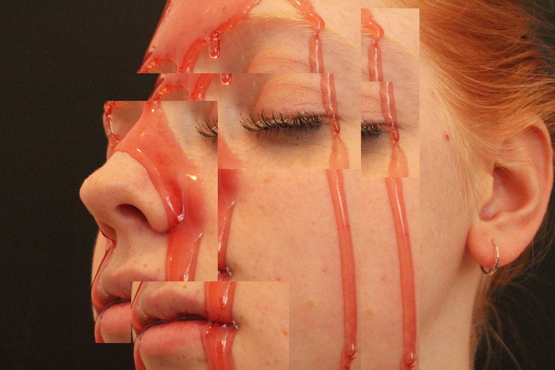
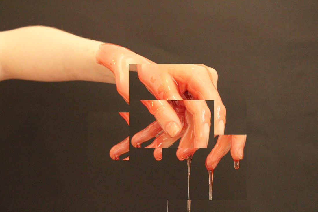
I tried to obscure the face further by applying the techniques I had learned when experimenting in Photoshop to create pieces like Gordon Magnin's work.
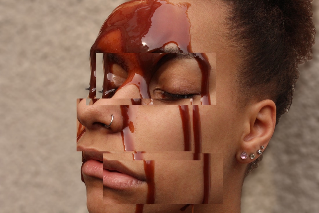
Out of my three strands this is my favourite and the one I am going to develop because I think that there are lots of ways that I could explore the idea of obscuring and making the face sculptural. I think that editing the photos to duplicate and layer them in an abstract collage-like way removes the structure of the face and helps to 'dissect' the face into sculptural chunks rather than one large body, although it slightly detracts from the drips because it disjoints the fluidity of them.
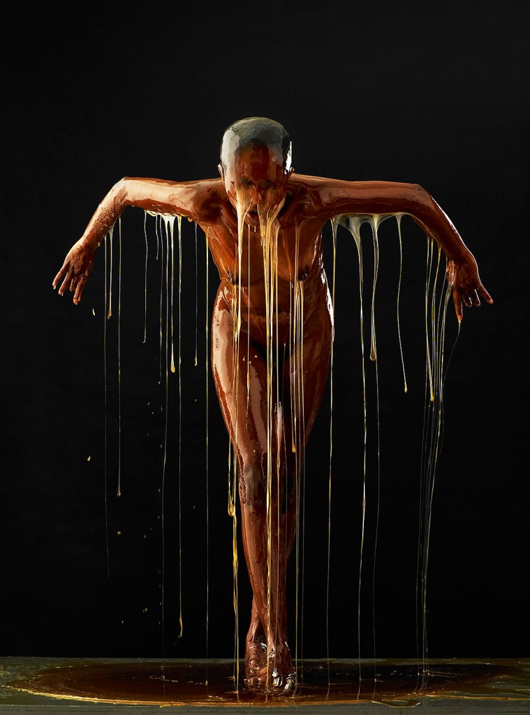
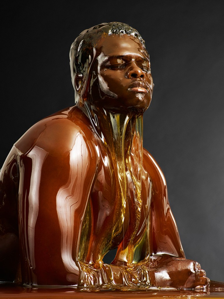
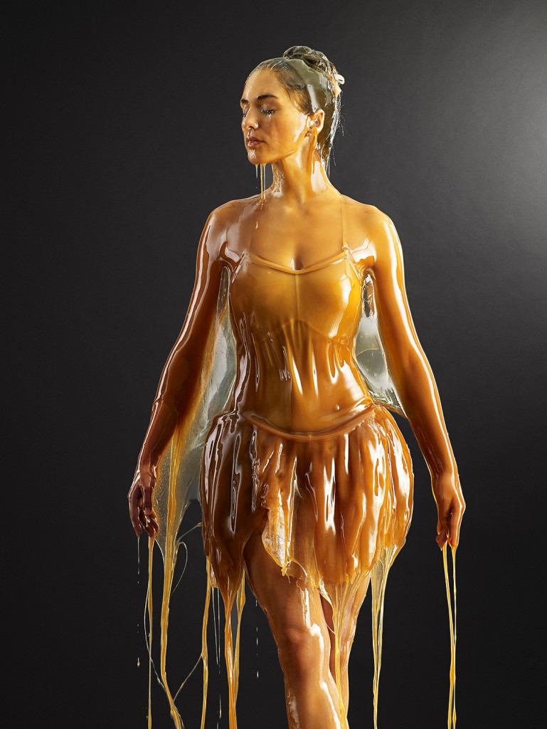
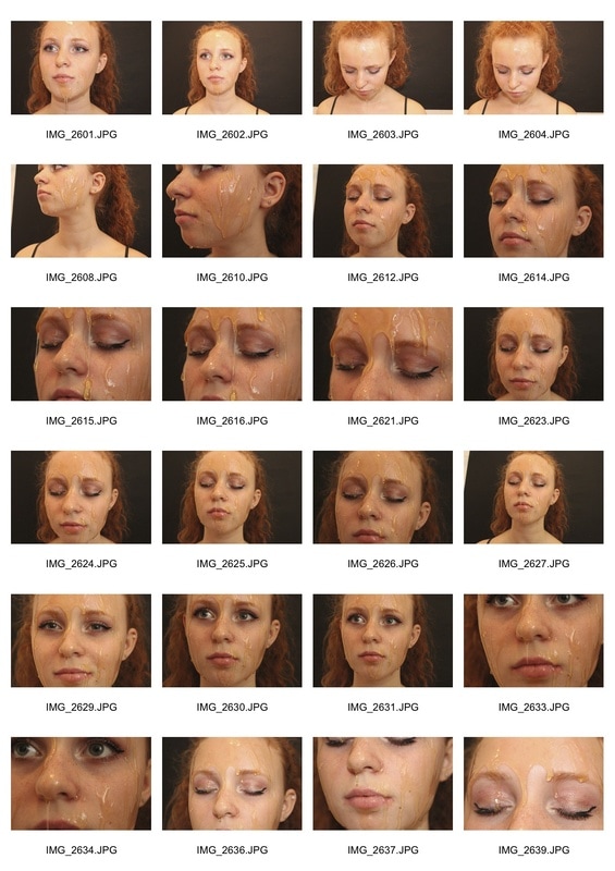
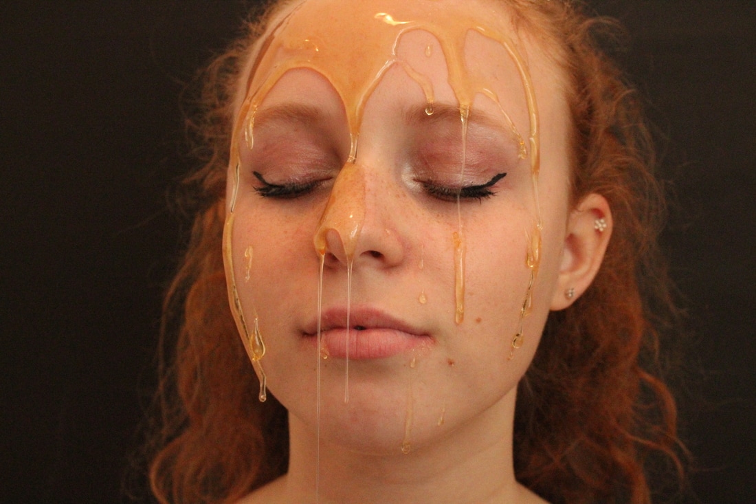
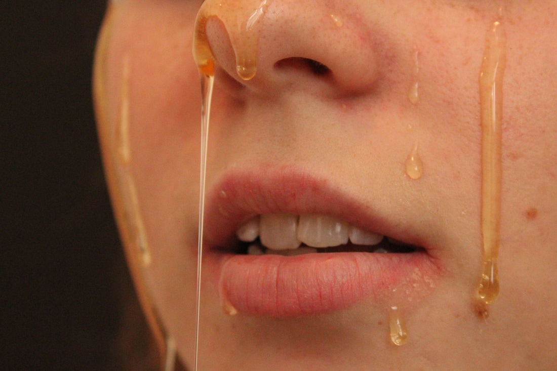
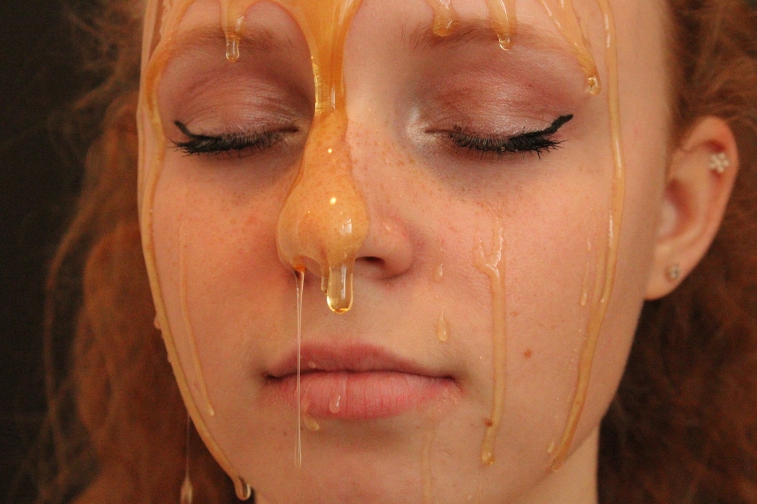
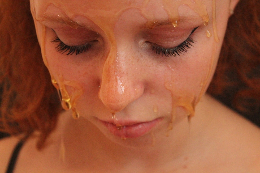
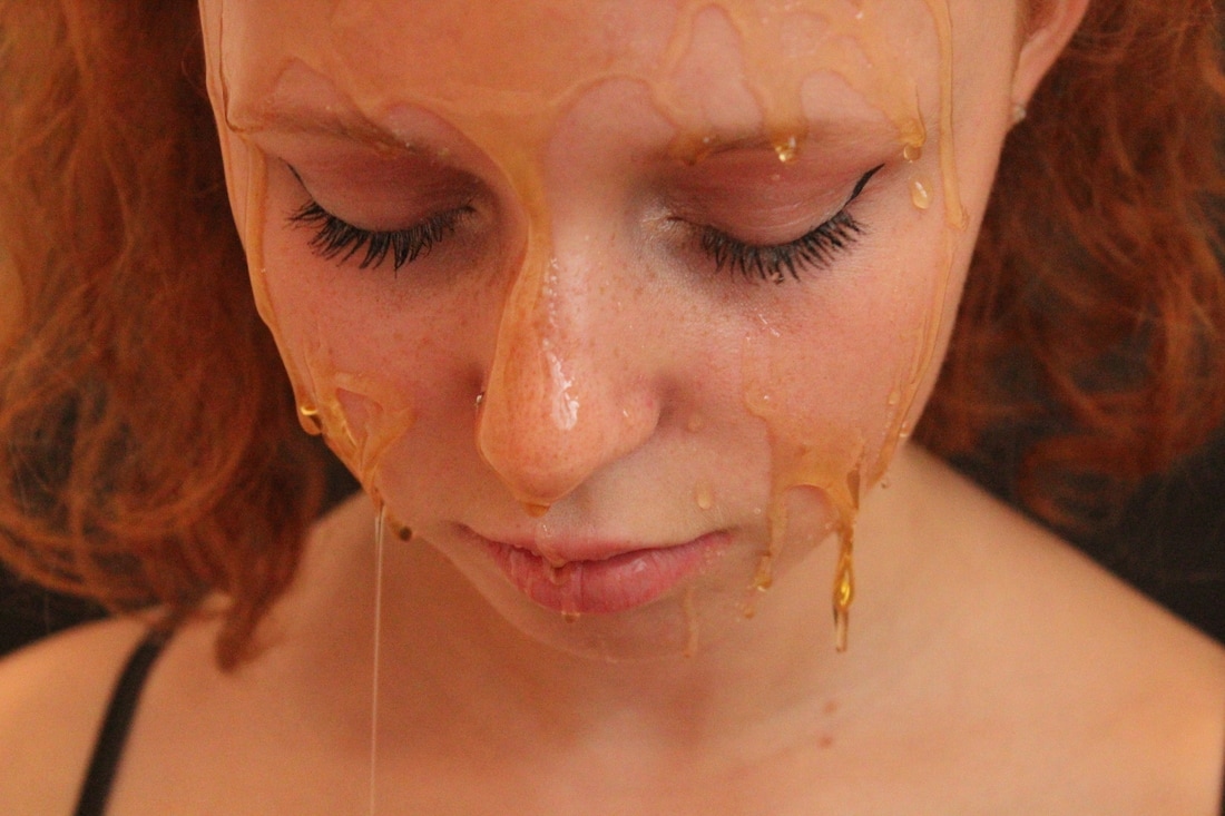
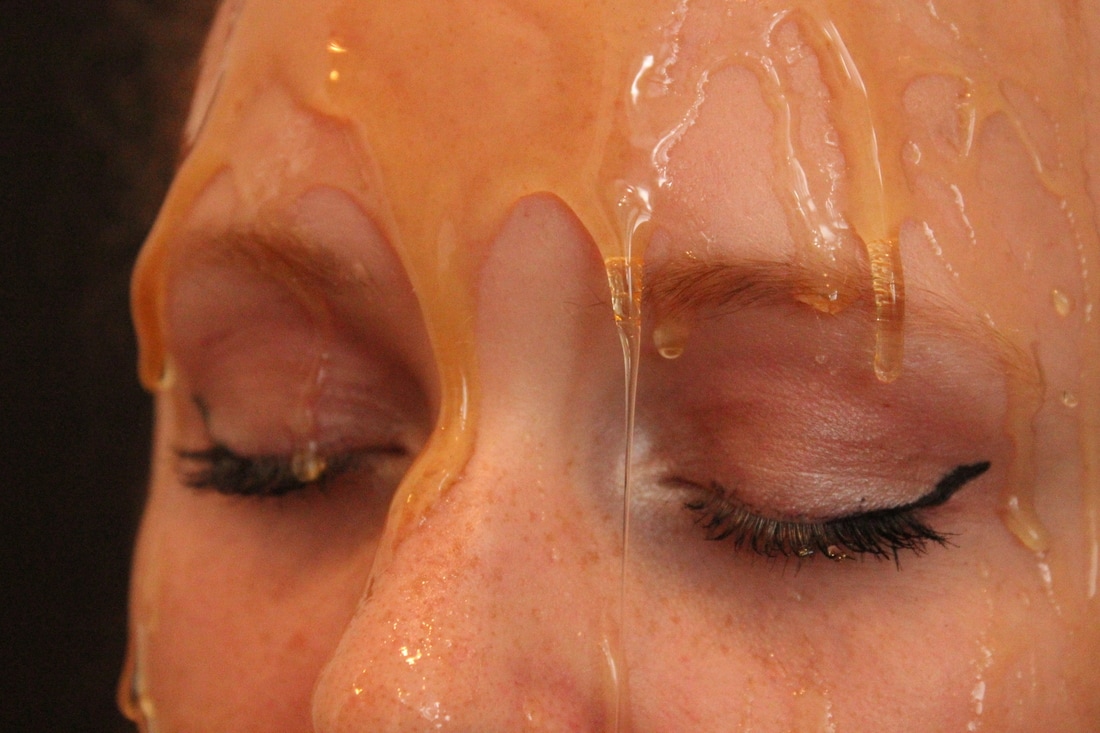
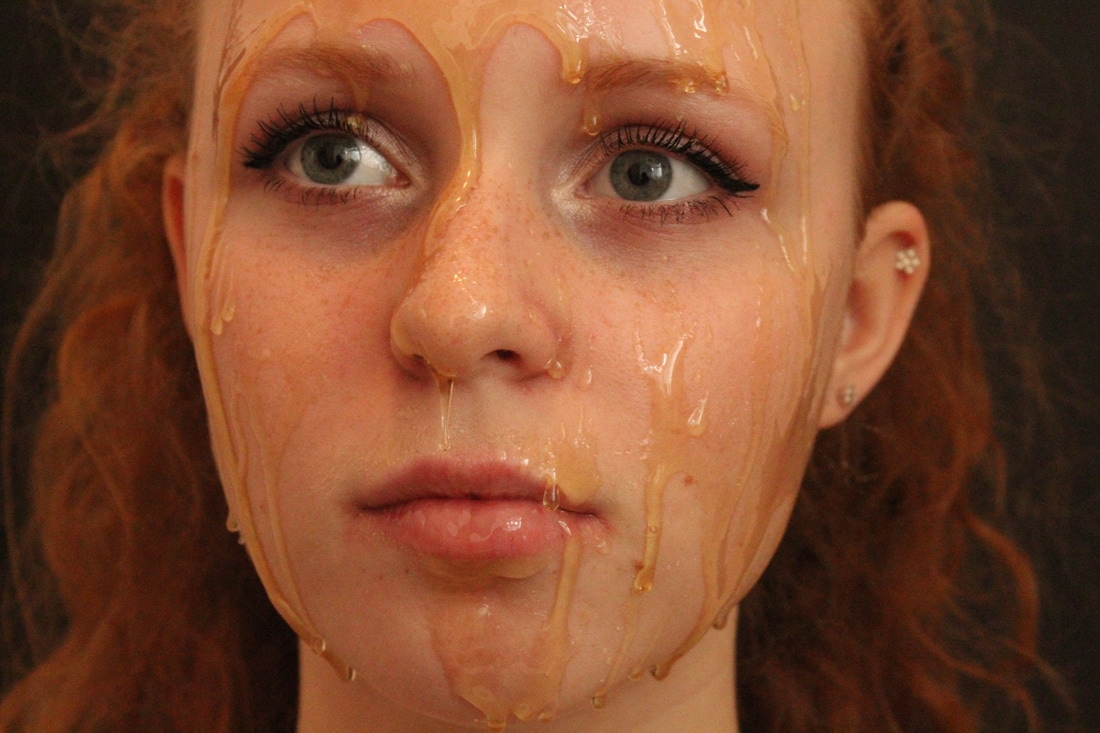
Blake little
Blake Little is a photographer based in Los Angeles. His series of photographs titles 'Preservation' shows people caught in movement, but trapped in viscose honey, making them look like sculptures in action or as if they are froze in time, like a beetle preserved in amber. He sought out models with a wide range of ages and different body types because he thought that the honey had a 'democratising' effect on each photograph because by transforming them into sculptures, he removes their identity which allows people to look past traditional ways of categorising people. As well as this it also presents the people as vulnerable and unprotected, because it gives a visual of a newborn fetus, covered in a nourishing substance.
|
|
|
|
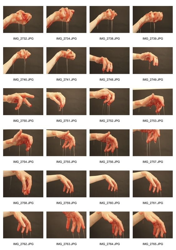
I chose to look at and try to imitate the work of Blake Little because I think that the honey distorts and changes the way that the face and body looks, so I bought some honey to pour over my friends face and a black piece of A2 paper to stick on the wall behind her because the background of Little's photos are black and I like how the honey drips stand out against the dark background. We did the photoshoot in the bath to try and avoid mess and because I don't have a professional place to shoot the photos where it would be okay to make a lot of mess. This was a bit of an issue because the lighting in my bathroom isn't dim and the overhead light has a yellow colour to it, but flash made it harder to see the clearly defined streaks of honey.
|
|
|
|
|
|
|
|
|
|
|
|
|
I liked how this turned out because of the shape and smoothness of the drips of honey which I think look really nice but because I didn't use much honey and it is quite see through, it doesn't have the impact I would like it to have where the face is shown differently to how it actually looks and seems like more of a sculpture than a face; the model in the photographs is more predominantly the focus of the images than the honey. By editing this in a collage-like way it helps to eliminate this effect because her face becomes a completely different shape and you have to look harder at the photographs to understand what you are looking at, enhancing the honey drips somewhat.
|
|
|
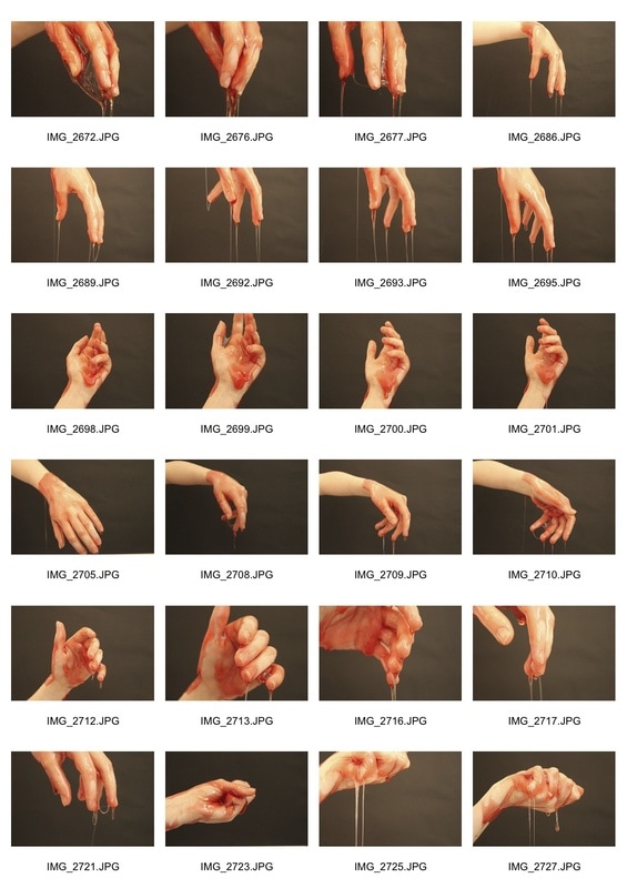
After I tested it with honey, I tried it out with some strawberry syrup. This time I did it on my friend's hand as well as her face because I wanted to test out the effect it would have on other parts of the body, not only the face. The photos of her hands were lighter because there was less in the foreground which left the background looking quite noisy.
|
|
|
|
|
|
|
|
|
|
I much prefer the photographs where I use the strawberry syrup because the bright colour of it in comparison to her skin helps to bring the focus to the syrup rather than her face. Also the strawberry sauce was more runny which made it drip in a nicer way, although I didn't have enough of it to replicate the amounts that Blake Little used in his photos. I edited these in the same way as the honey ones, and I think it looks really nice on the hand ones but on the photos with the syrup on her face I don't think it is so effective.
|
|
Some problems I faced when trying to create photos this way were that my friends didn't want as much to be poured on them as is in Blake Little's photos, and I wouldn't have a suitable place to do it in such large volumes anyway. I am going to move away from the idea of obscuring structure with honey and other viscous substances because I want to explore other ways it can be done more effectively.
juke schoorl
Juke Schoorl is a Dutch photographer who likes to manipulate her subjects to make them look like something else. She is most well known for her fascination with the human body and the ability to manipulate the skin and flesh to make it look like something completely different. She uses simple and cheap materials such as tape and nylon fishing rope to pull and shape the skin in fascinating ways which makes it look like it's not skin at all.
I like the way that she is able to disassociate the body parts with the rest of the body by taking photos which only focus on certain parts of the body. I want to explore her techniques because it links to manipulating and obscuring the shape of the body and face and I think that it's particularly interesting that she is resourceful and uses cheap easily supplied materials, and I am going to attempt this myself because it would be easily for me to buy the things that I need to recreate it successfully.
I like the way that she is able to disassociate the body parts with the rest of the body by taking photos which only focus on certain parts of the body. I want to explore her techniques because it links to manipulating and obscuring the shape of the body and face and I think that it's particularly interesting that she is resourceful and uses cheap easily supplied materials, and I am going to attempt this myself because it would be easily for me to buy the things that I need to recreate it successfully.
|
|
|
|
|
|
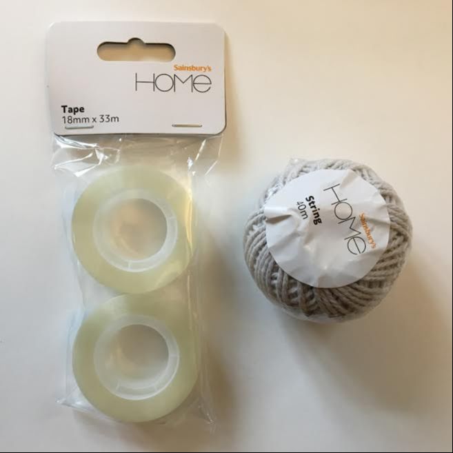
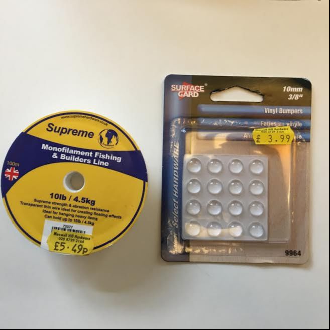
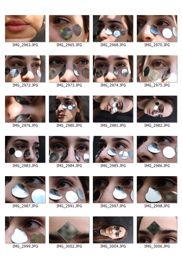
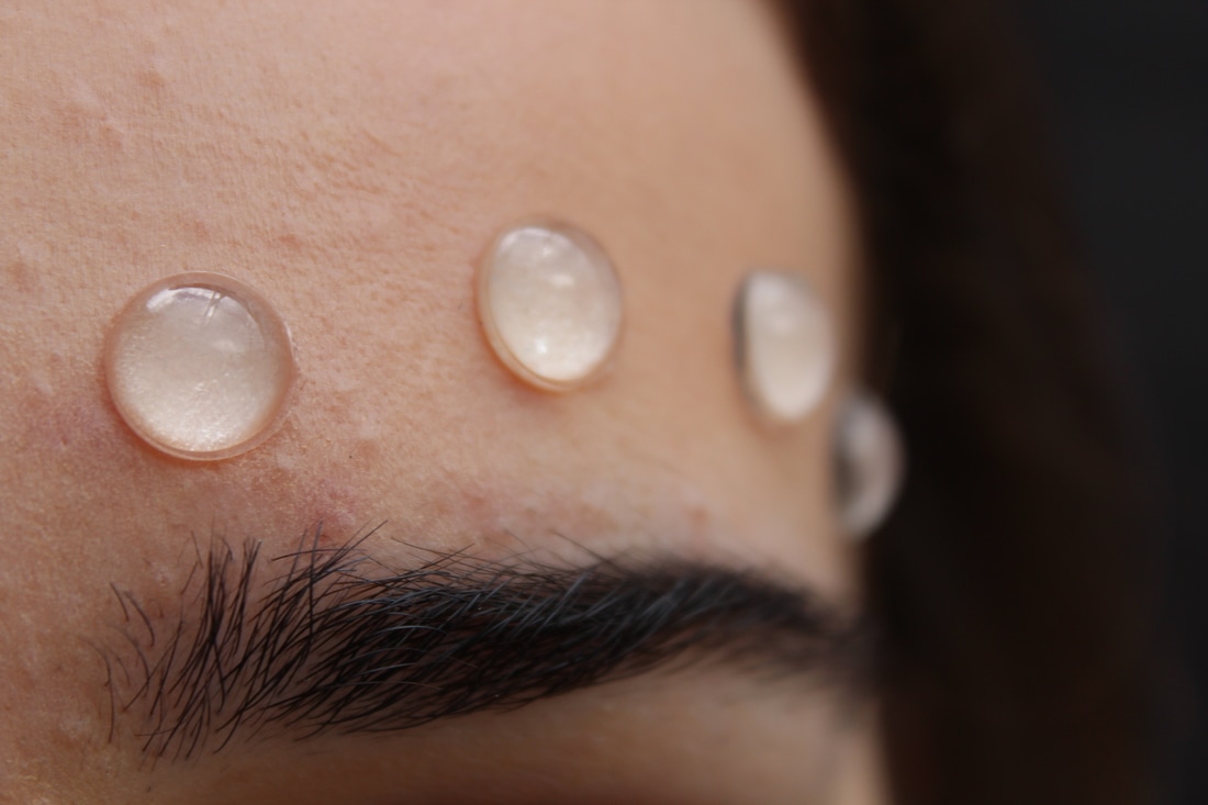
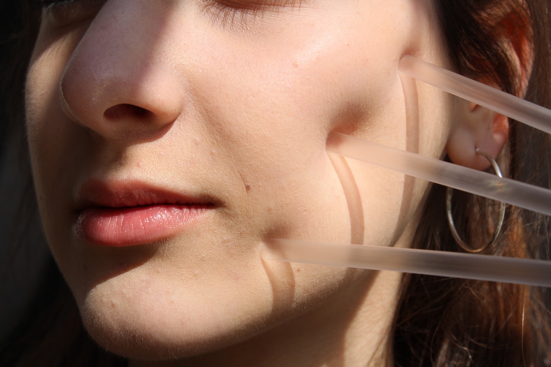
I resourced some cheap materials to do a photo-shoot inspired by the work of Juke Schoorl including:
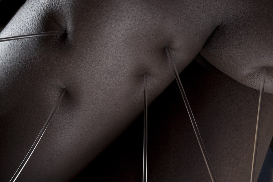
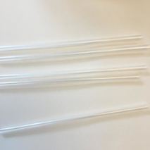
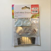
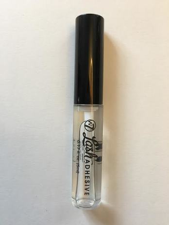
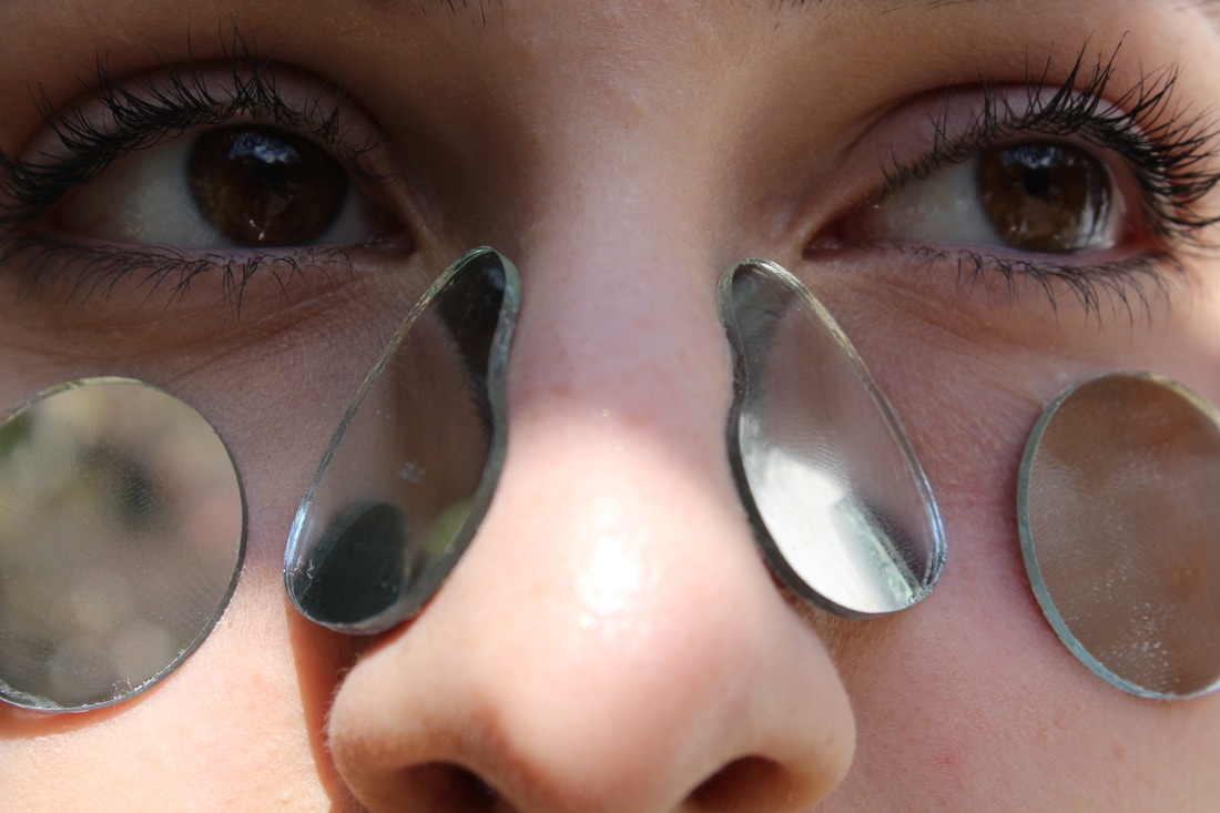
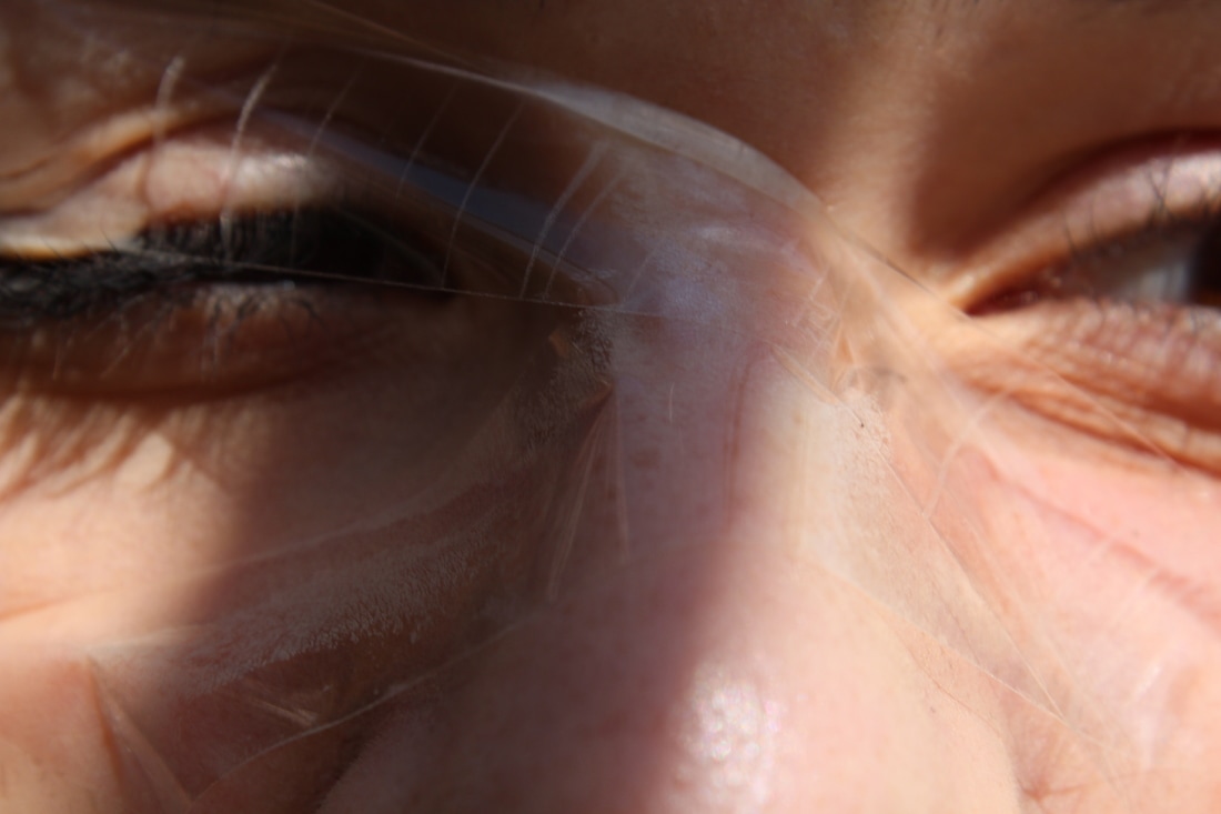
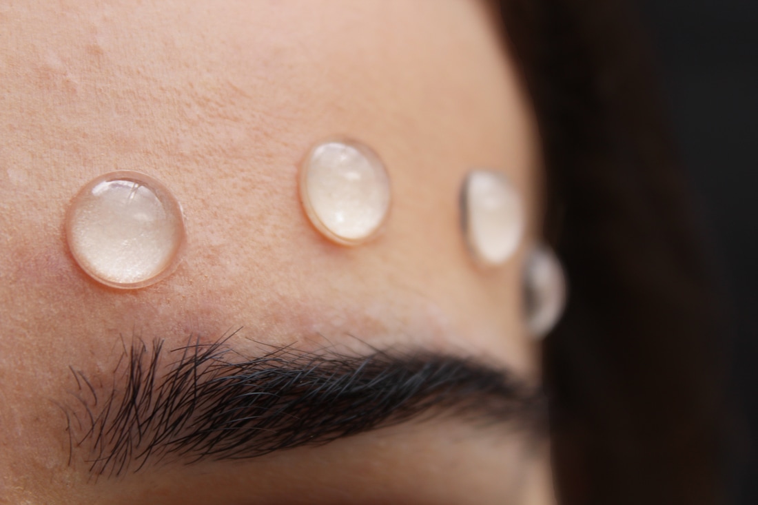
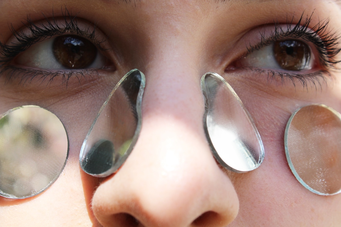
I used the materials that I had gathered and used them in different ways to manipulate my friend's face. I used the vinyl bumpers and stuck them onto different places on her face to try and make it look like growths or spots. I then used the clear straws, because I couldn't find any clear plastic rods like Juke Schoorl had, and had her hold them into her face to push it in. After this I used Sellotape and twine and wrapped these around her head in an attempt to push and squeeze the structure of her face around.Juke Schoorl used the twine to pull the skin away from the body but I couldn't find a strong enough glue which would be safe for her skin to hold the twine on. Finally I used some eyelash glue to stick mirror mosaic pieces onto her face underneath her eyes and on her forehead because I thought this would change her facial structure in the way that it would reflect other parts of her face in it and make it seem like it has more surfaces, or that you could reach into it. |
|
|
|
|
|
|
|
|
|
I am happy with the way that these photos turned out, I think that the ones with the fishing twine, mirrors and vinyl bumpers look the best out of them all. The natural sunlight helped me a lot in this shoot because it created some more interesting patterns and shadows on her face. I found it difficult to decide where to position things for a lot of the elements in this photo-shoot so there isn't much variation in all of the photos. It was hard to tie the fishing twine so I had to hold one side whilst my friend pulled another piece tight around her face which meant that I couldn't use as much as I wanted, but I still really like the effect because you cant see the twine very much so it gives more of an impression that the skin is doing it on its own rather than being changed. One that I didn't think worked very well was the Sellotape around her face, partially because it wasn't very sticky.
|
|
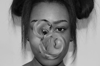
I like the way that these photos turned out after I edited them and made them a bit brighter, especially the ones with the sticky dots because it's hard to determine what it is in the photograph (which was my aim), and I think that they are almost reminiscent of 'Glass Tears' by Man Ray which I saw in the Radical Eye exhibition at Tate. Despite this, the rest of the photos didn't turn out as abstract and sculptural as I would have liked them and think that there is more I could have done to alter the structures.
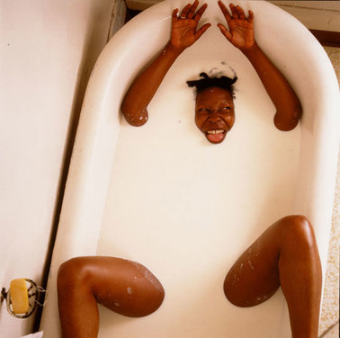
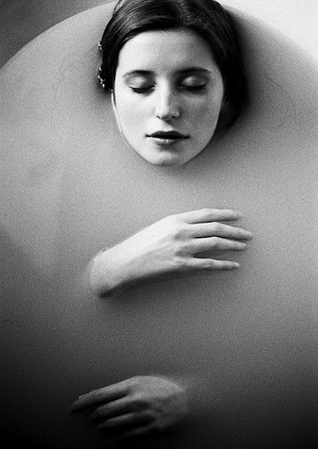
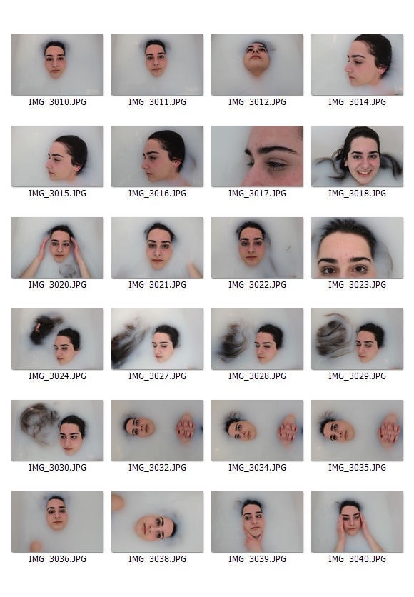
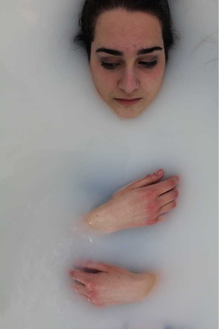
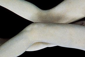
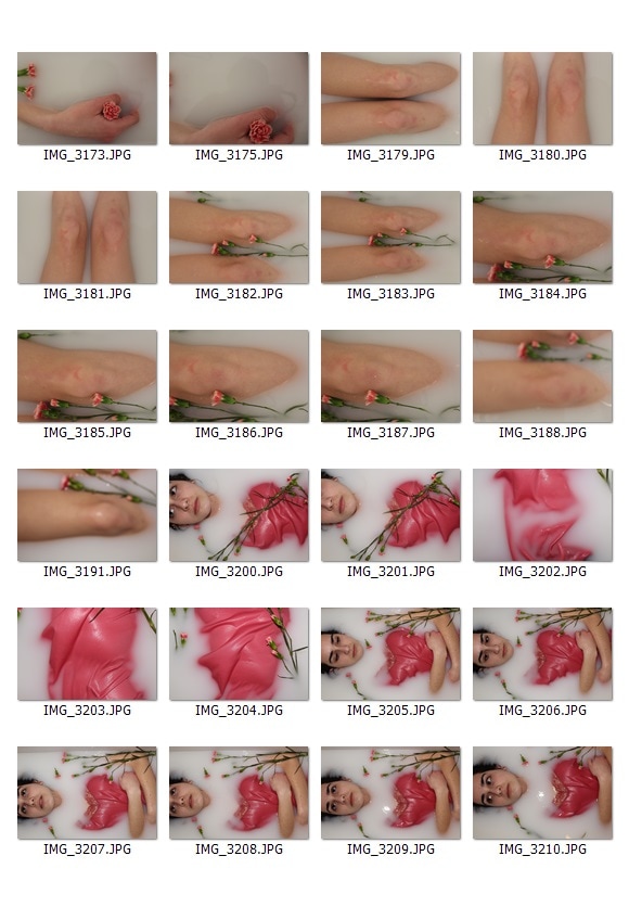
milk baths
|
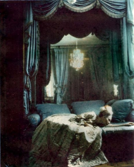
Another way that I am going to explore obscuring the structure of the face and body is by using a bath of milk, or another opaque liquid. This has been done by a few famous photographers including Annie Leibovitz's famous photograph of Whoopi Goldberg in milk and Jaques Henri Lartigue.
|
|
|
|
|
|
|
|
|
To recreate this idea I filled a bath up halfway with warm water and added 4 litres of skimmed milk (each litre bottle cost 75p) which made the water cloudy and milky, although I could have used more milk to increase the opacity of it.
|
|
|
|
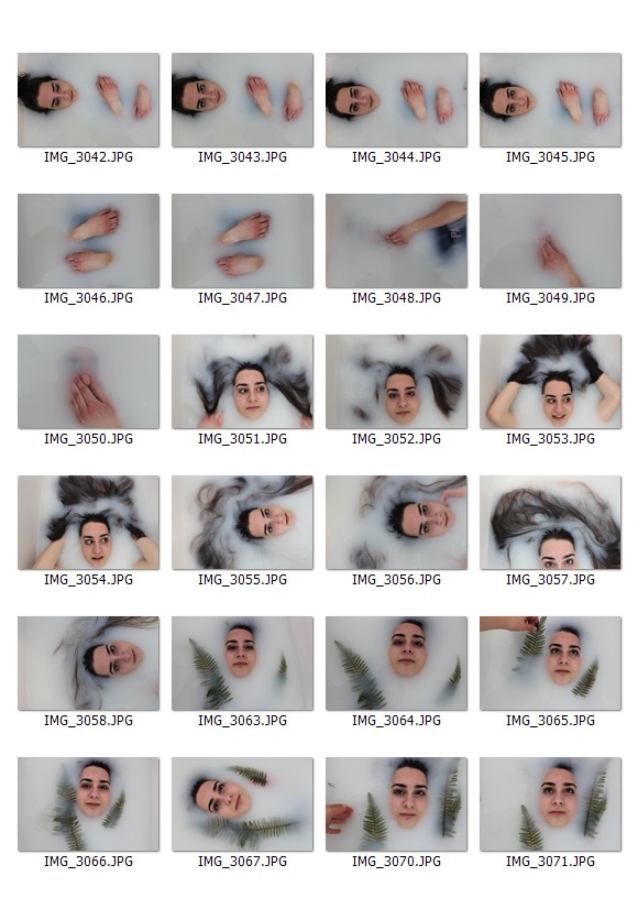
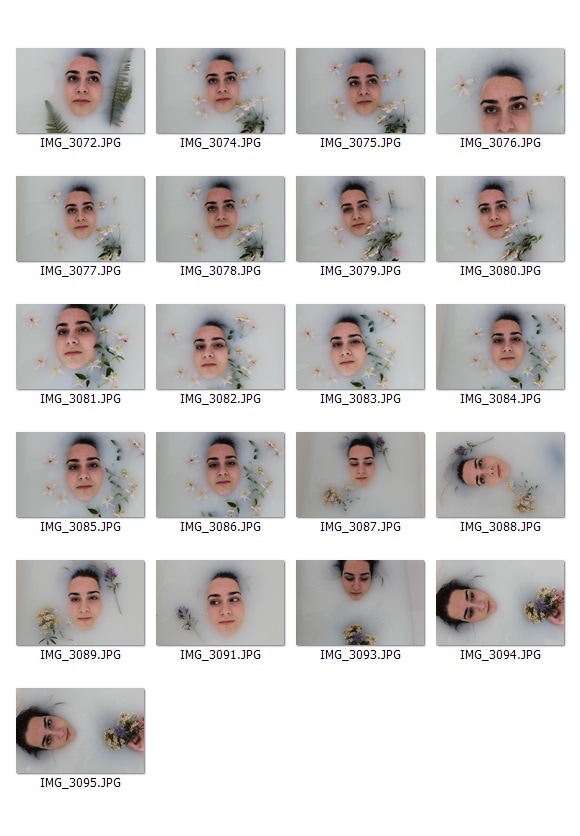
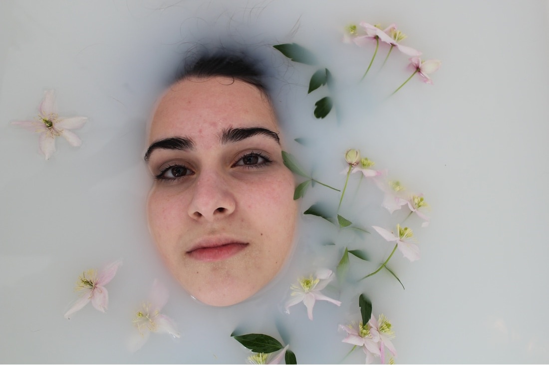
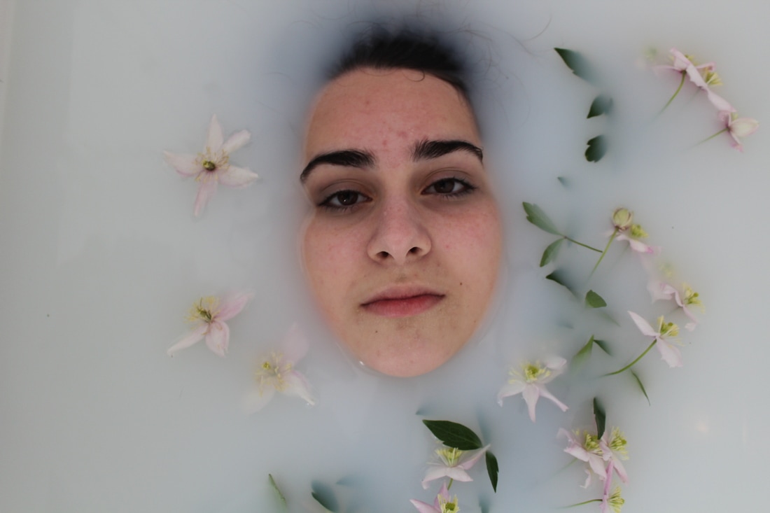
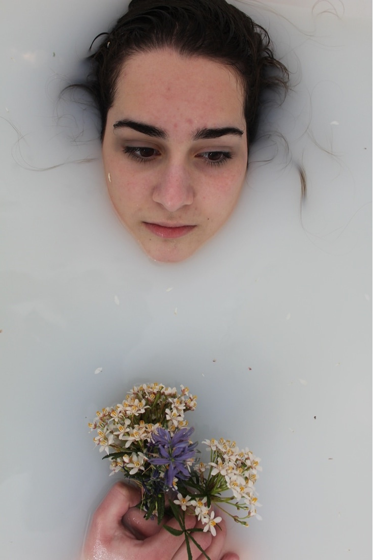
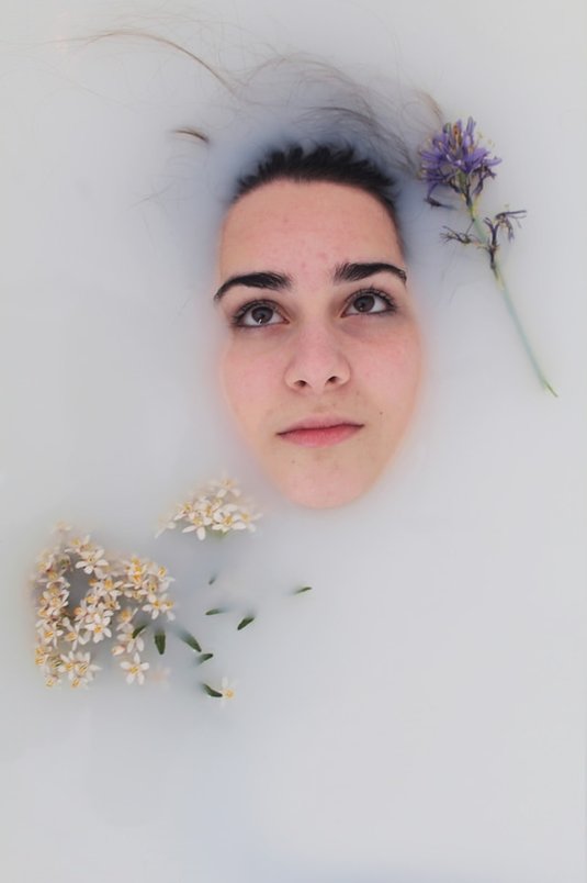
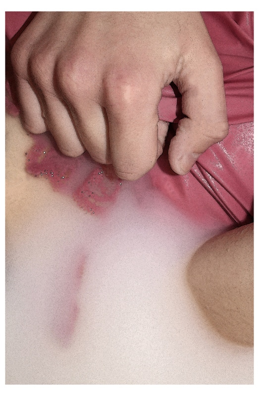
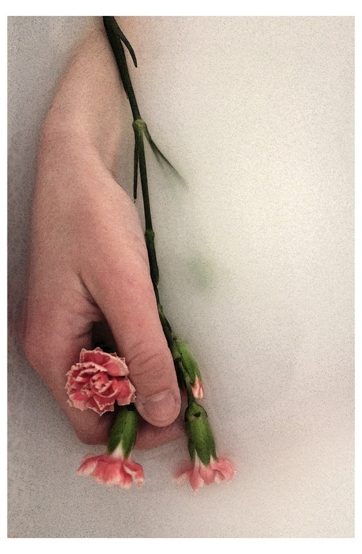
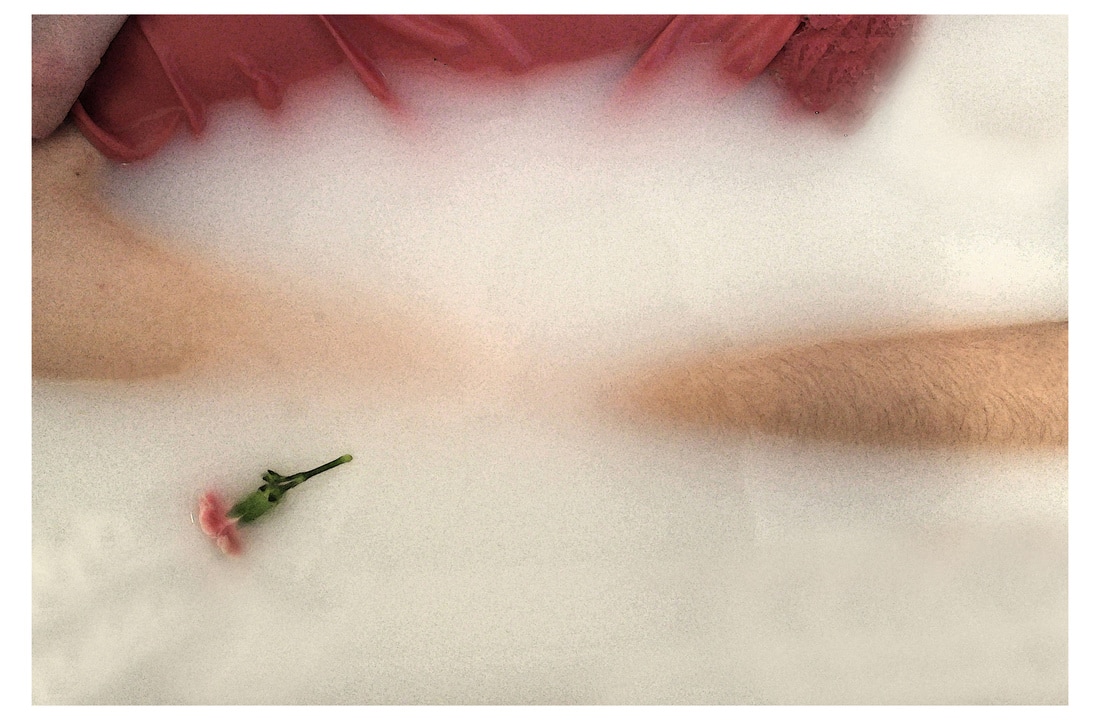
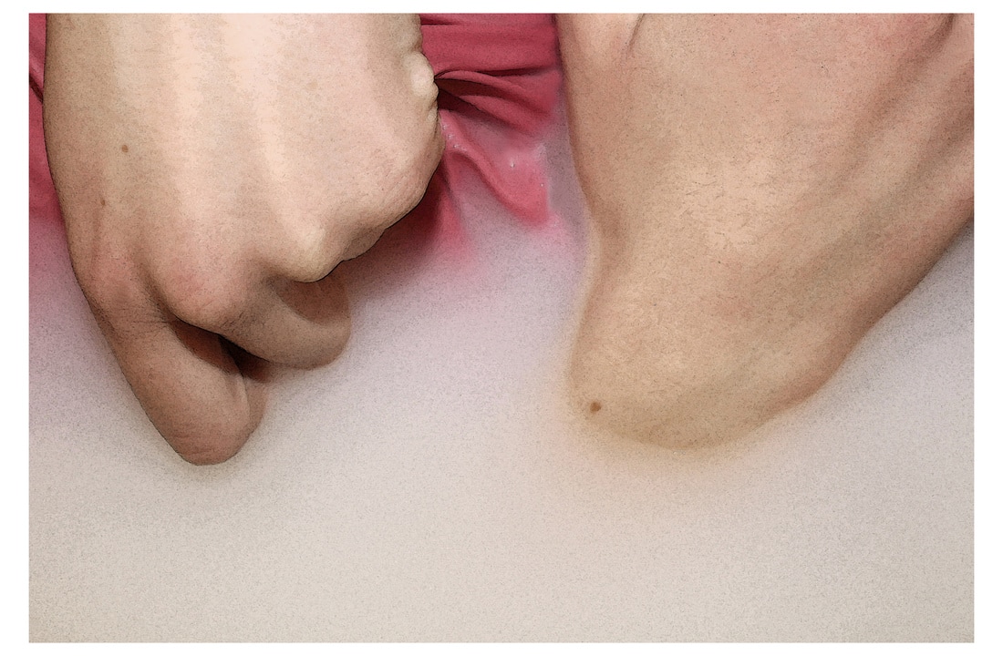
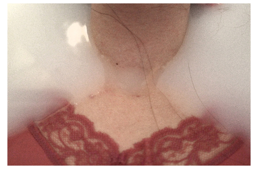
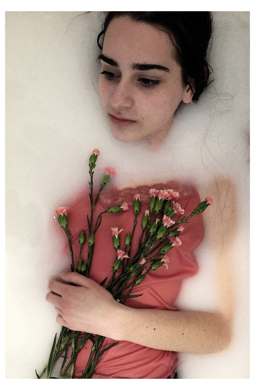
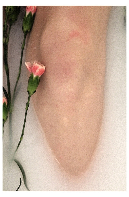
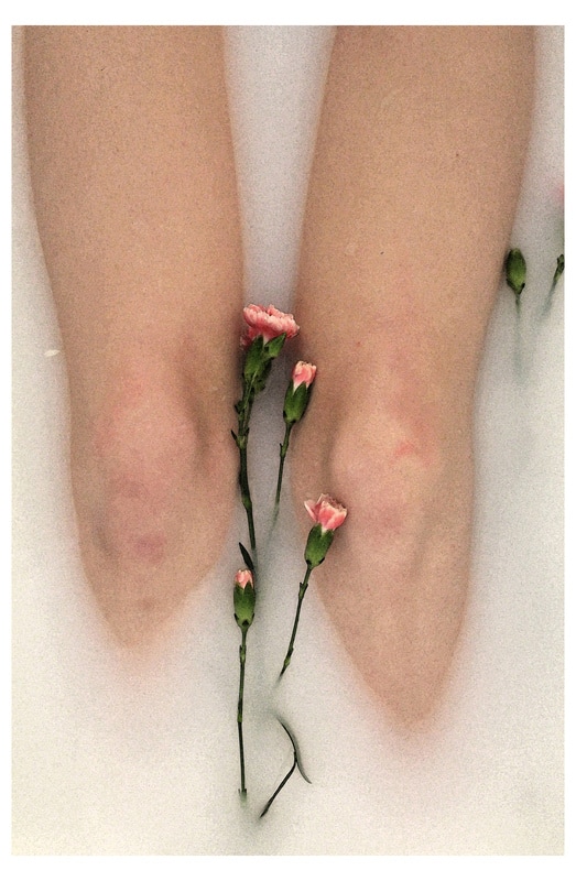
final piece
My final pieces will continue with the idea of a milk bath, except in a more refined style. I looked at the work of some photographers who's work has an etherial dreamy look to it, particularly Deborah Turbeville's work which is really unsaturated and grainy and has a soft-focus washed out look to it. I will take inspiration from photos in this style for my final piece because the milk in the photographs can look very harsh and white and crisp and I want the photos to have a soft aesthetic to them and to give more of a narrative.
   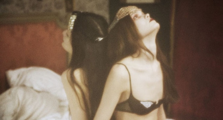 |
Deborah Turbeville
|
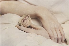
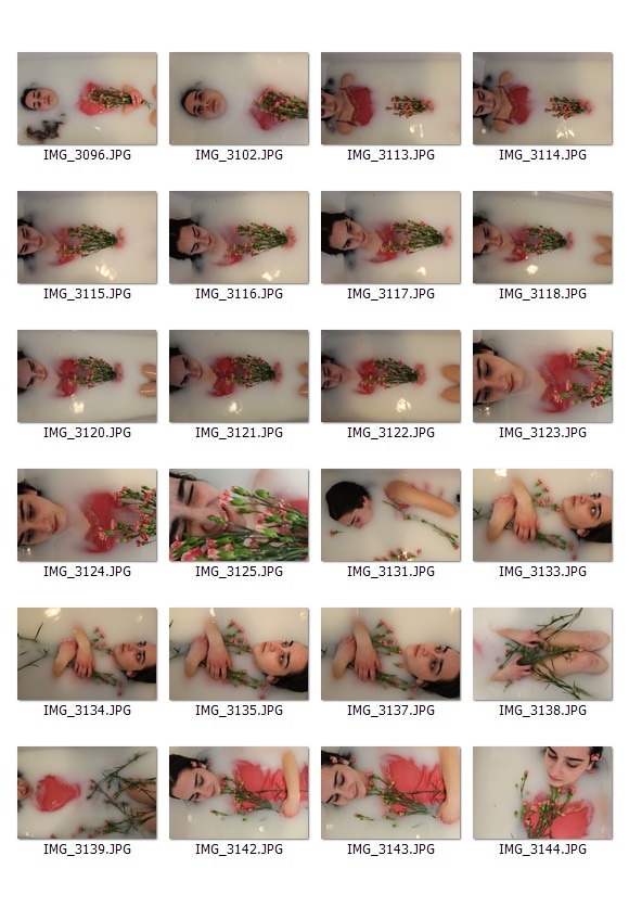
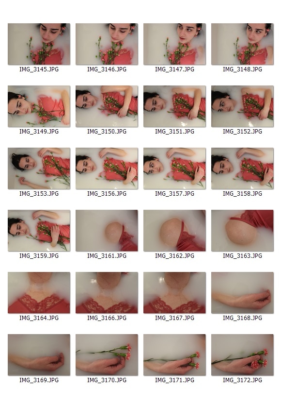
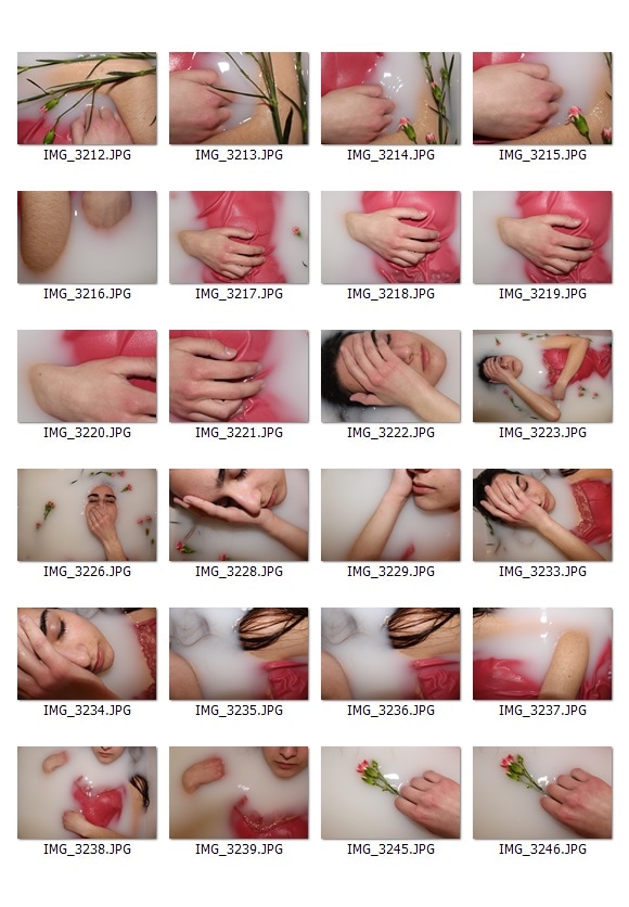
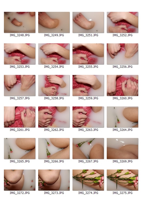
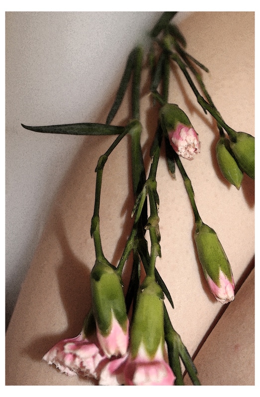
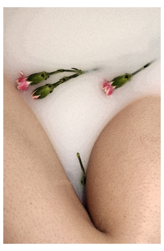
This time for my photoshoot I used more milk (6x75p semi skimmed 1 litre bottles) and slightly less water so that the water would be more opaque. I bought a top from a charity shop that I thought would help me to achieve the sort of etherial and mystical stye I was trying to achieve because it was floaty and had lace details. Finally, I got a bunch of carnations because they are quite small and delicate and the pink went with the colour of the top, which both contrasted against the white of the milk. I decided that I would take some close up photos of parts of the model which were partially submerged in milk, to abstract the body parts and make it unclear what the subjects of each photo was, and make it sculptural. I wanted to have one photo showing the whole 'scene' to give context.
|
|
|
|
|
|
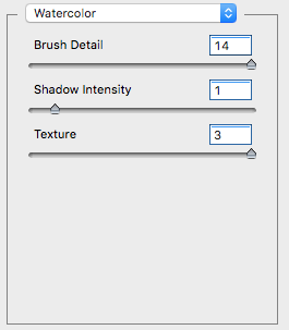
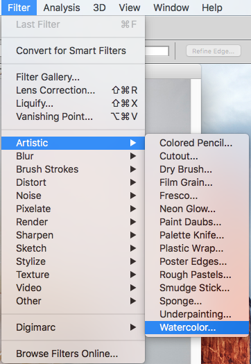
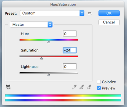
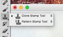
To edit the photos I applied a filter on photoshop called watercolour which makes photos look like watercolours but because my photos are large the effect is less intense and instead it just looks grainy and noisy, which is the effect I was trying to get. Because the filter made parts of the photo which were white black, I used the clone stamp tool to remove any reflection from the milk and any shiny parts on the skin/clothes. I applied the filter twice to make it as grainy as possible. I then desaturated the photos.
|
|
|
|
|
|
|
|
|
|
|
