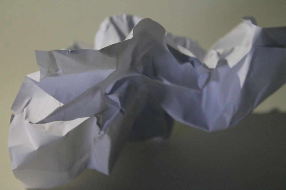
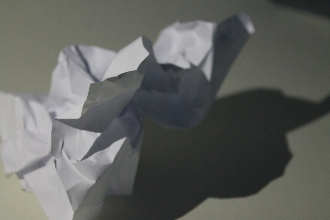
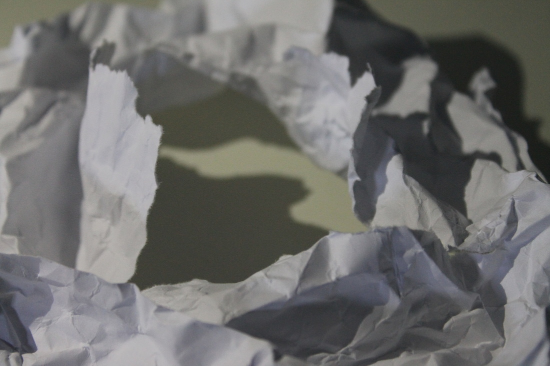
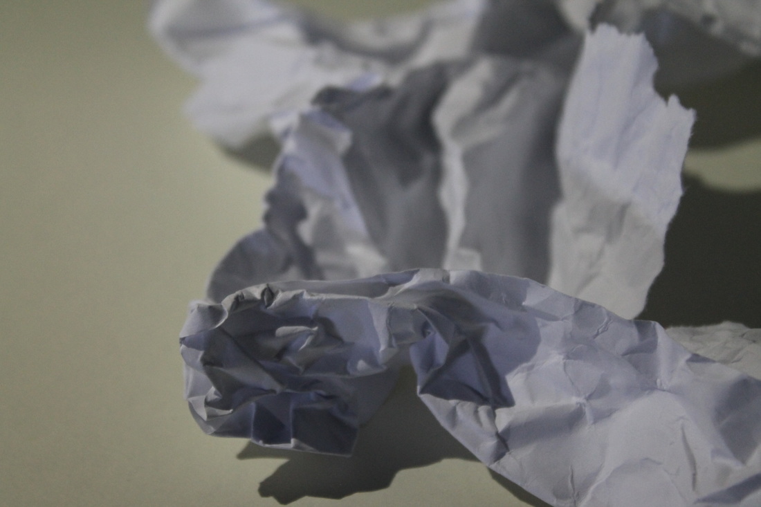
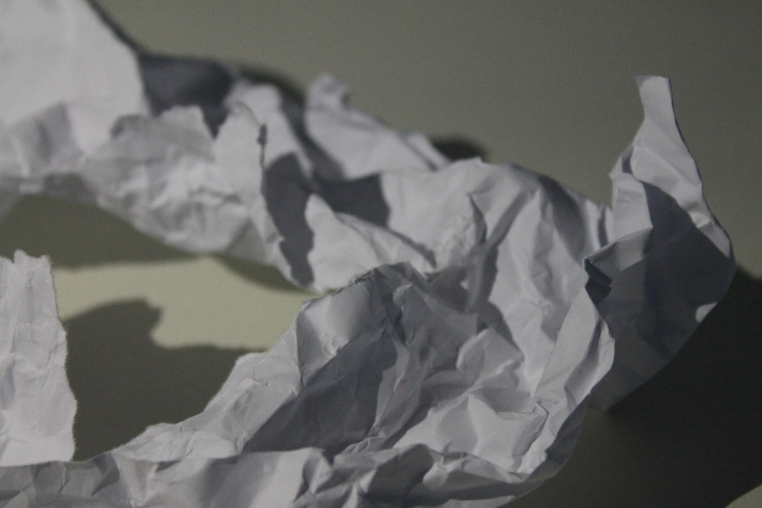
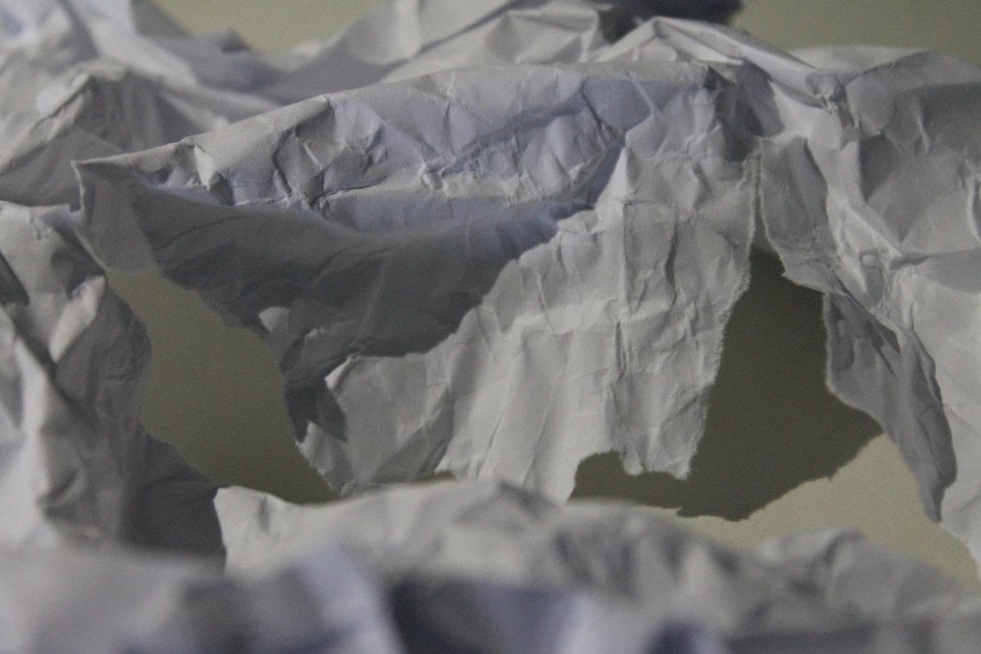
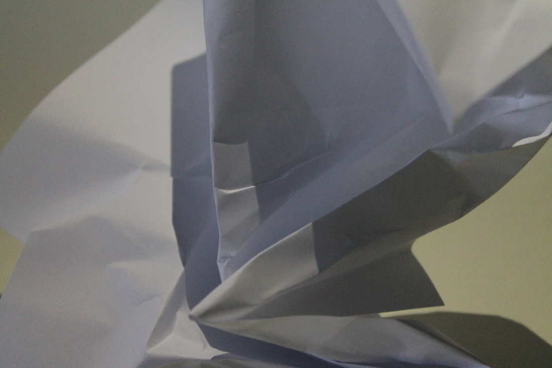
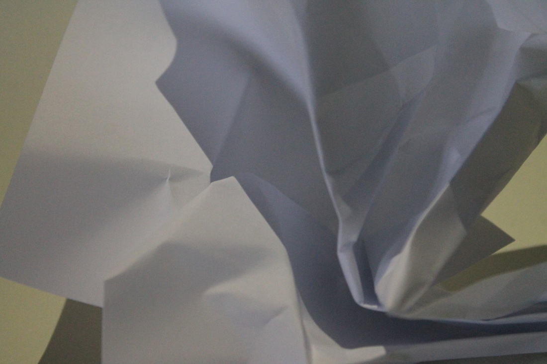
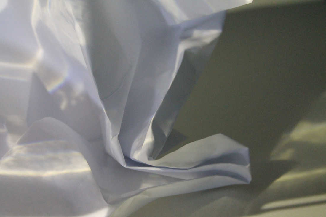
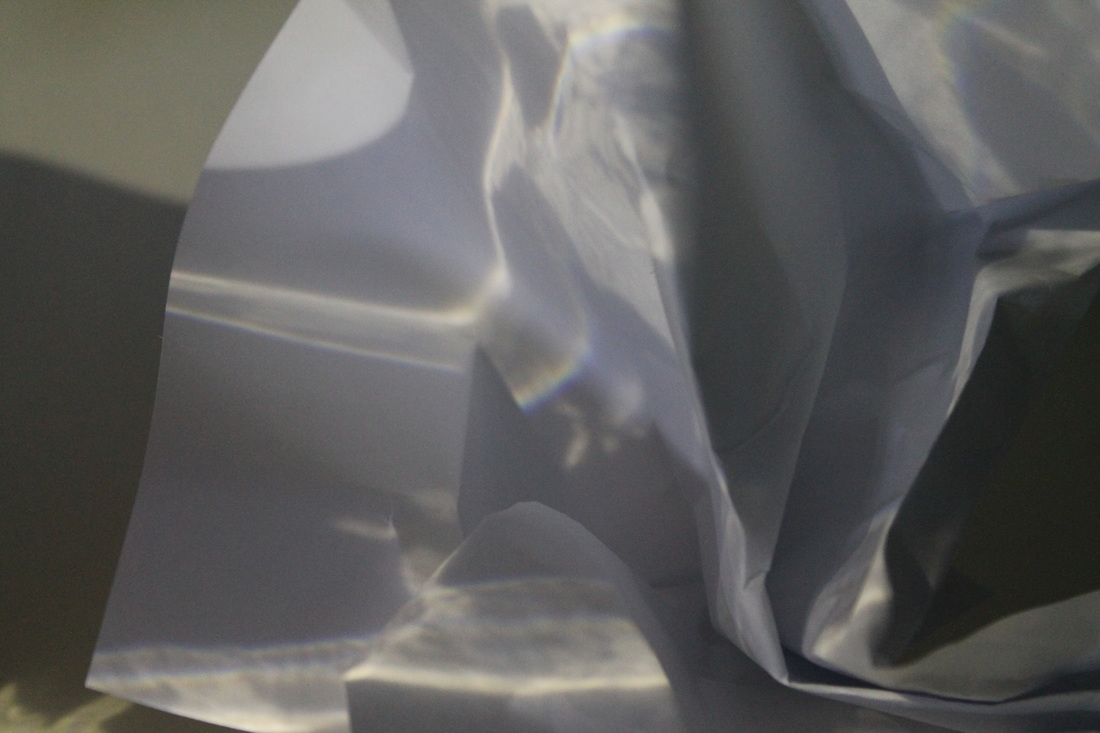
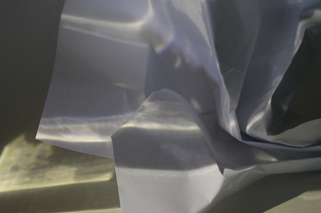
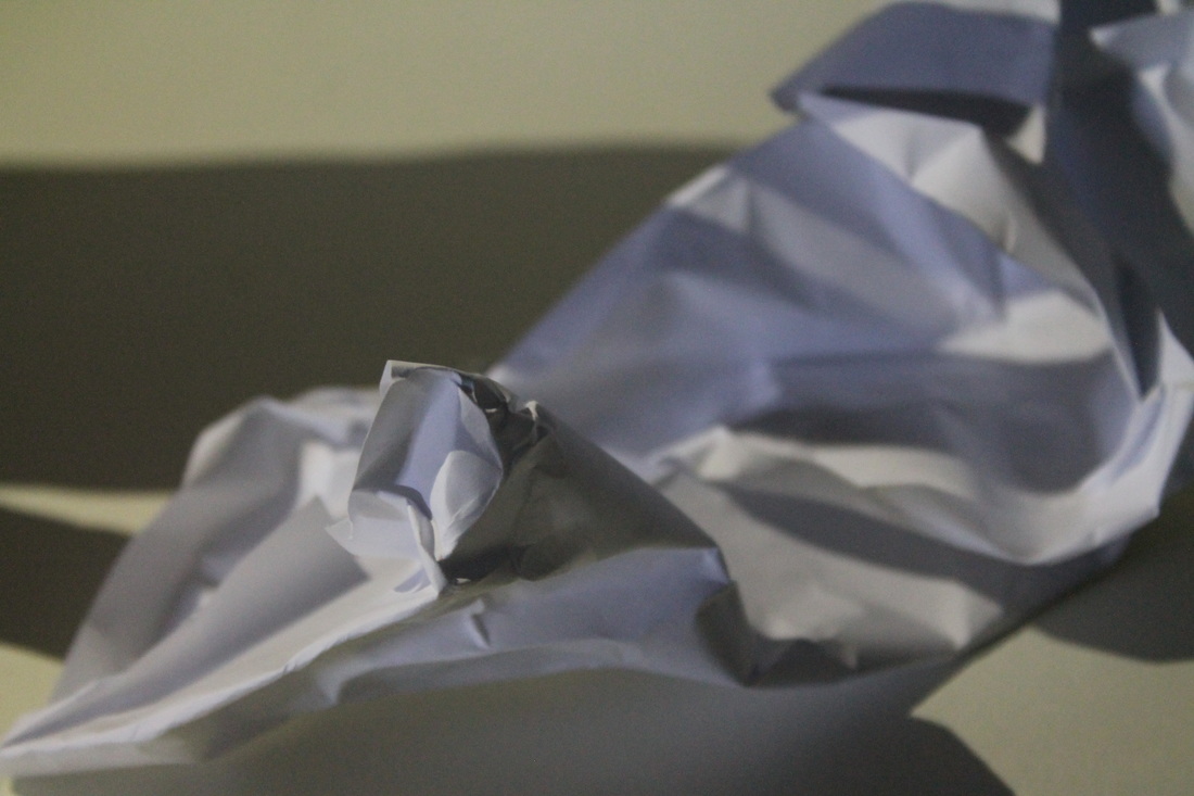
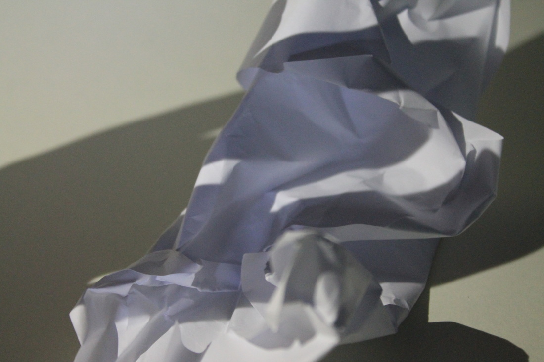
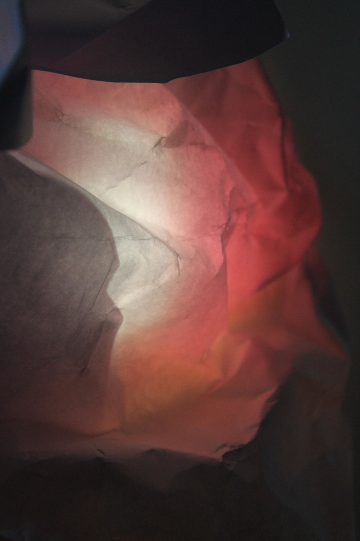
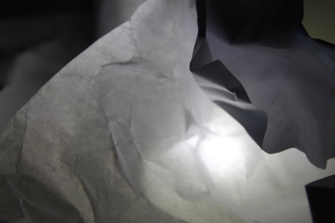
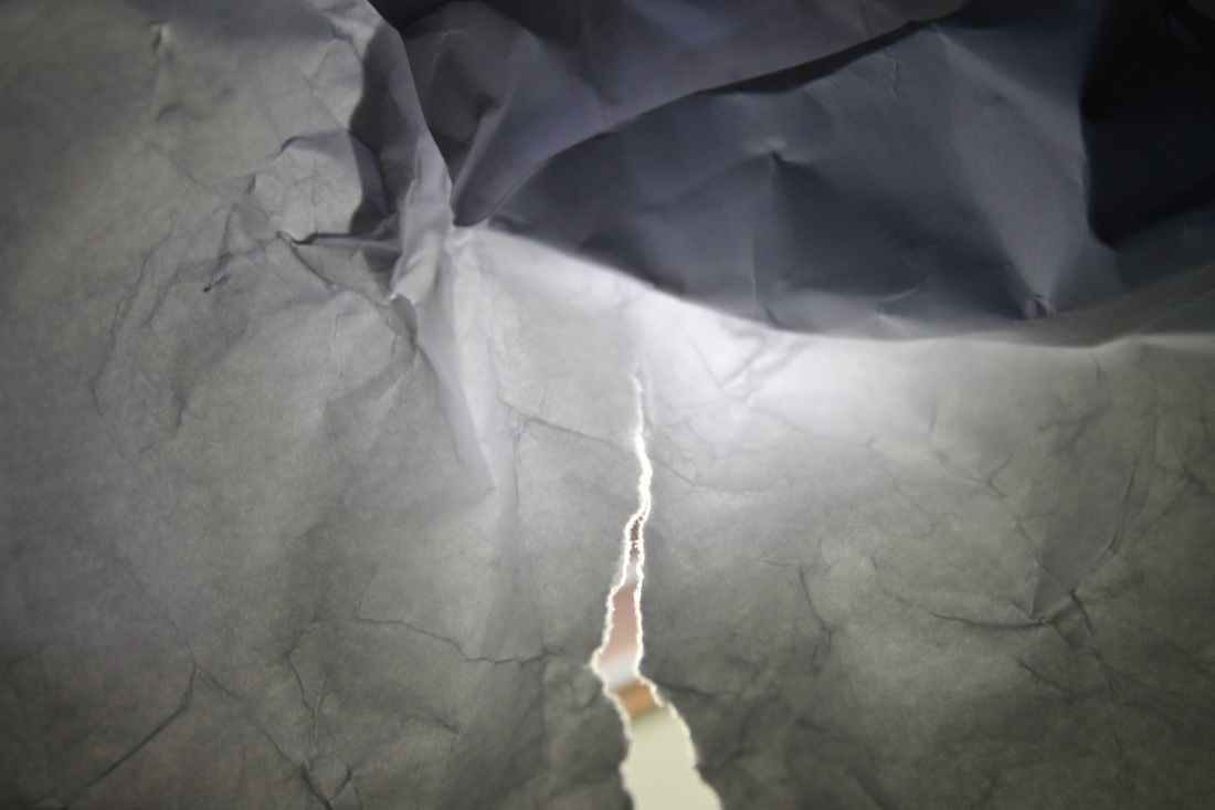
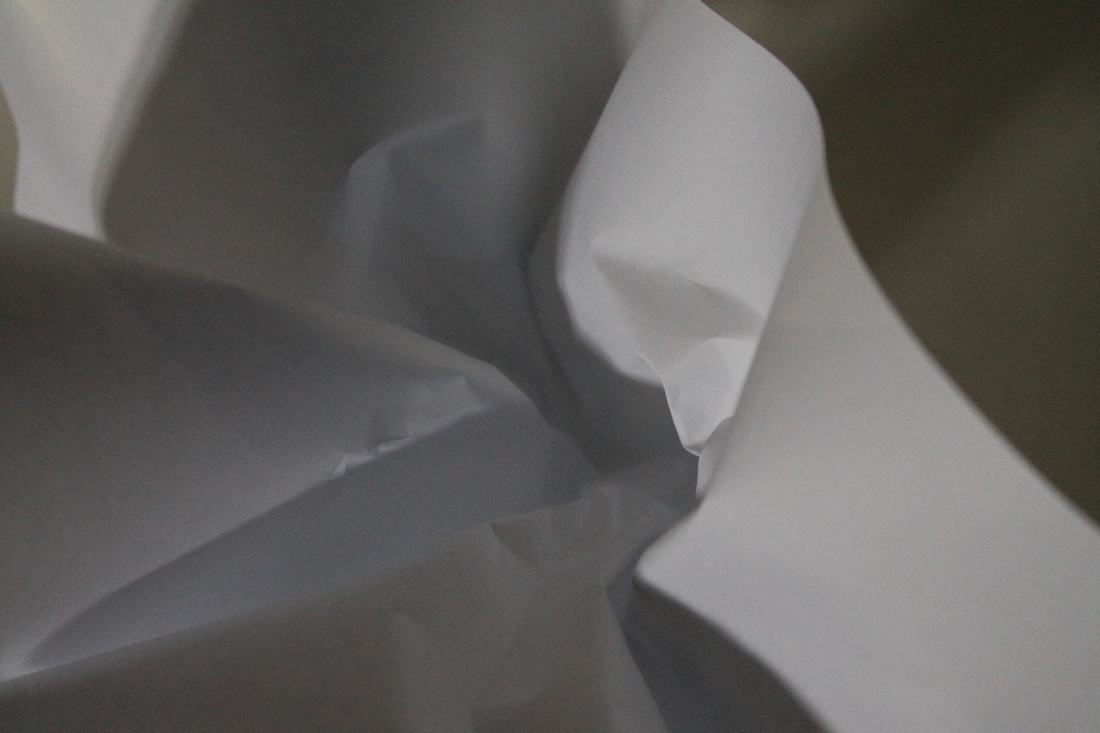
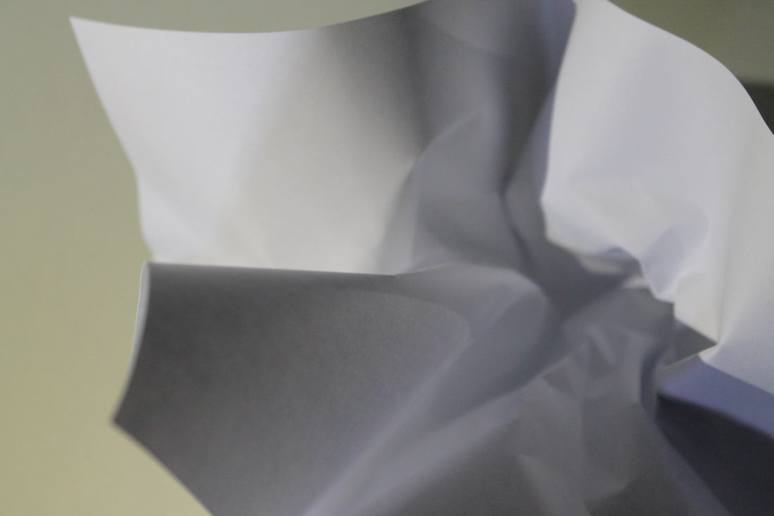
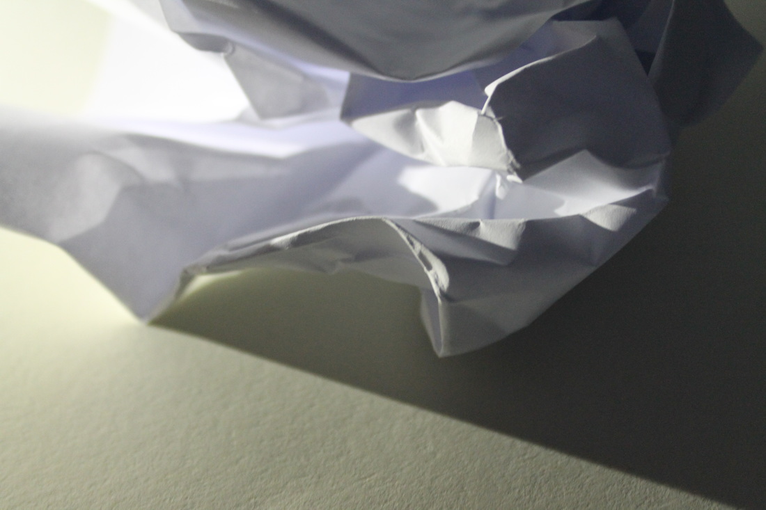
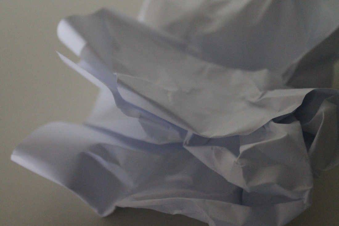
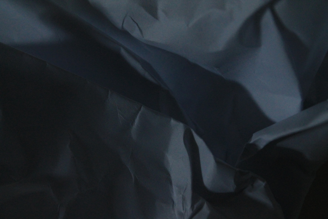
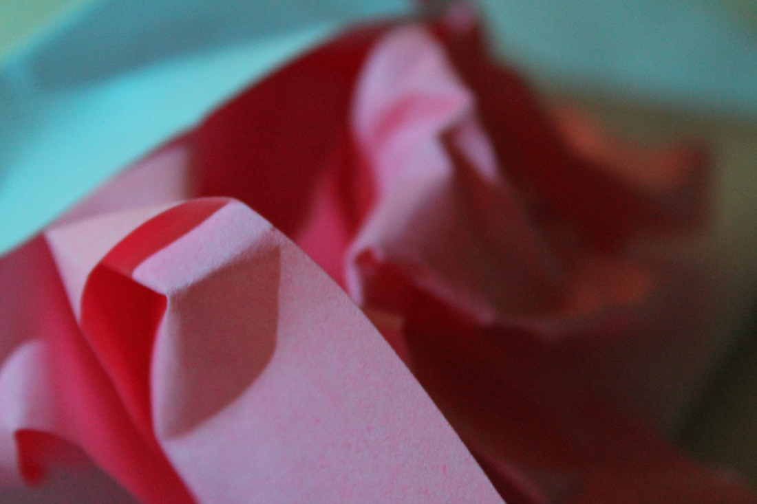
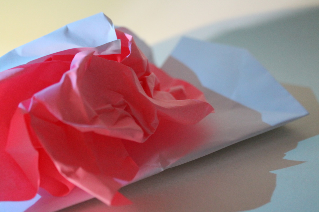
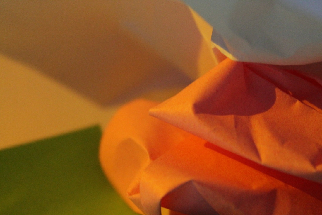
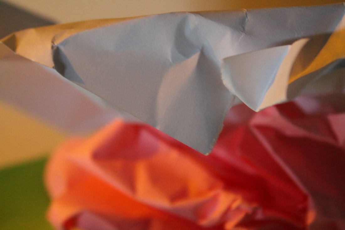
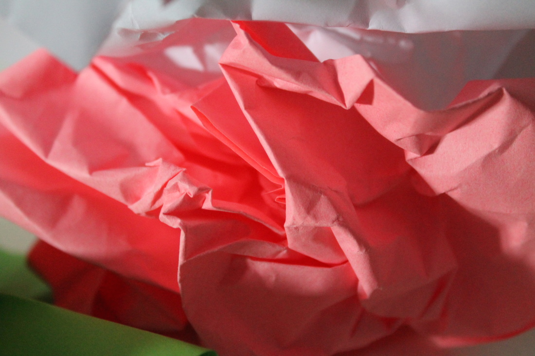
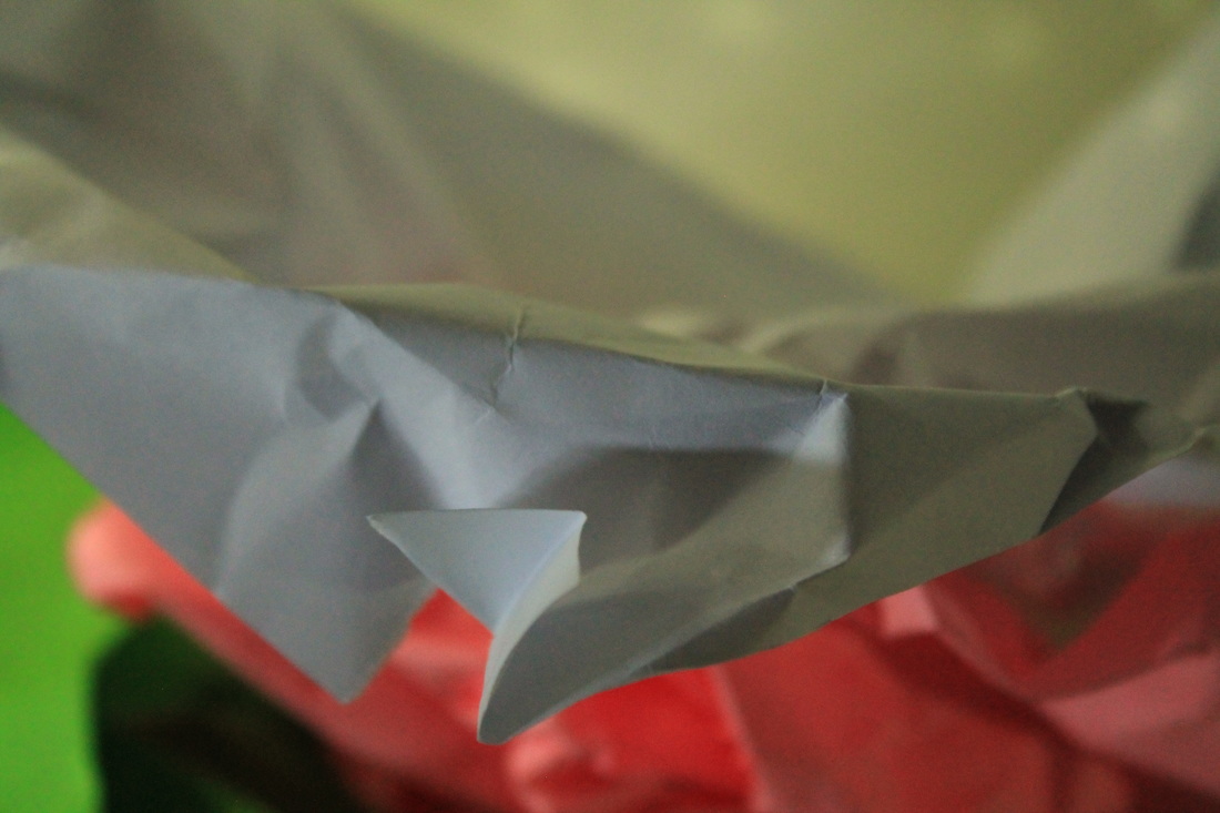
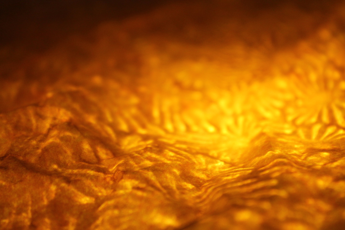
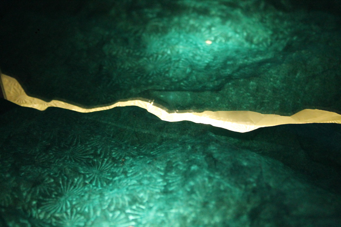
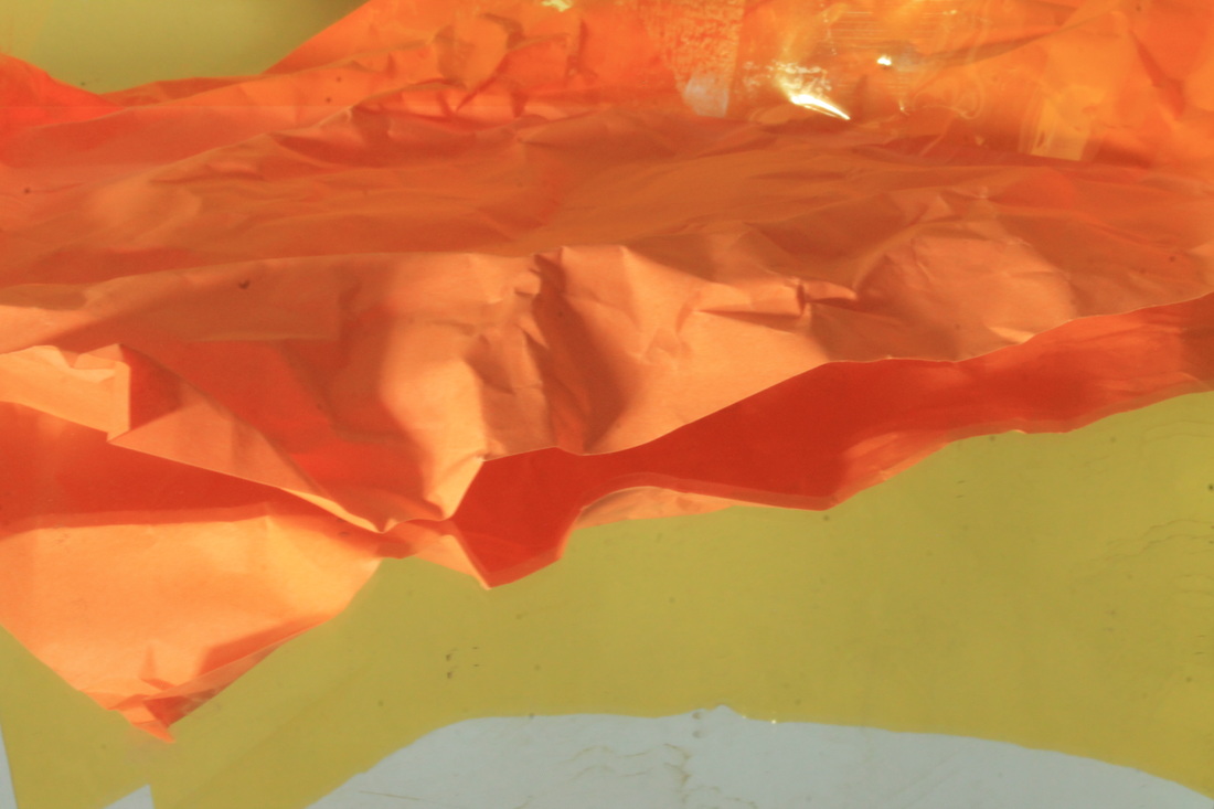
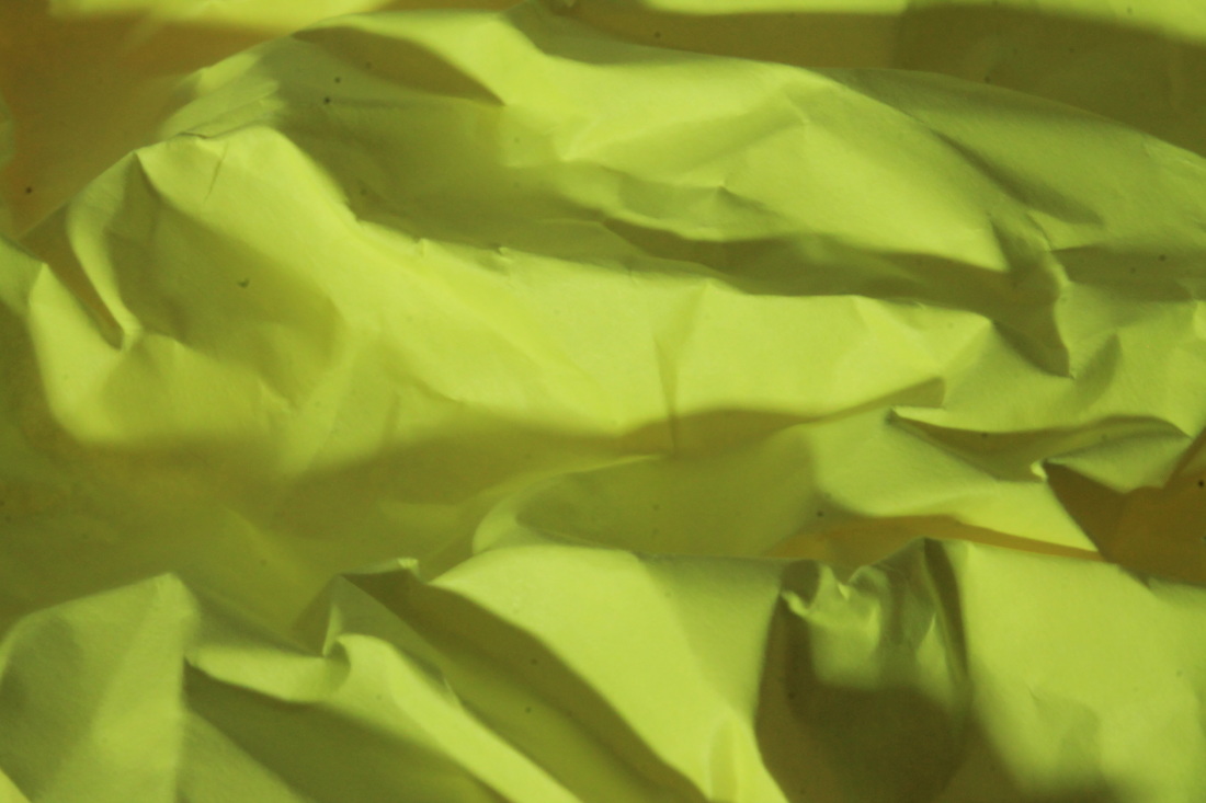
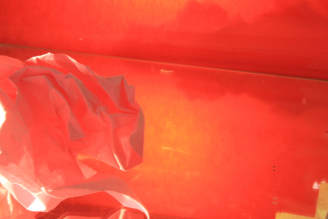
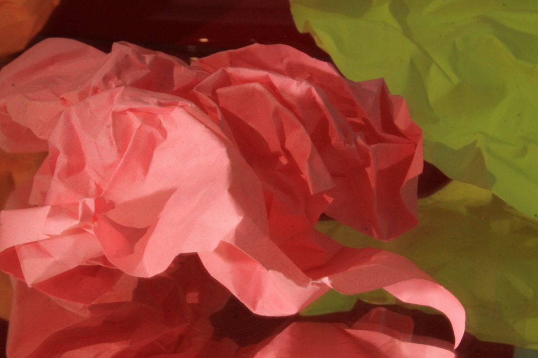
the white paper test
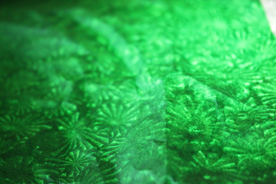
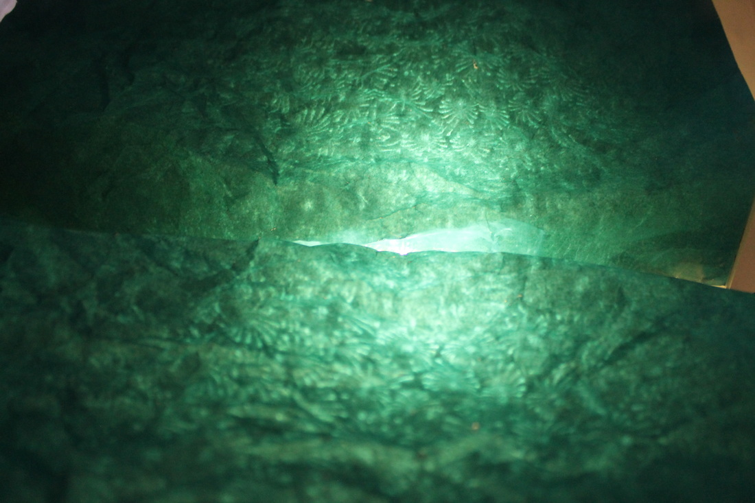
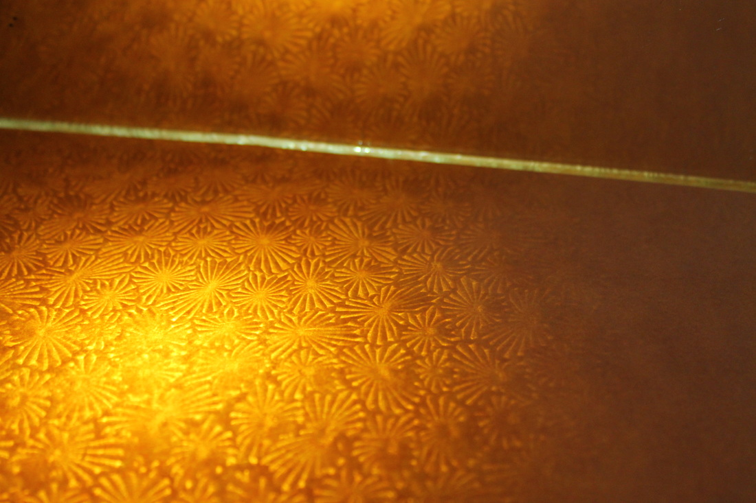
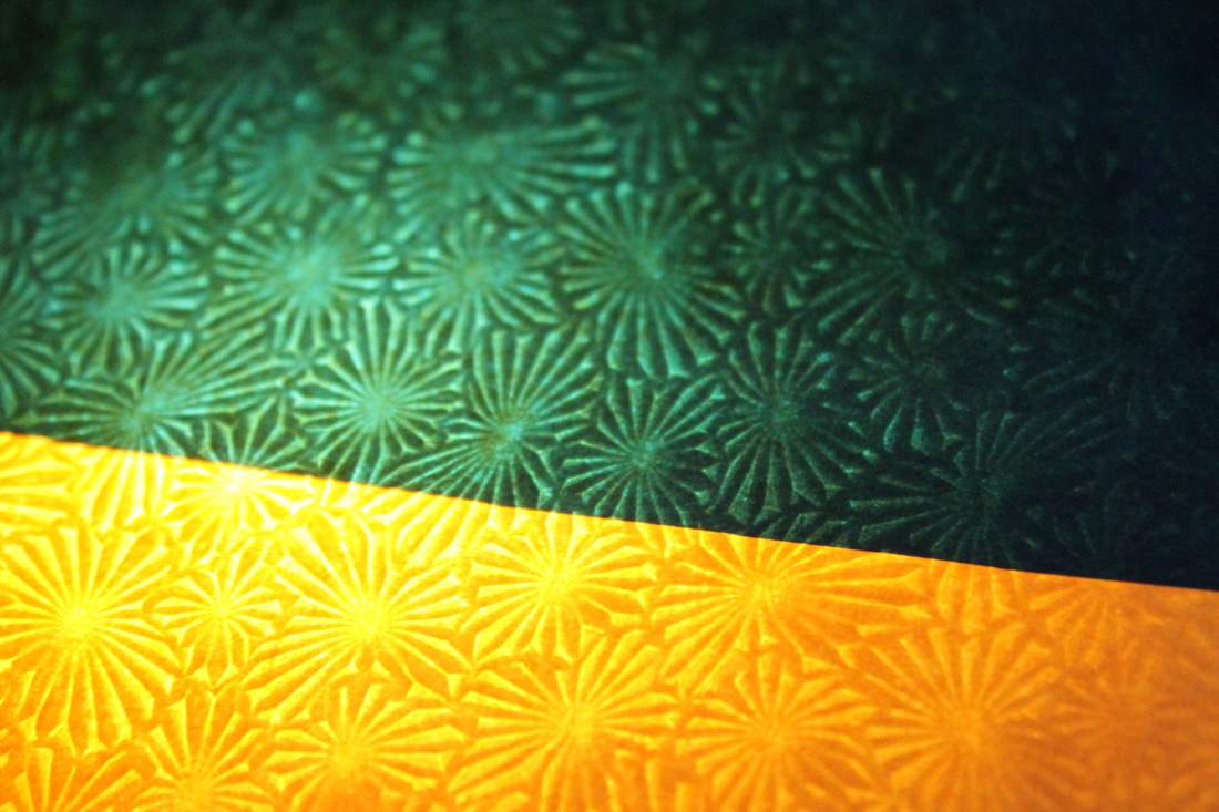
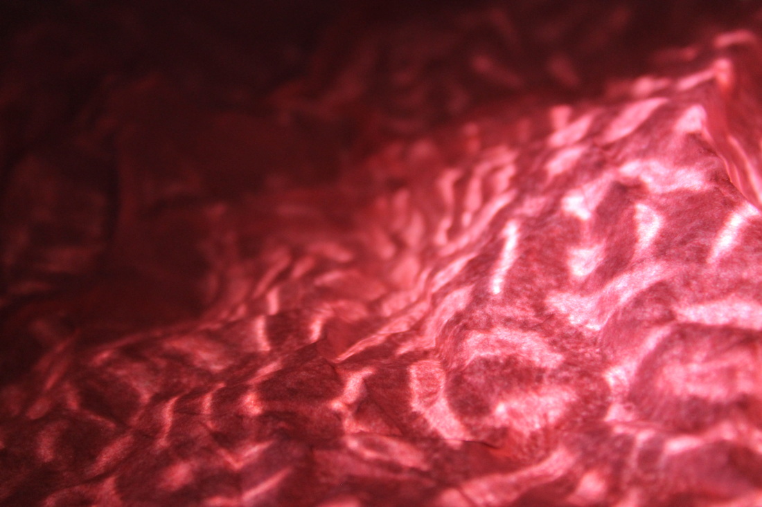
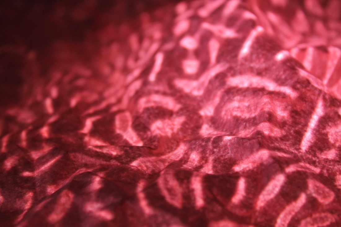
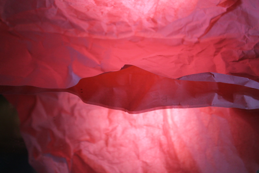
The white paper test required me to find ways of taking a photo of a plain white sheet of paper on a white background in many different interesting ways by crumpling it up, folding it, shining light on it from different angles etc. I used the torch on my phone in all of the photos to create shadows and emphasise the folds and creases on the paper. In some photographs I shone light through the pattern on my phone case which created interesting designs, and when I shone it very close to the case it reflected the pink light through the paper.
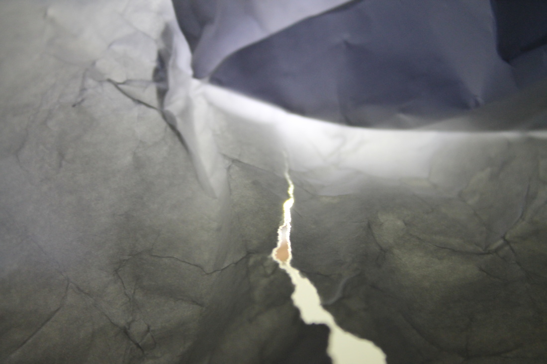
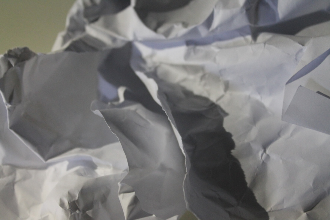
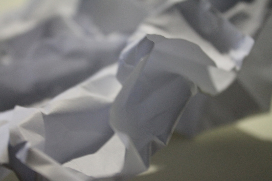
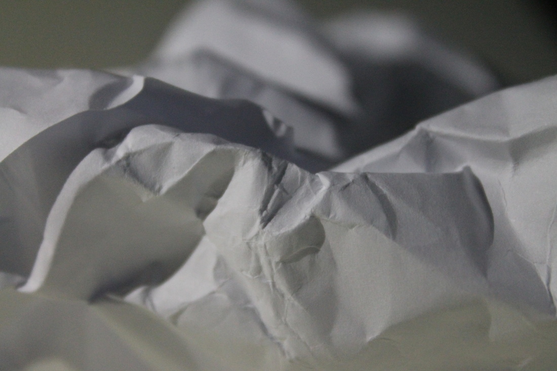
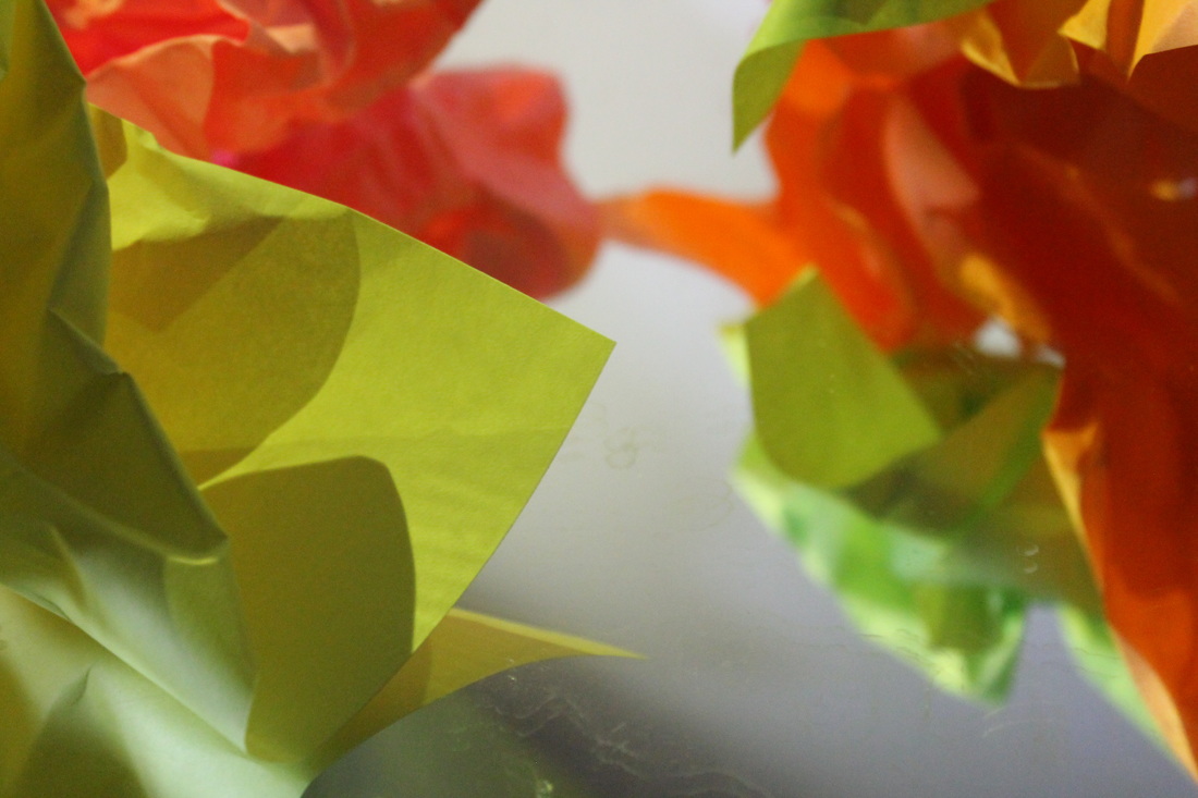
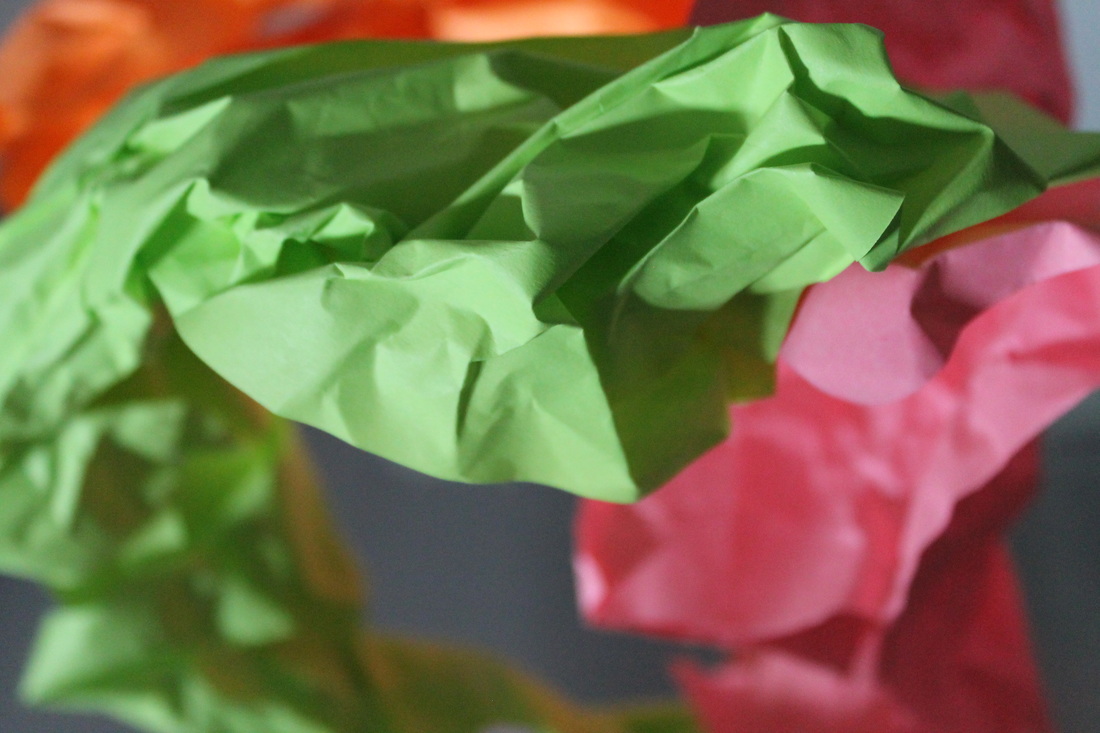
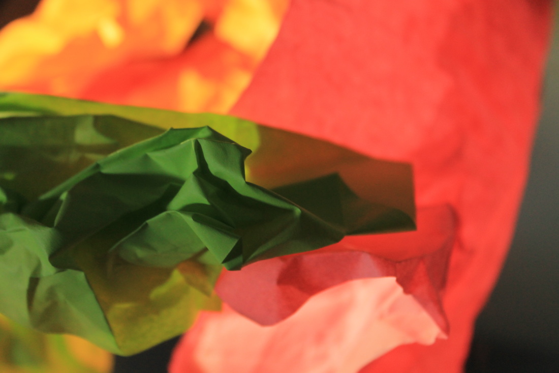
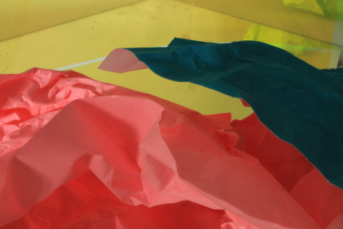
I then did the same thing but using a wider variety of materials such as coloured paper, gel lighting sheets, mirrors and patterned glass to create a wider variety of results.
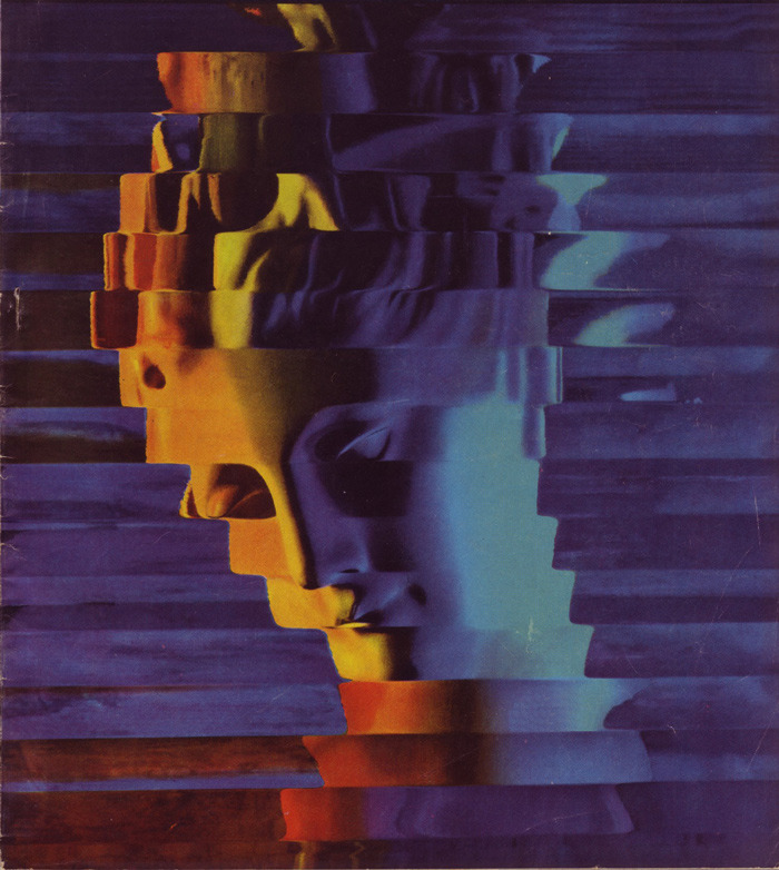
Tamara Lorenz
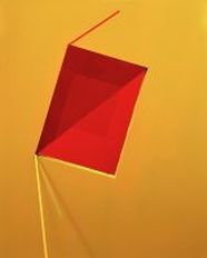
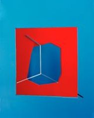
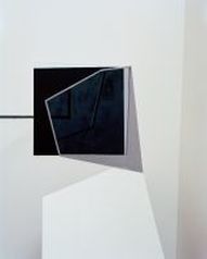
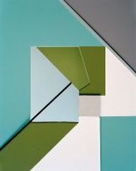
This series of photographs has been inspired by the photographer Tamara Lorenz who creates paper constructions and then photographs them to show their abstract qualities. She uses bold colours and strong lines, shapes and tones to create contrast in her photographs. The photographs don't represent anything specific but leaves the viewer the opportunity to interpret the photo in their own way.
This series of photographs has been inspired by the photographer Tamara Lorenz who creates paper constructions and then photographs them to show their abstract qualities. She uses bold colours and strong lines, shapes and tones to create contrast in her photographs. The photographs don't represent anything specific but leaves the viewer the opportunity to interpret the photo in their own way.
|
|
|
|
my interpretation of abstraction
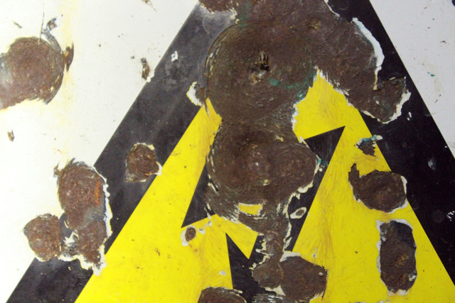
I took a series of photographs which I believed represented the title 'Absrtact(ion)'. They mostly include patterns naturally formed in nature such as cracks, rust, decay and shadows. I believe that this is what truly represents abstraction because these things form naturally without the aid or manipulation of a person attempting to make it look abstract.


experimental manipulation
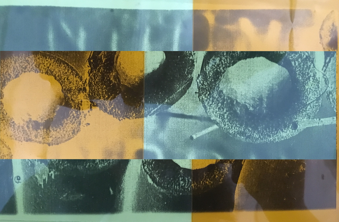
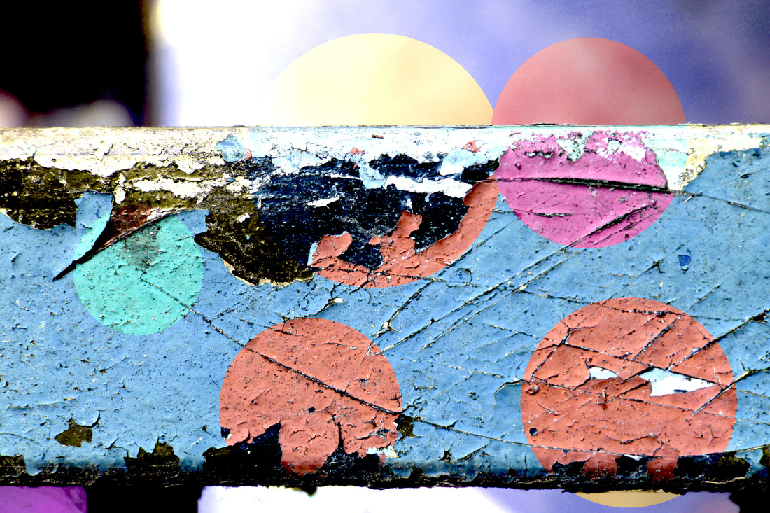
Here I have used photoshop and physical methods such as painting and applying gel filters to change the photos and make them one-off pieces.
Physical manipulation
To get these results I physically manipulated the photographs. Using a postive print on acetate of one of my absract photos I created a negative print of the photograph in the darkroom. I layered two different colours of gel colours over the negative print to create an interesting eye-catching and contrasting piece. I also used a regular photograph and sponged on paint in the background so that the foreground stood out more, and I scratched away the background of another one using keys and put a blue gel colour behind it.
Digital manipulation
I used photoshop to maipulate some of my favourite abstract photographs i had created.
I used photoshop to maipulate some of my favourite abstract photographs i had created.
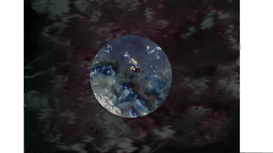
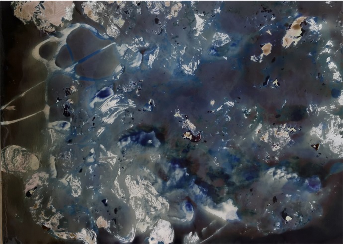
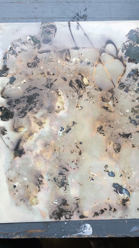
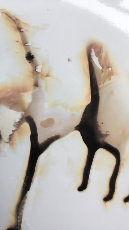
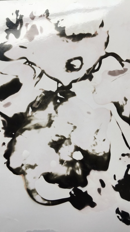
chemigrams
Chemigrams were created by Pierre Cordier on November 10th, 1956. To create them resisting substances are applied onto light-sensitive paper and then developed. This creates interesting abstract patterns, colours and shapes. To create mine I used various substances such as dish soap, moisturiser and maple syrup. To create images with white backgrounds I placed the paper into the 'fix' solution before the developer, and if I had wanted a black background I would have placed the image into the developer first like a regular photograph. I thought that this created a nicer finish and looked more abstract.
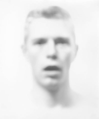
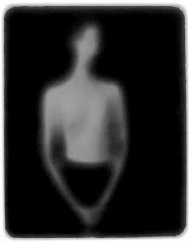
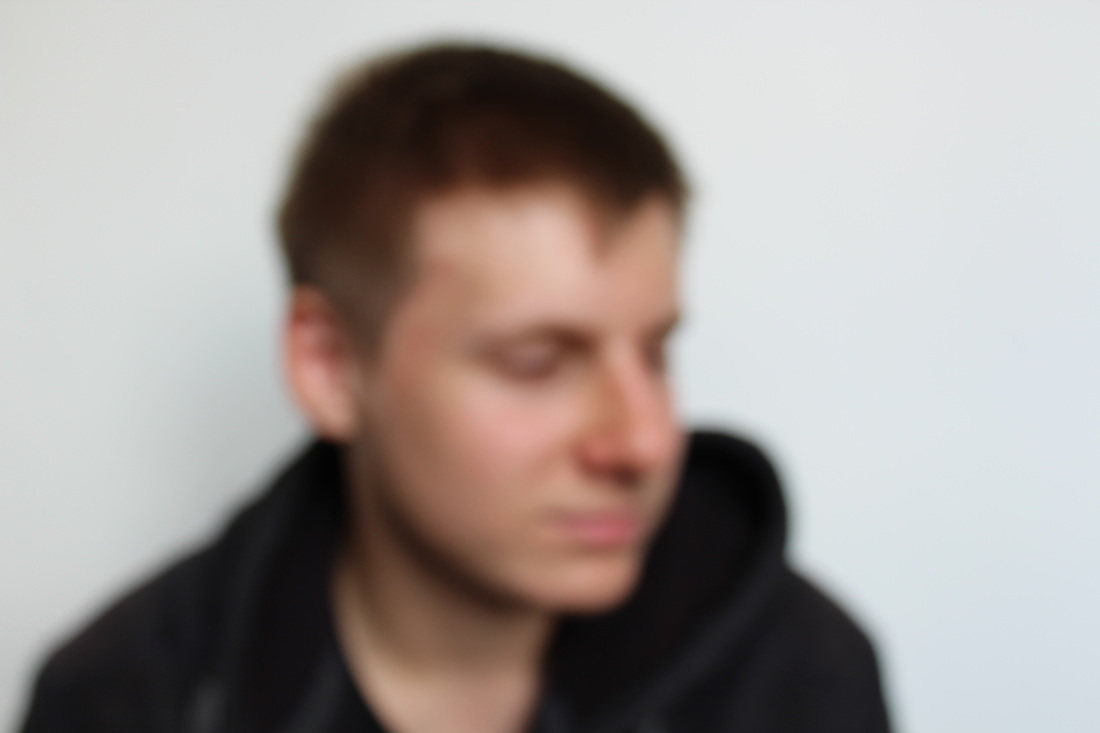
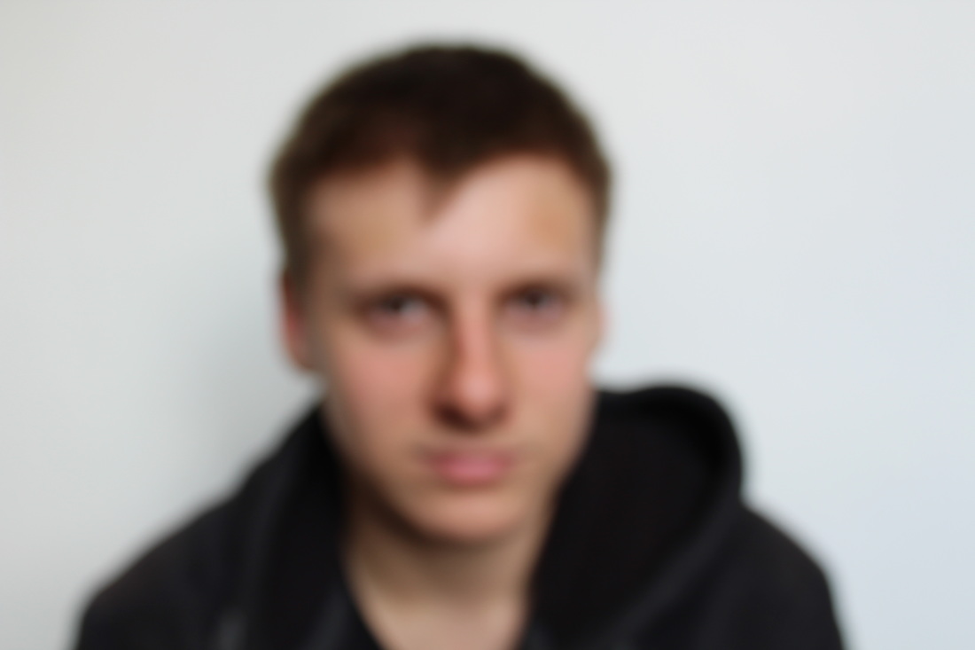
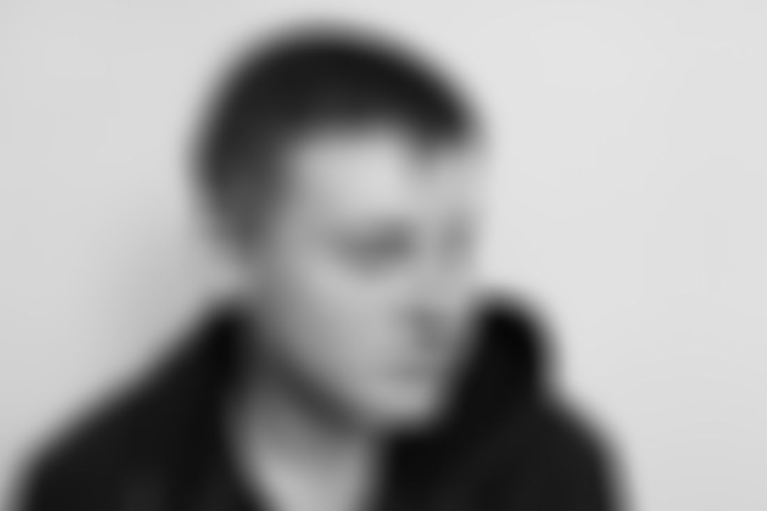
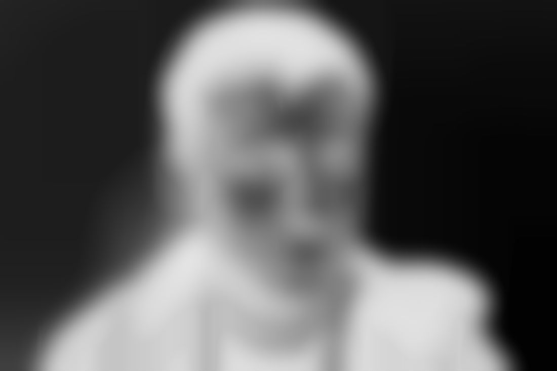
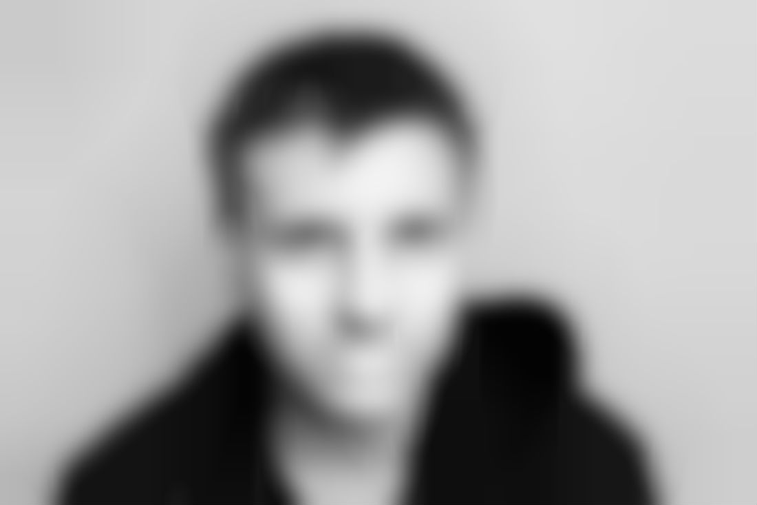
bill jacobson
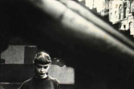
Bill Jacobson is an American photographer born in 1955. He has physically manipulated his work by taking out of focus portraits of people. This creates the effect that the subject of the photograph is dead, gone or unknown. This helps to support Bill Jacobson's point about how the mind usually only retains fragments of information such as dreams or faces. It also emphasises the fact that a photograph is a moment that can never happen again.
|
|
|
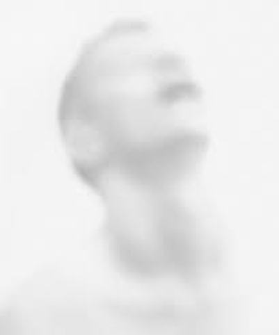
Work inspired by Bill Jacobson
In an attempt to recreate the work of BIll Jacobson I changed the settings on my camera so that I could manually adjust the focus and I took photos of Max out of focus. I then digitally edited the photos in photoshop, blurring them far more dramatically and made them black and white, changing the colour levels and inverting one of them.
In an attempt to recreate the work of BIll Jacobson I changed the settings on my camera so that I could manually adjust the focus and I took photos of Max out of focus. I then digitally edited the photos in photoshop, blurring them far more dramatically and made them black and white, changing the colour levels and inverting one of them.
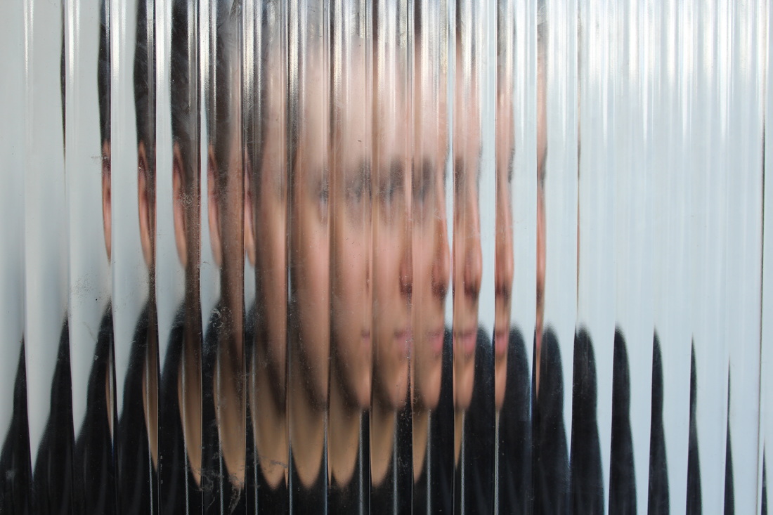
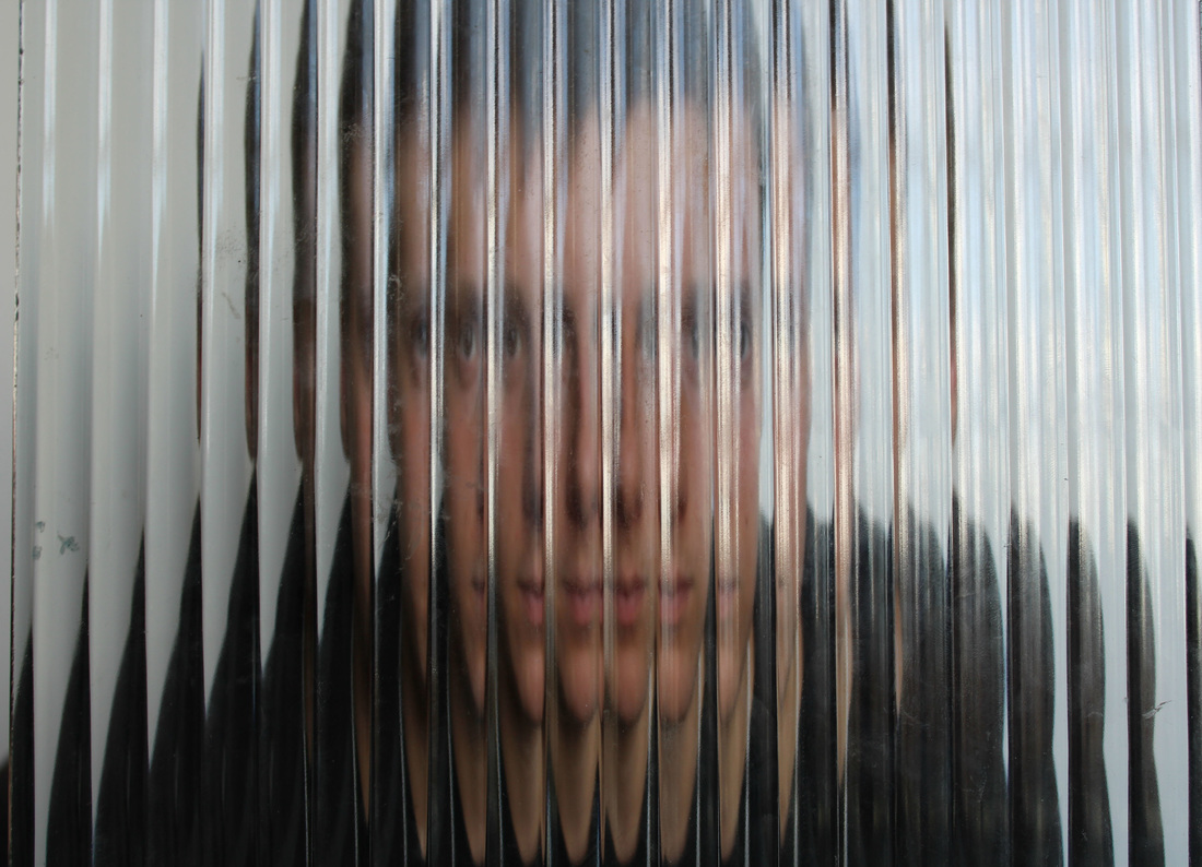
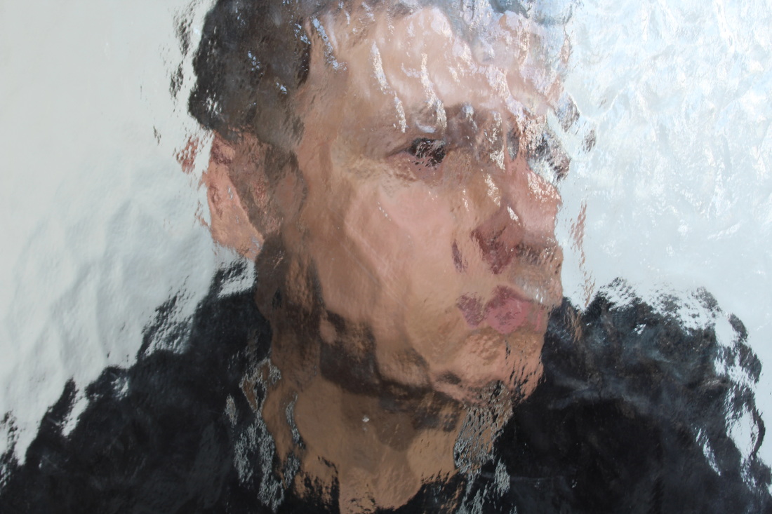
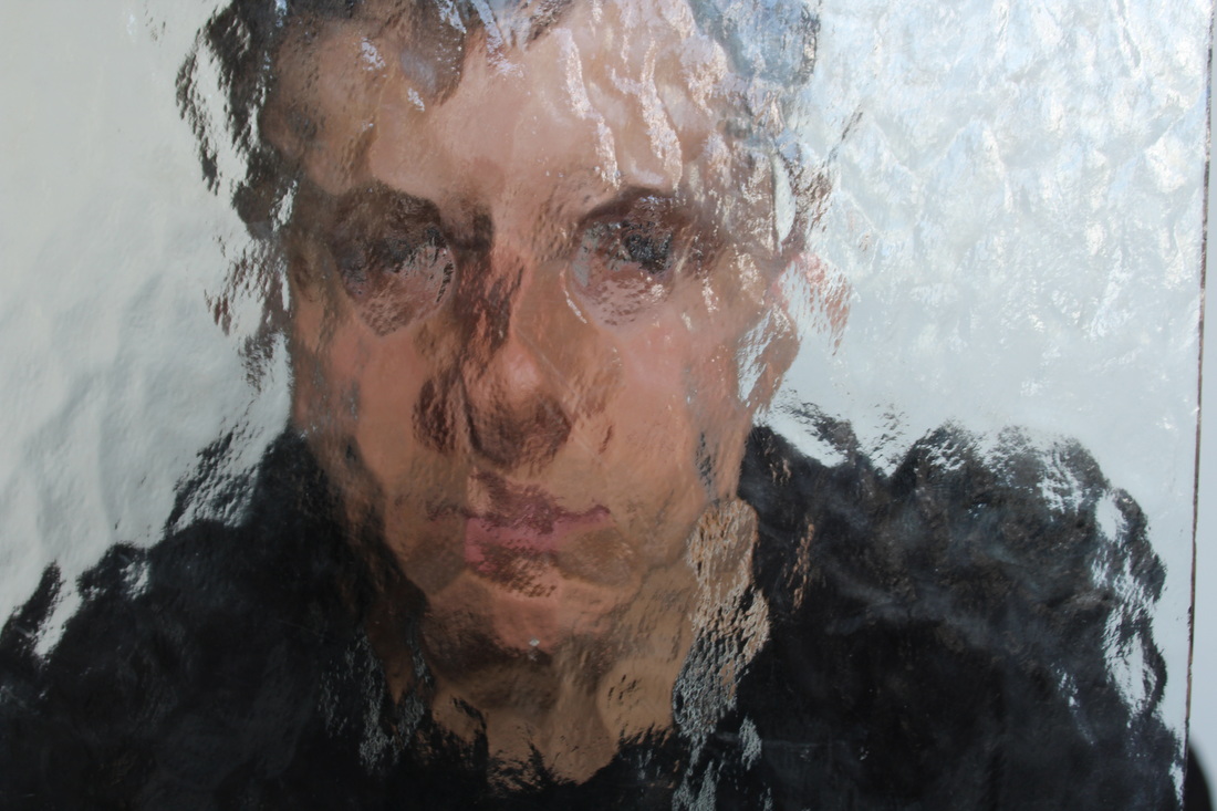
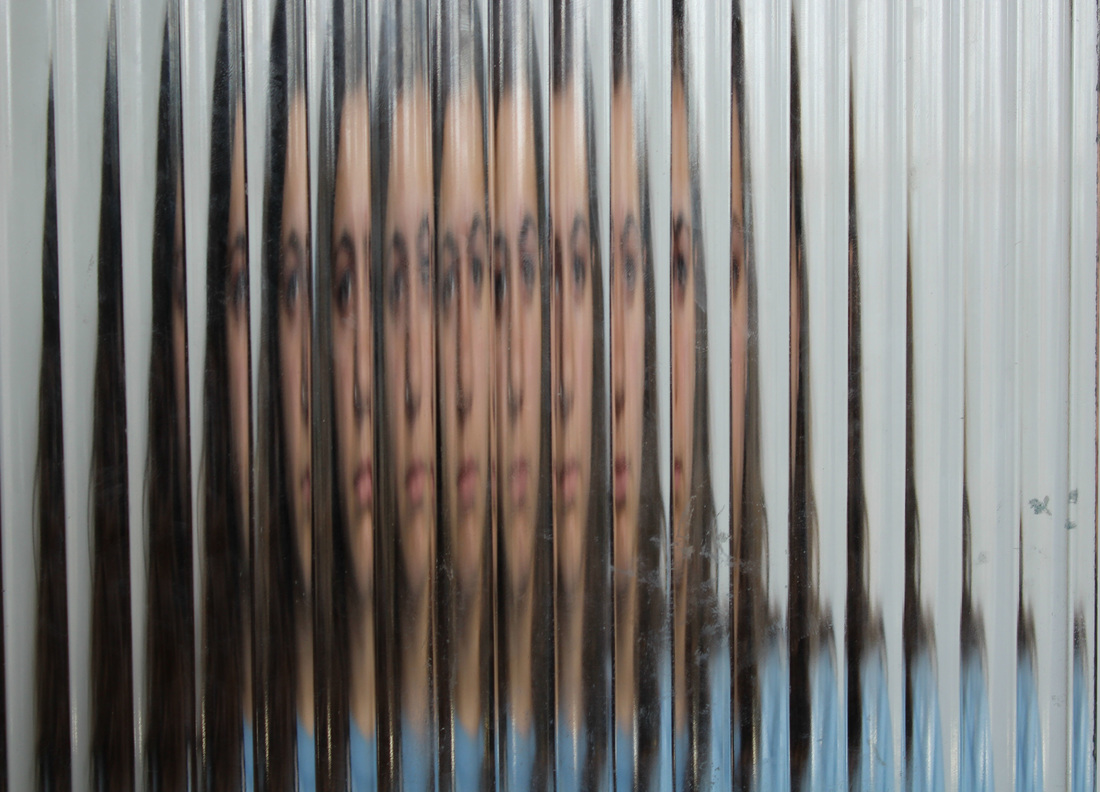
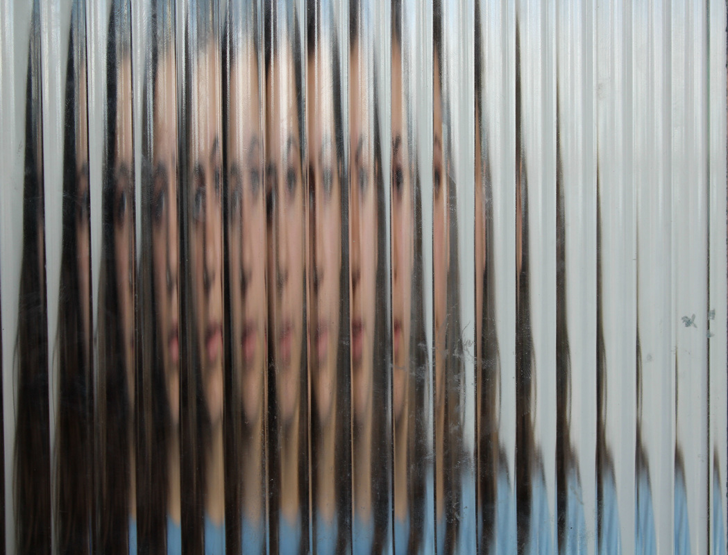
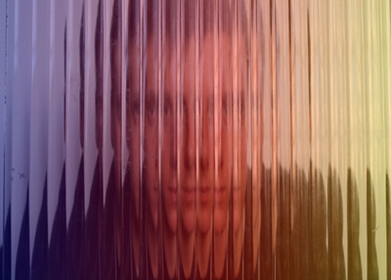
erwin blumenfeld
Erwin Blumefeld was a famous German fashion photographer, well known for his work published in the likes of Vogue and Harper's Bazaar 1940-50. In his photography he attempted to push the boundaries of typical fashion photography, to be able to find beauty within what would conventionally be considered ugly. He does this by distorting his images in a way so that they don't quite piece together properly but it is still clear what they are. Blumenfeld was able to pull this off so effectively due to his constant 'rule breaking' and experimentation in the dark room which made him an expert at making something essentially wrong look right.
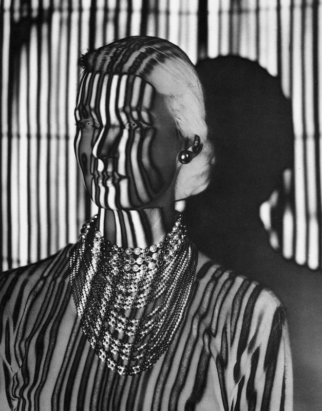
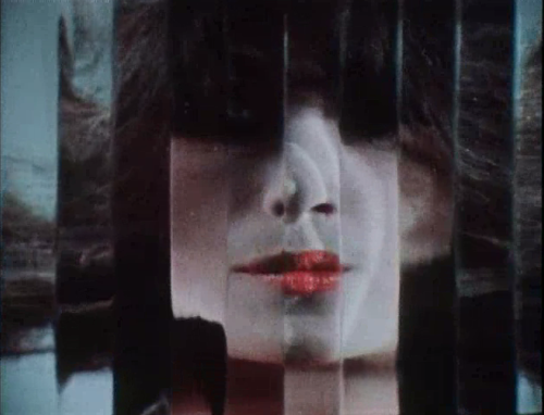
Work inspired by Erwin Blumenfeld
Inspired by the effect that Blumenfeld had achieved in his photographs, I used differently patterned panes of glass and held them up in front of Max's and my own face to distort them. I then experimentally edited some of them in photoshop to add more vivid colour, in an attempt to make my work link to Erwin Blumenfeld.
Inspired by the effect that Blumenfeld had achieved in his photographs, I used differently patterned panes of glass and held them up in front of Max's and my own face to distort them. I then experimentally edited some of them in photoshop to add more vivid colour, in an attempt to make my work link to Erwin Blumenfeld.
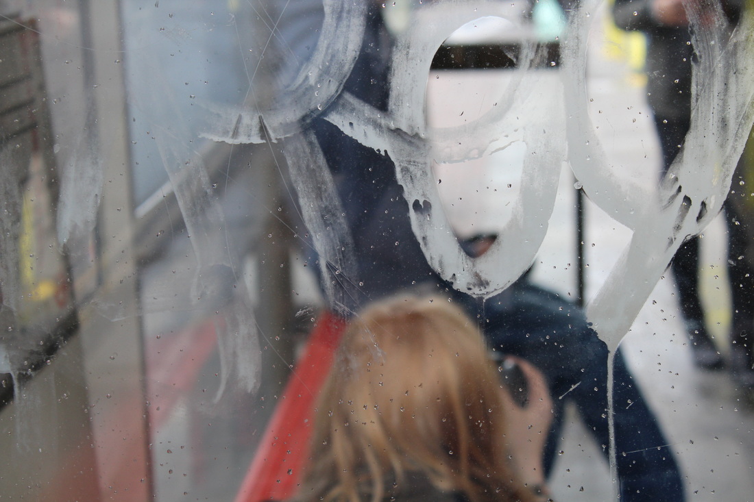
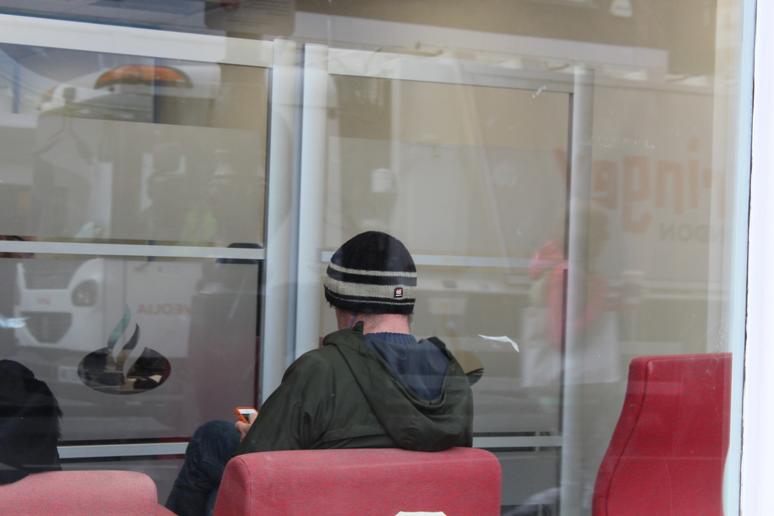
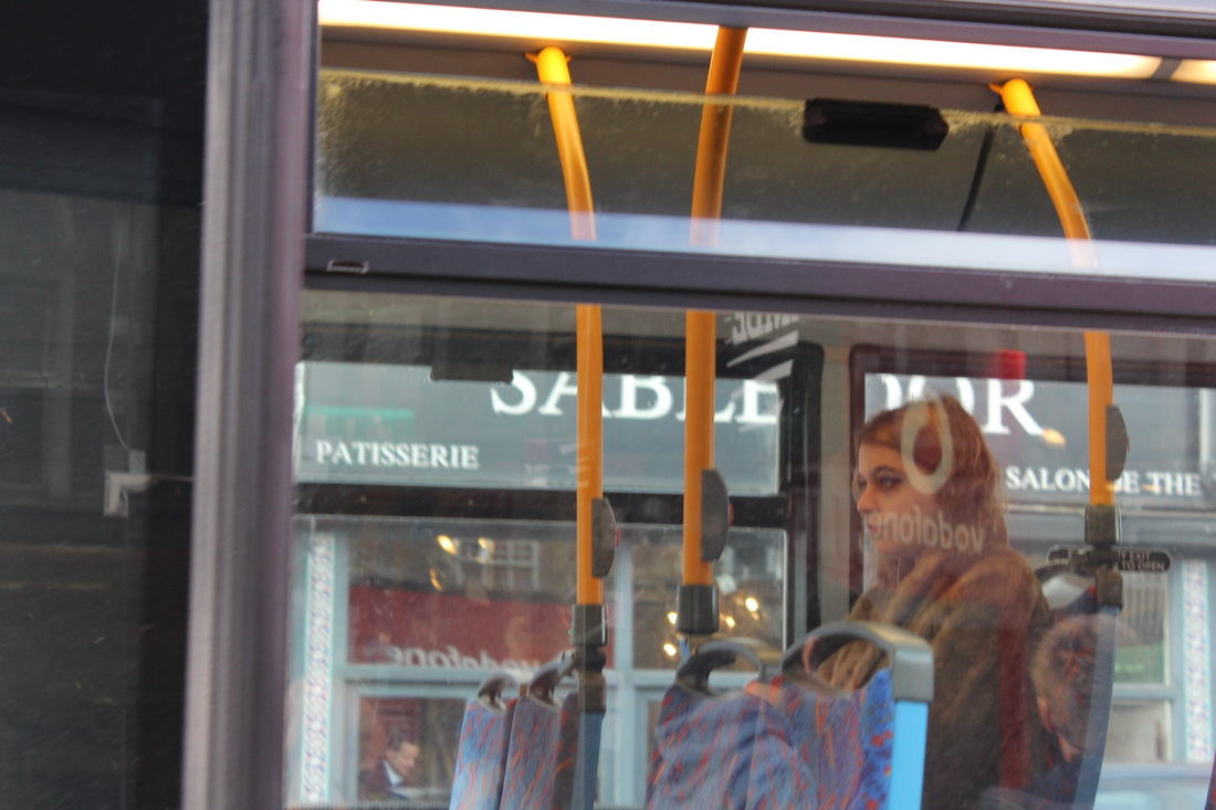
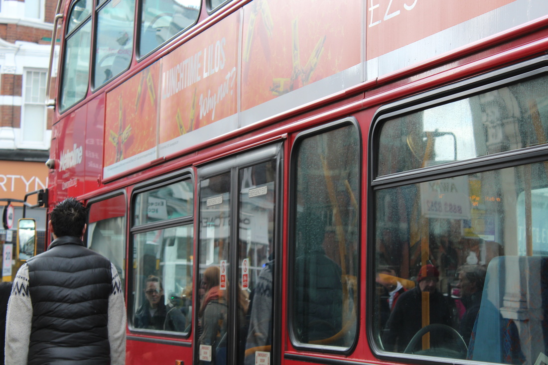
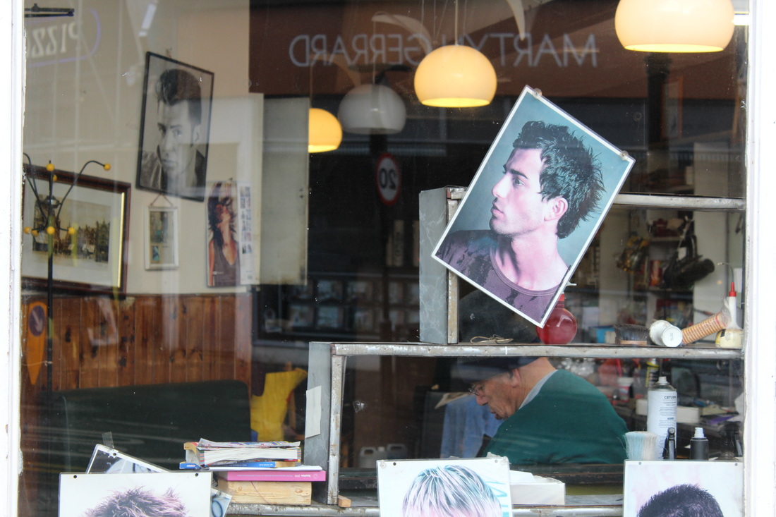
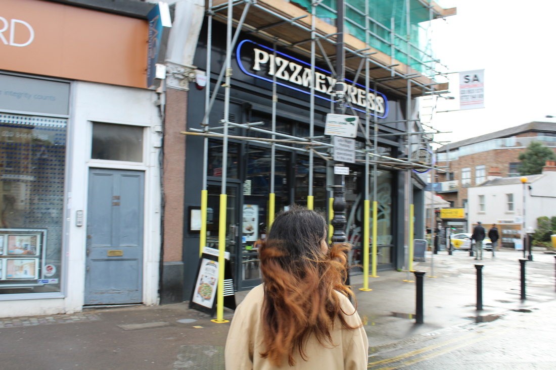
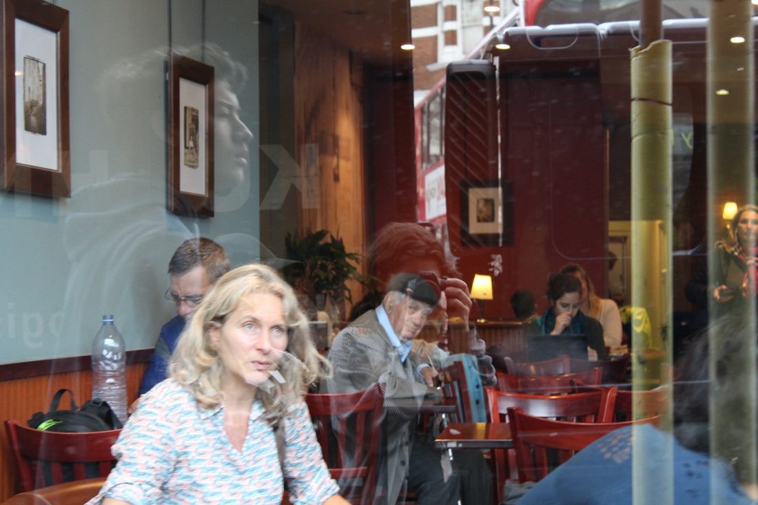
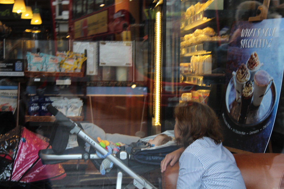
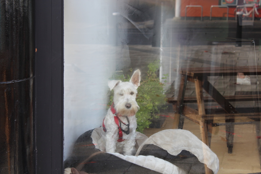
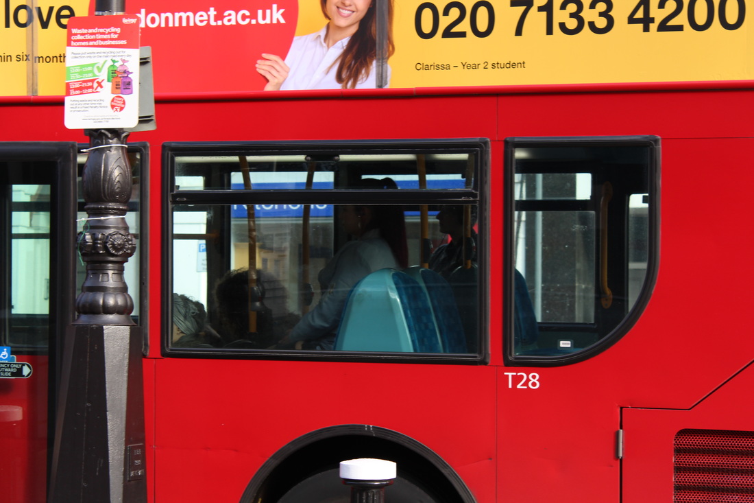
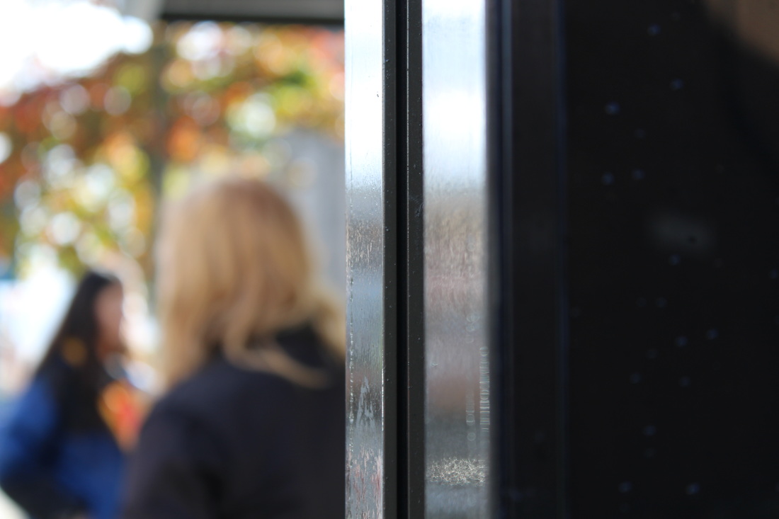
saul leiter
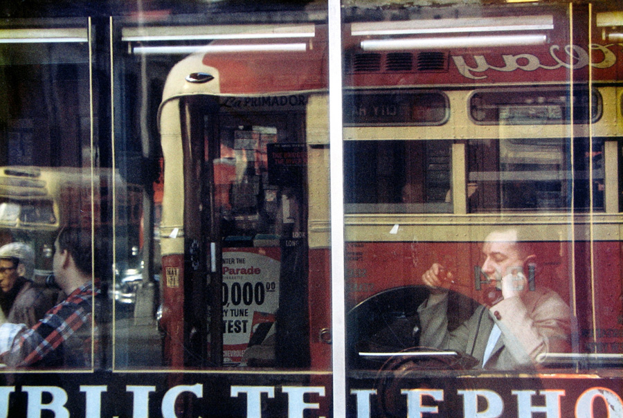
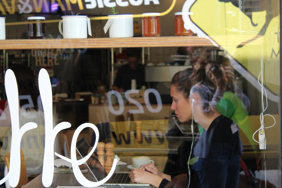
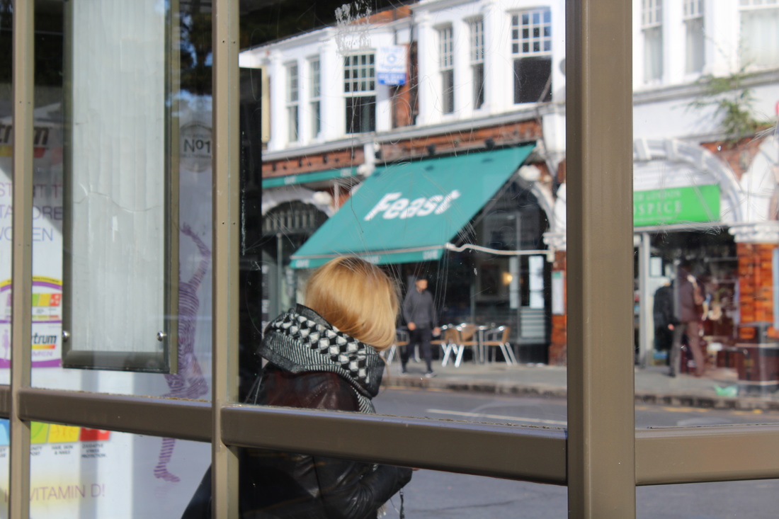
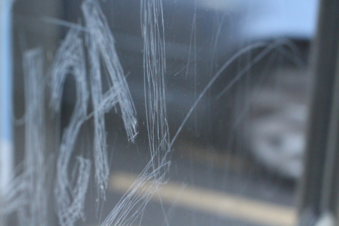
Saul Leiter was an American photographer, well known as a pioneer of colour photography. His most famous photographs are those of people in the street; he would photograph people through or behind objects which would obscure the image. The lack of clear detail, blurring of movement and the reduction in depth of field, as well as the use of windows and shadows as natural filters, combined to create incredible abstract pieces, never posed or set up. He did this because he wanted to make the viewer of the photographs unsure of what they were looking at, and to make it unclear why he took the photograph in the first place, so that they have to search for something within the photographs.
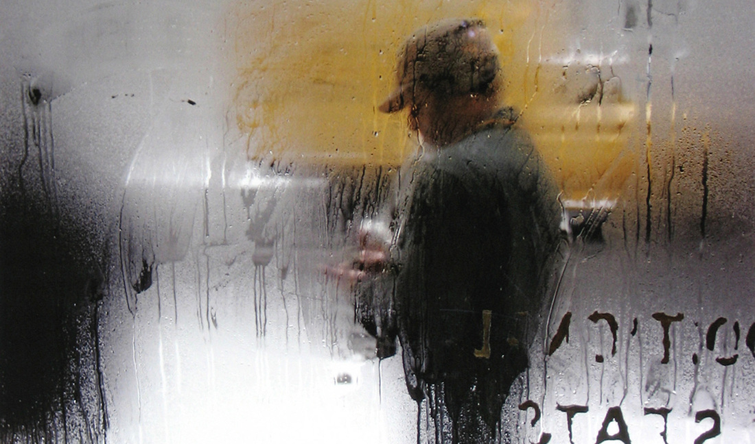
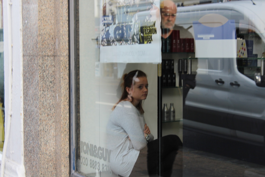
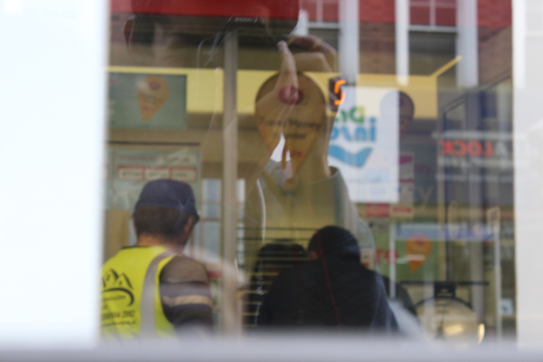
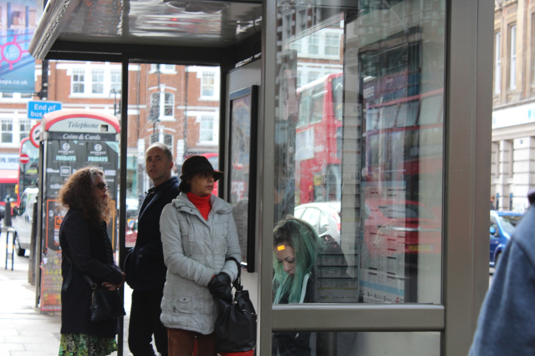
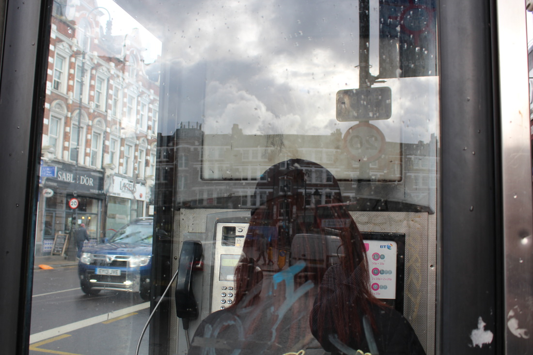
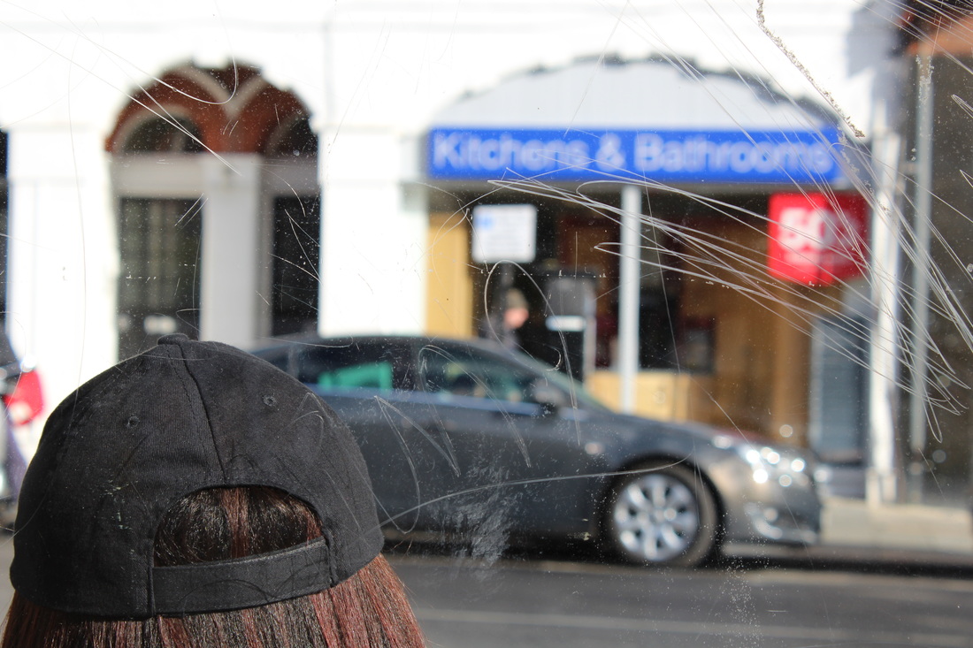
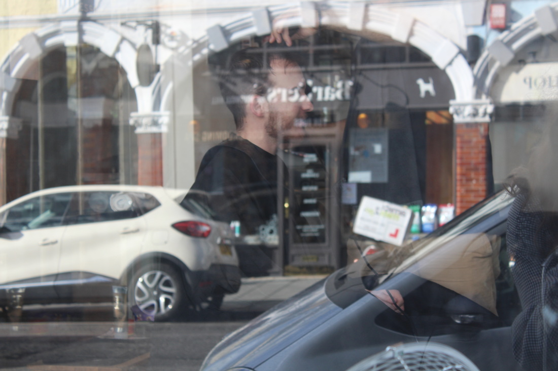
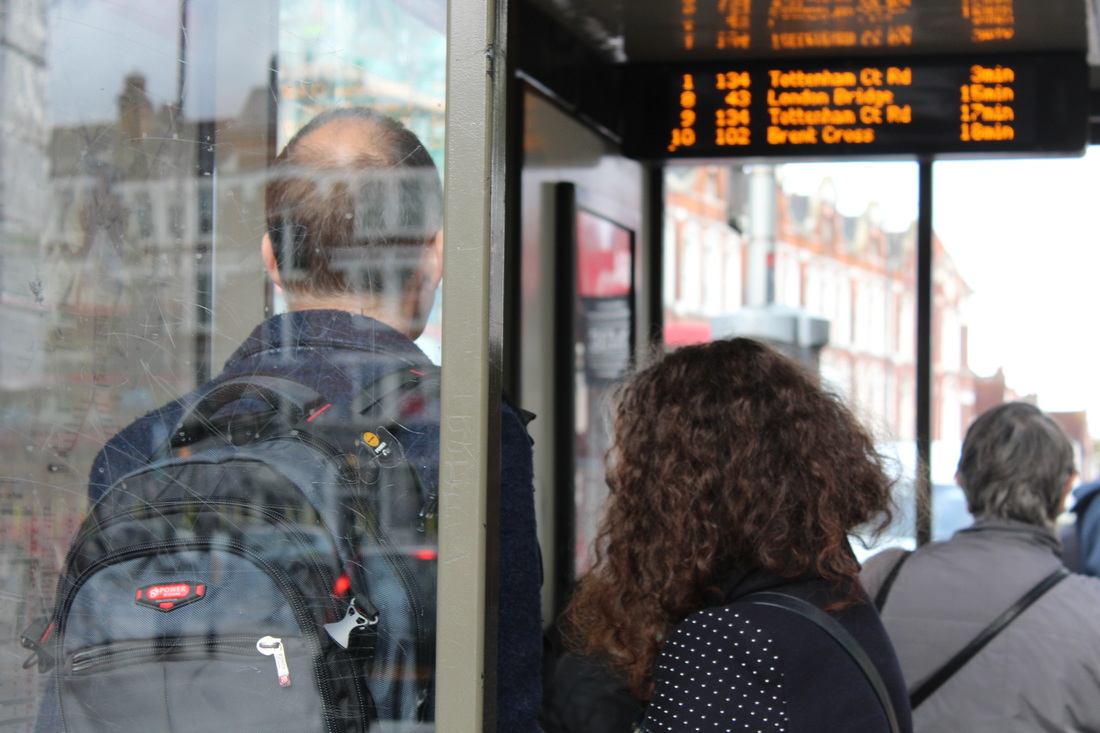
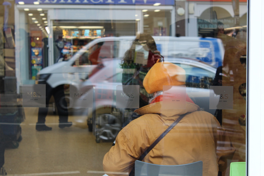
Work inspired by Saul Leiter
After seeing Leiter's work, I went out into Muswell Hill and took 'candid' photographs of people going about their daily lives, through windows, bus shelters and cars. I like the way that my interpretation of his work turned out because I believe they capture the same abstract feeling as Leiter's do. I have not edited any of these photographs because I wanted them to be as natural and representative of real life as possible. Despite this, I think some of the photographs would be much better if you couldn't see my reflection in the glass, as this damages the 'naturalness' of the photographs; makes them seem more posed.
After seeing Leiter's work, I went out into Muswell Hill and took 'candid' photographs of people going about their daily lives, through windows, bus shelters and cars. I like the way that my interpretation of his work turned out because I believe they capture the same abstract feeling as Leiter's do. I have not edited any of these photographs because I wanted them to be as natural and representative of real life as possible. Despite this, I think some of the photographs would be much better if you couldn't see my reflection in the glass, as this damages the 'naturalness' of the photographs; makes them seem more posed.


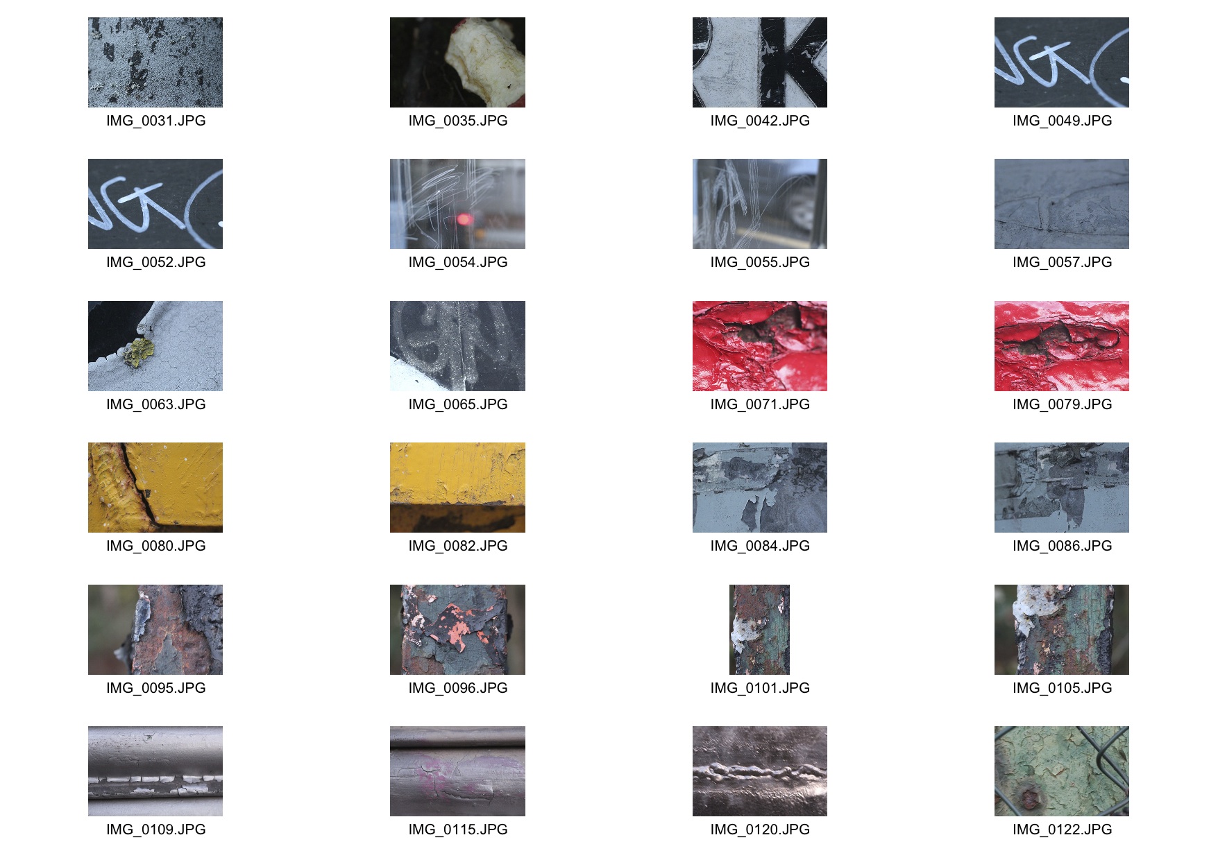
Three strands
Strand one
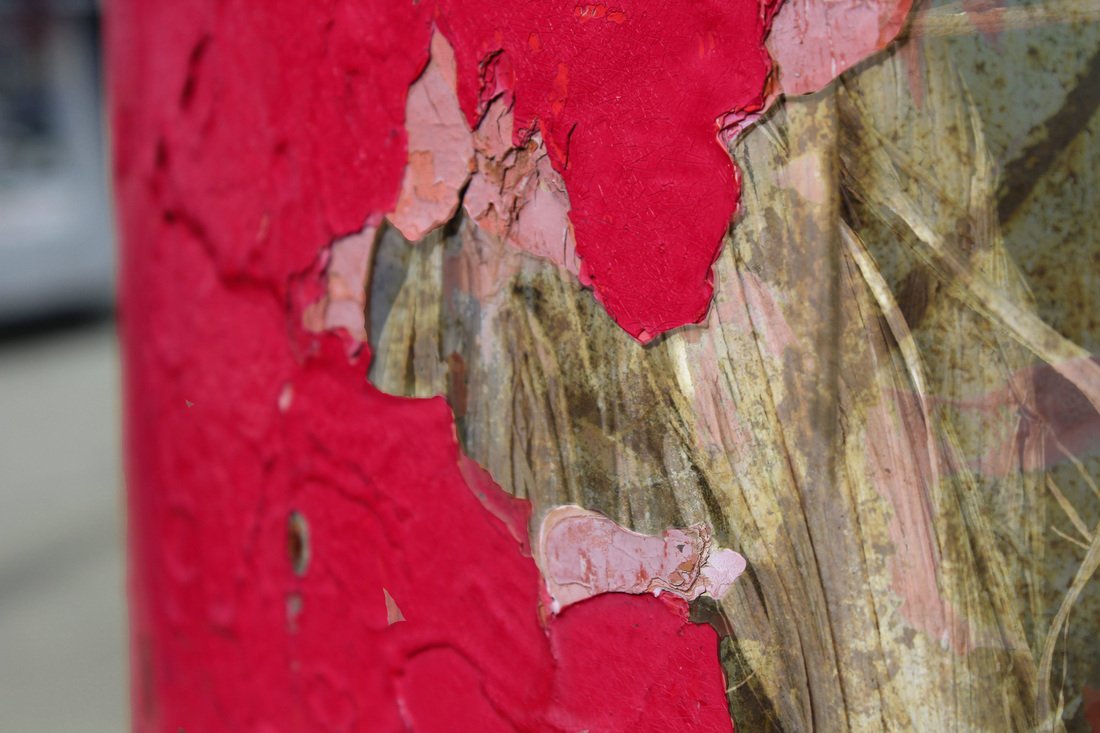
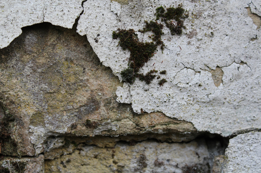
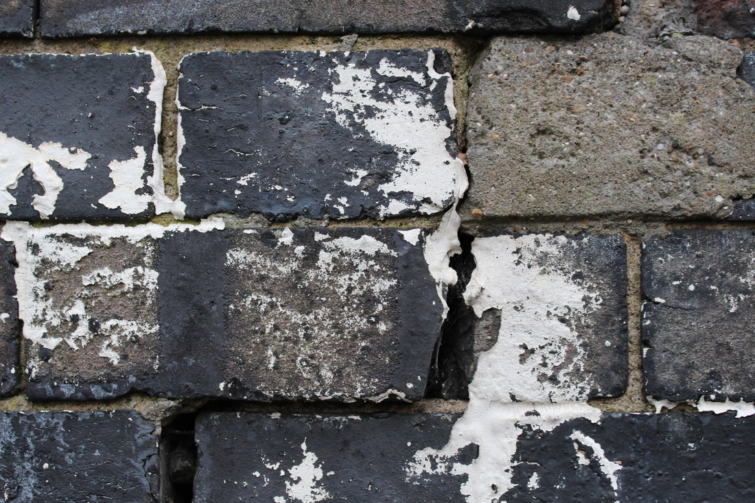
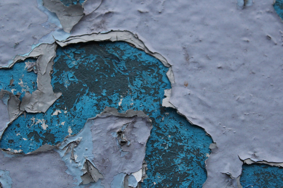
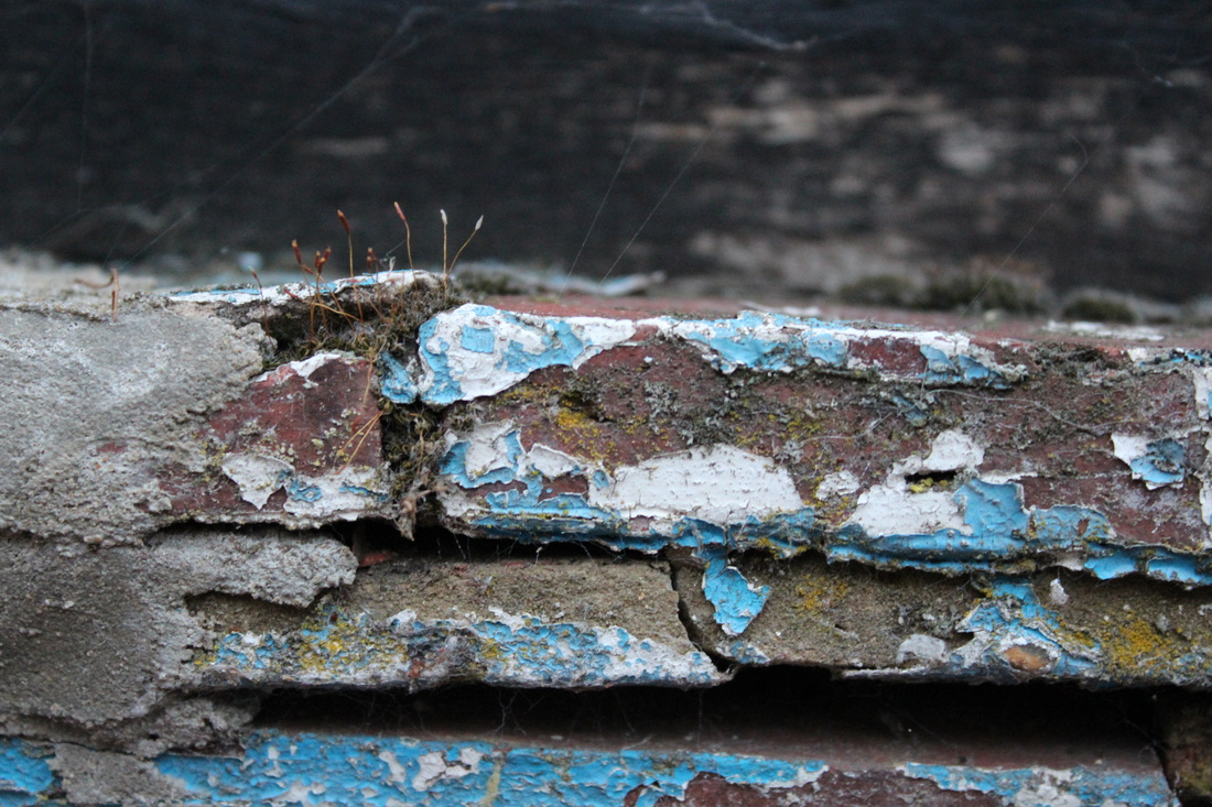
My first idea was to capture the delapidation and vandalism found in buildings, brickwork and paintwork. This included rust, flaking paint, broken bricks and grafitti.
My first idea was to capture the delapidation and vandalism found in buildings, brickwork and paintwork. This included rust, flaking paint, broken bricks and grafitti.
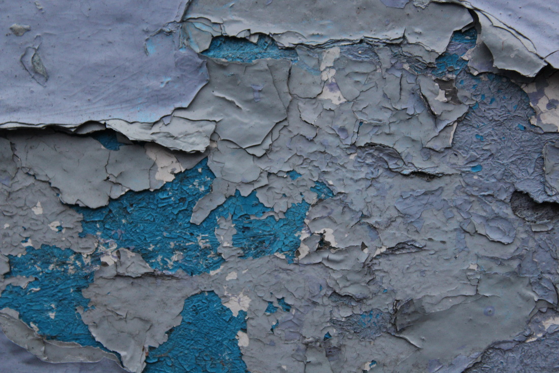
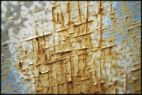
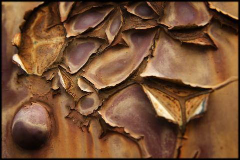
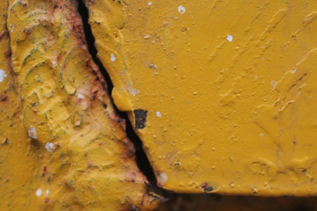
I have used Anna Mika as an inspiration for my first strand by going out in my local area and finding things that are old and in need of repair such as broken brickwork, graffiti and peeling paint. Although i was inspired by her my work is very different to hers as I focused more on close ups of different things. I particularly like the photos which show peeling paint because close up photos of these allow you to see the detail in the small flakes of paint, the layers underneath and sometimes moss growing on top or around it. To further develop this idea I would go out further and go specifically to places which I knew were dilapidated or decaying so that I could get more photographs.


Strand two
Juke Schoorl
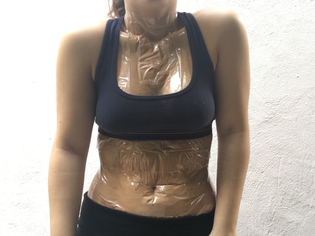
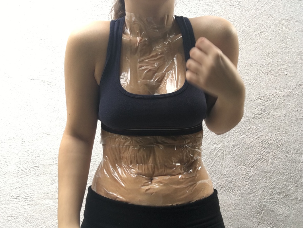
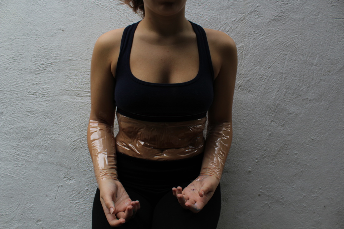
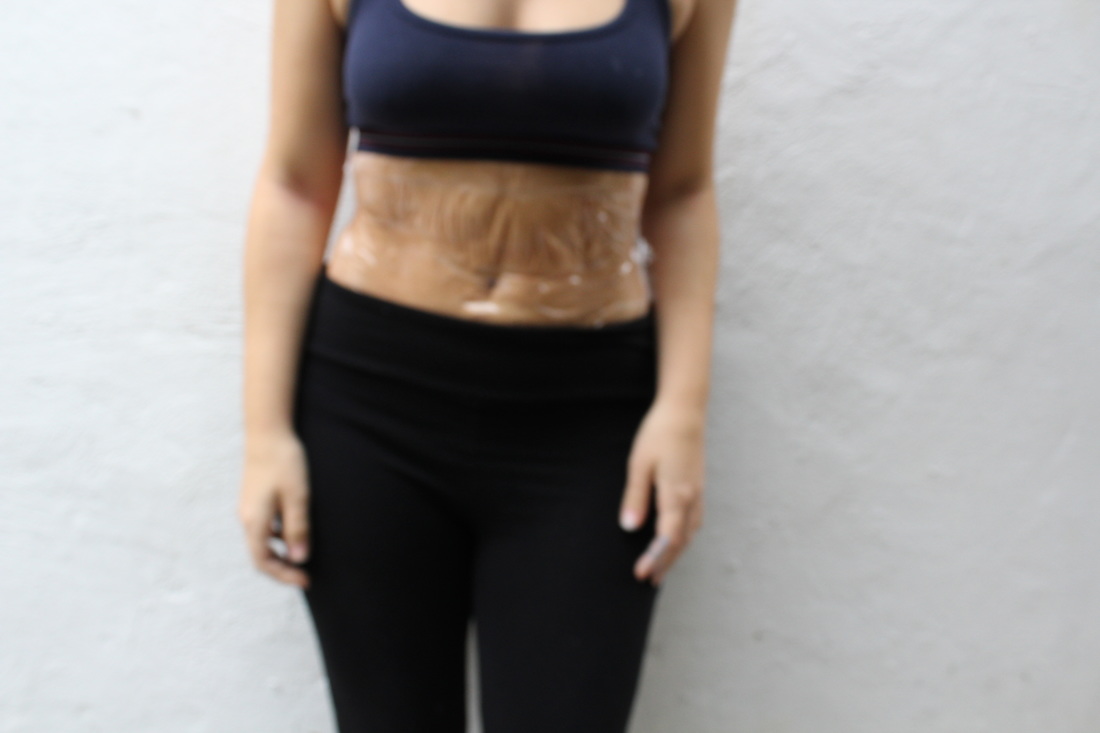
Juke Schoorl is a Dutch photographer who likes to manipulate her subjects to make them look like something else. She is most well known for her fascination with the human body and the ability to manipulate the skin and flesh to make it look different to how it is. She uses simple material such as tape and nylon fishing rope to pull and shape the skin into a new shape. This makes it look as though something is physically wrong with the subject. I have been inspired by her work in my second idea and if I continued on with this idea I would try to manipulate the skin in more than just one way.
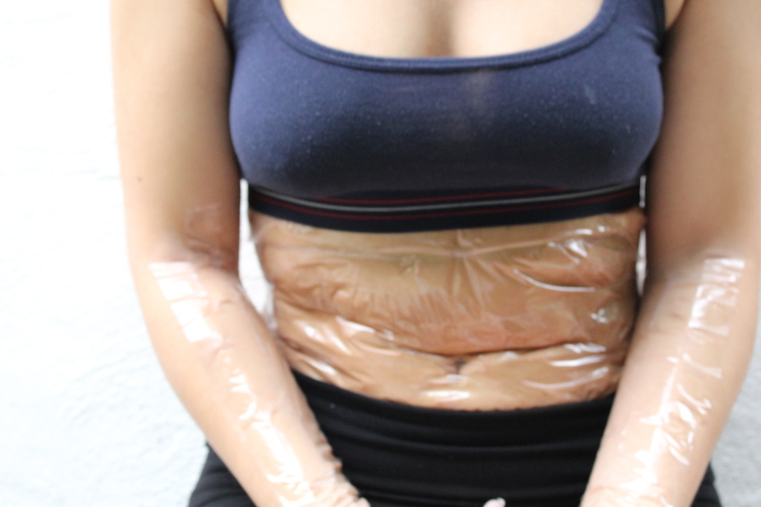
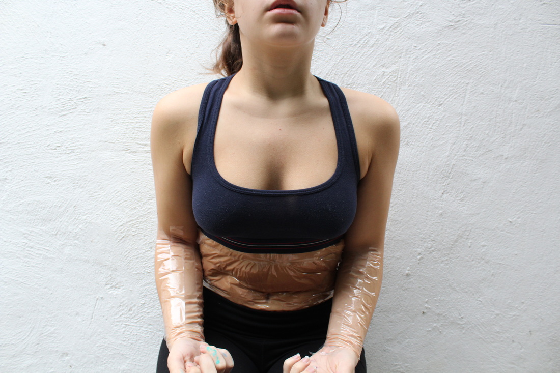
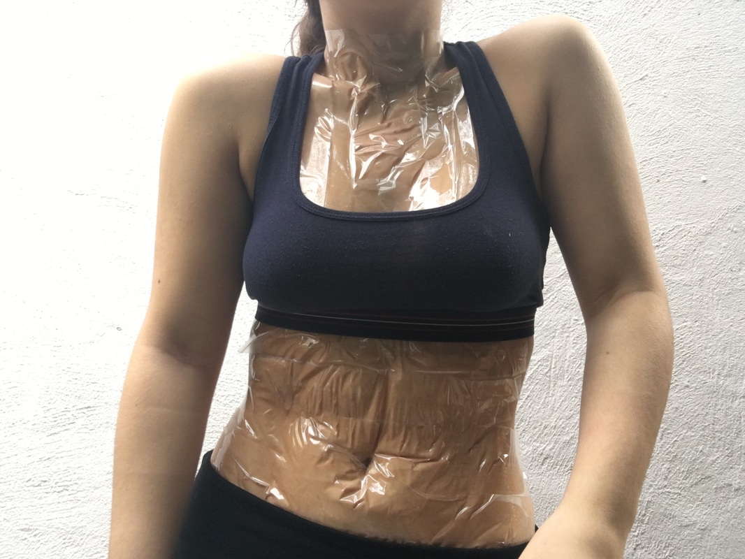
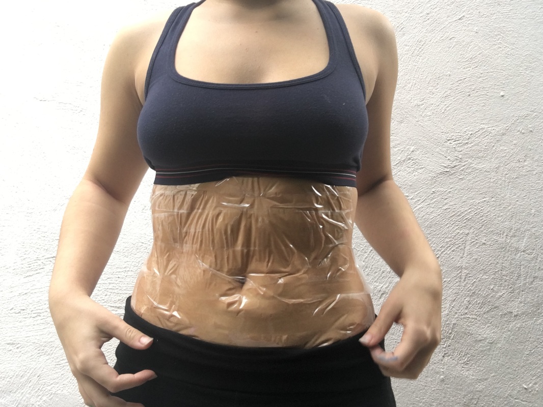
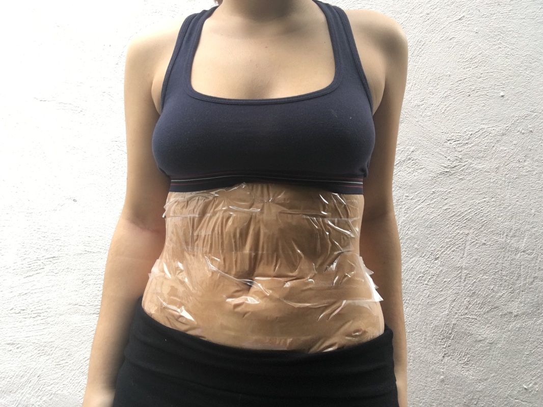
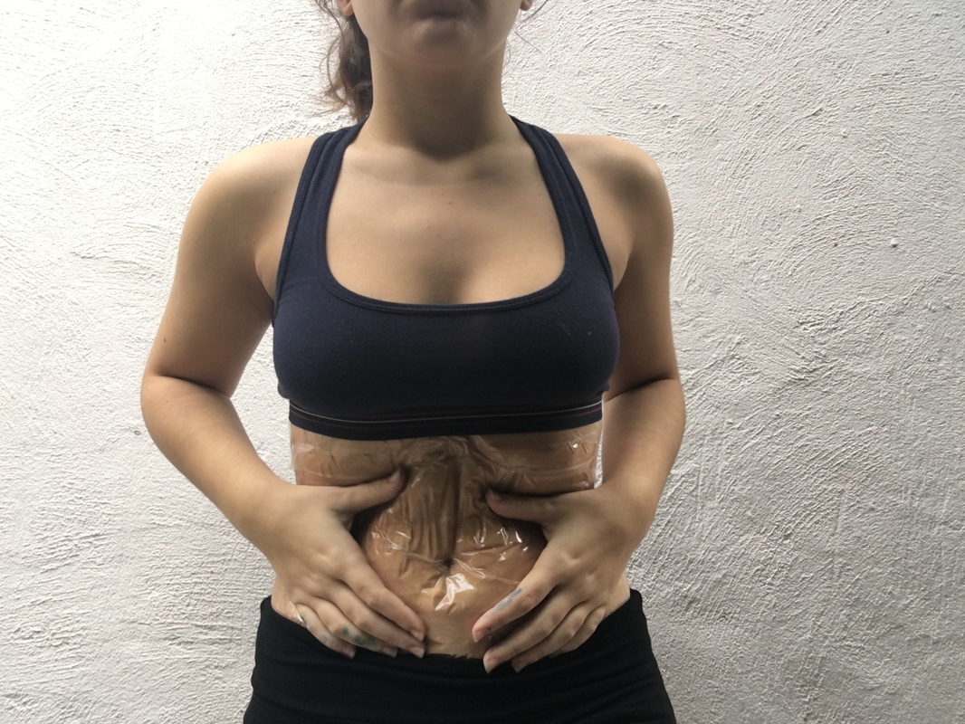
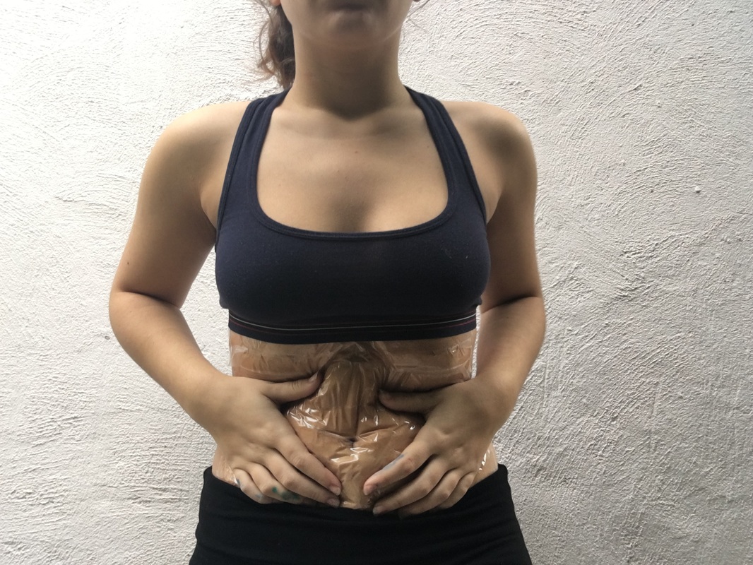
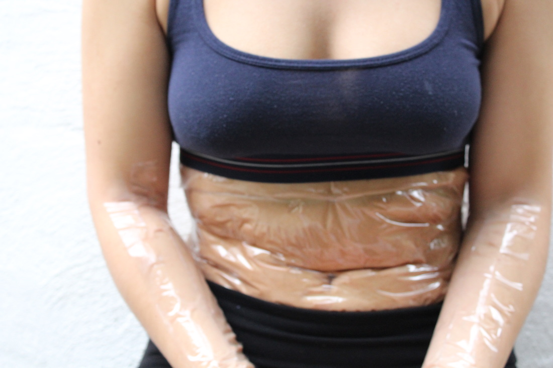
Juke Schoorl
Juke Schoorl is a Dutch photographer who likes to manipulate her subjects to make them look like something else. She is most well known for her fascination with the human body and the ability to manipulate the skin and flesh to make it look different to how it is. She uses simple material such as tape and nylon fishing rope to pull and shape the skin into a new shape. This makes it look as though something is physically wrong with the subject. I have been inspired by her work in my second idea and if I continued on with this idea I would try to manipulate the skin in more than just one way.
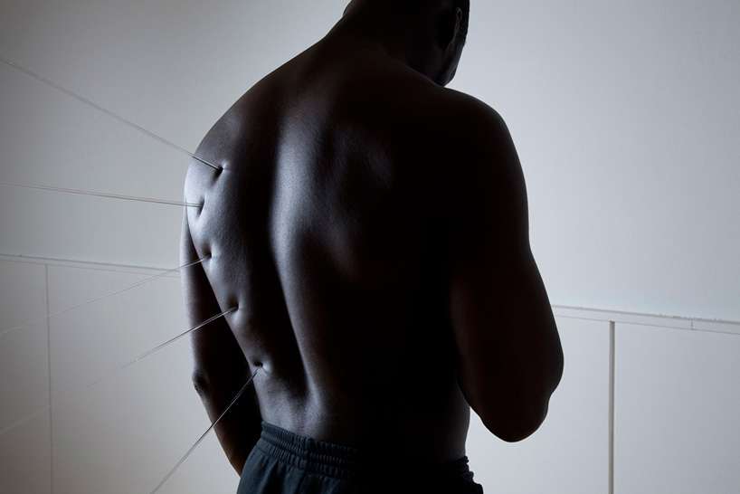
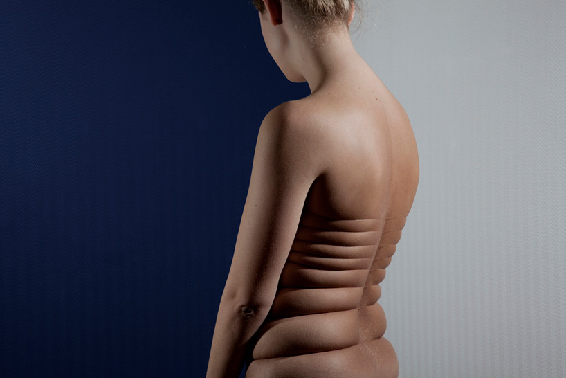
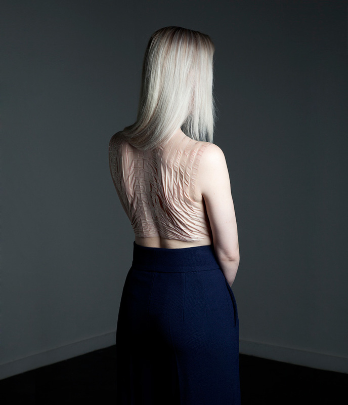
Inspired by the work of Schoorl, I took photos of myself with tape on my stomach, arms and my chest. I liked the way this looked when i moved in different ways and stretched my skin out or sat in a hunched position to make it fold over. It links to the theme of abstraction because I can't control the way in which the photos will come out as I can't know how the tape will make the skin look until the end. If I were to continue with this idea I wouldn't use myself as the model as I found it hard to take them from the right distance/with the right exposure because I couldn't see the photograph I was taking. It also made it difficult to apply the tape to my body in the way that I wanted to.

Strand three
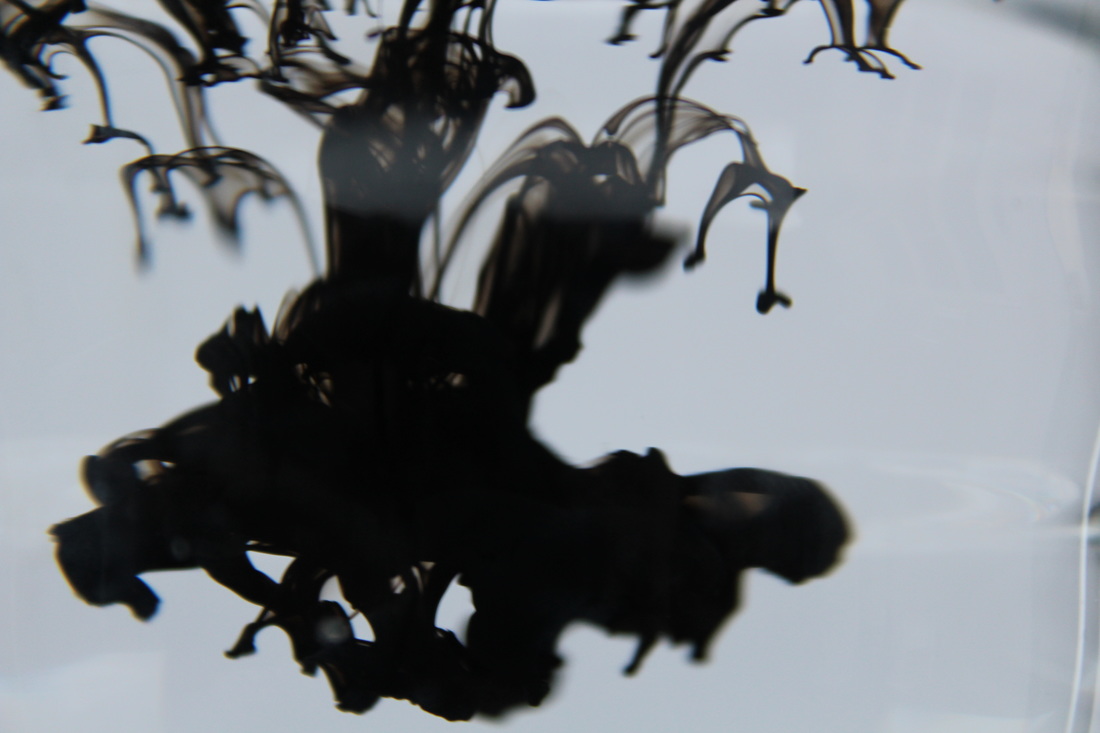
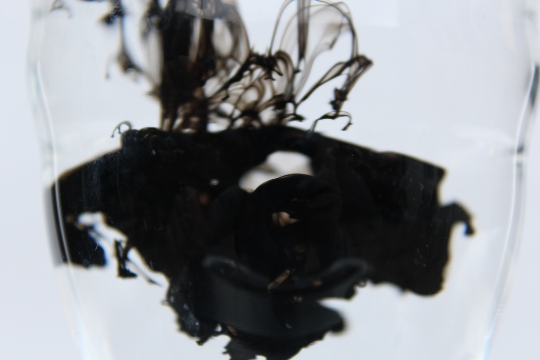
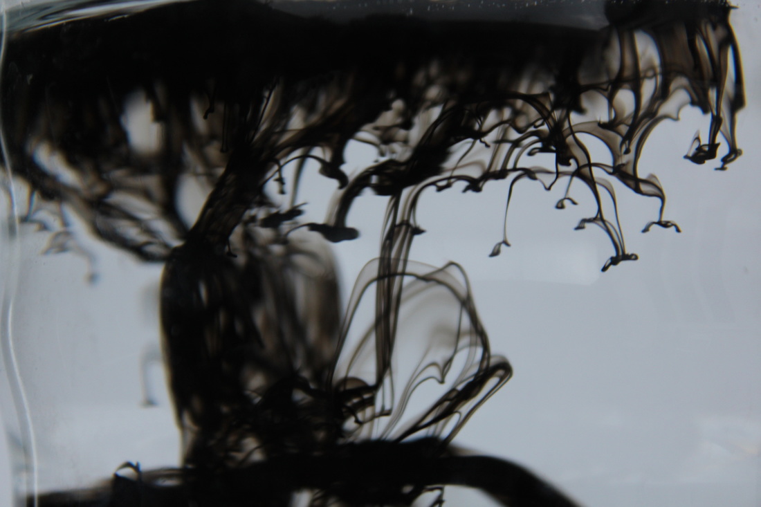
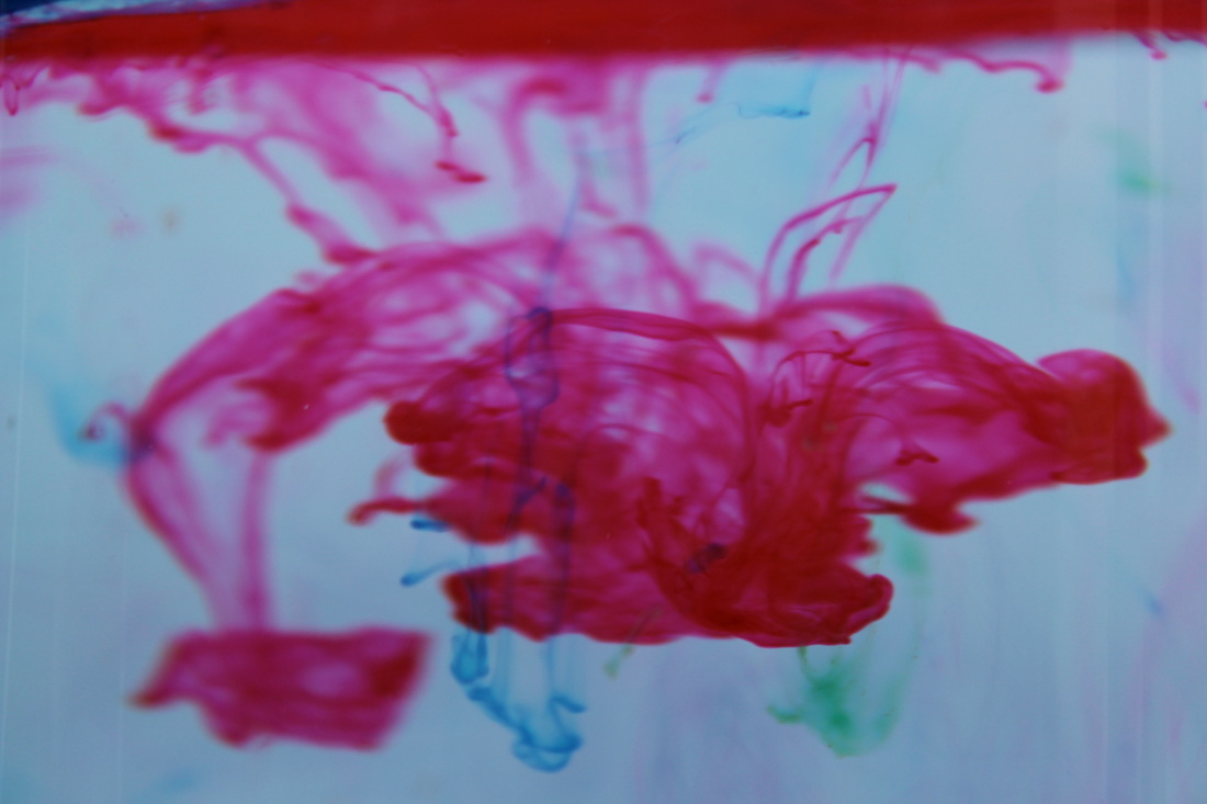
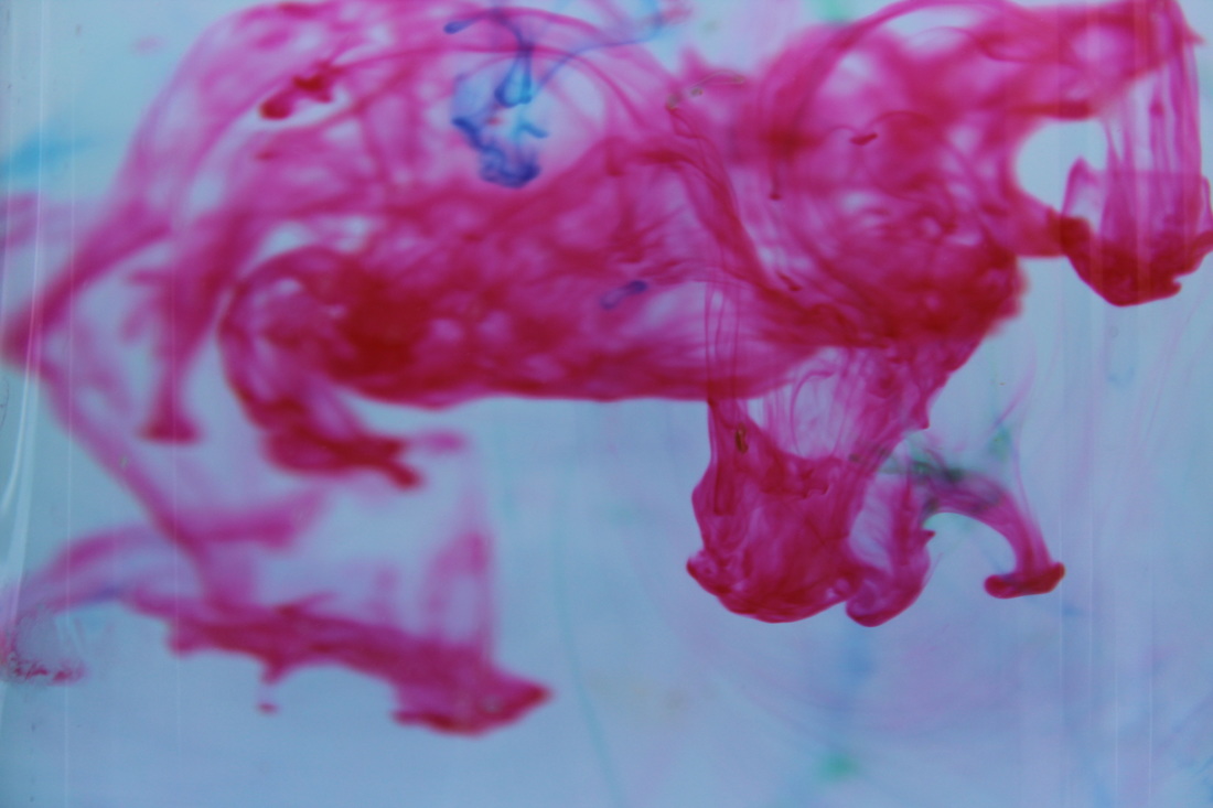
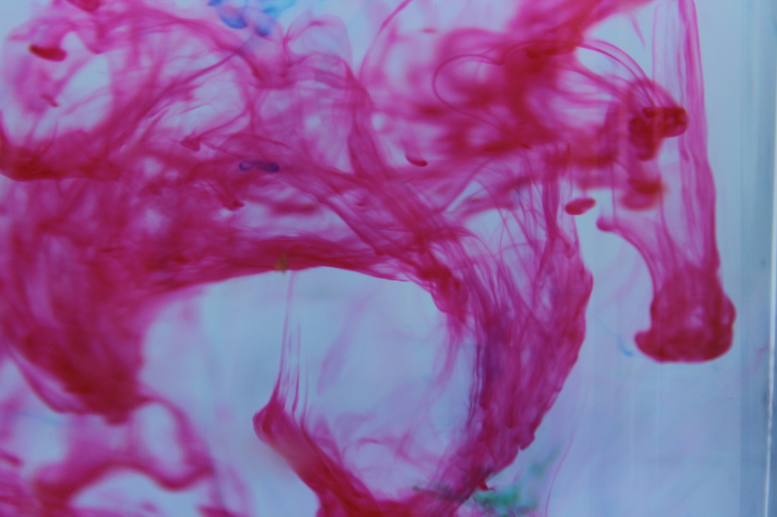
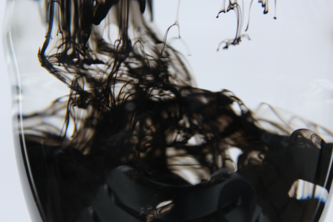
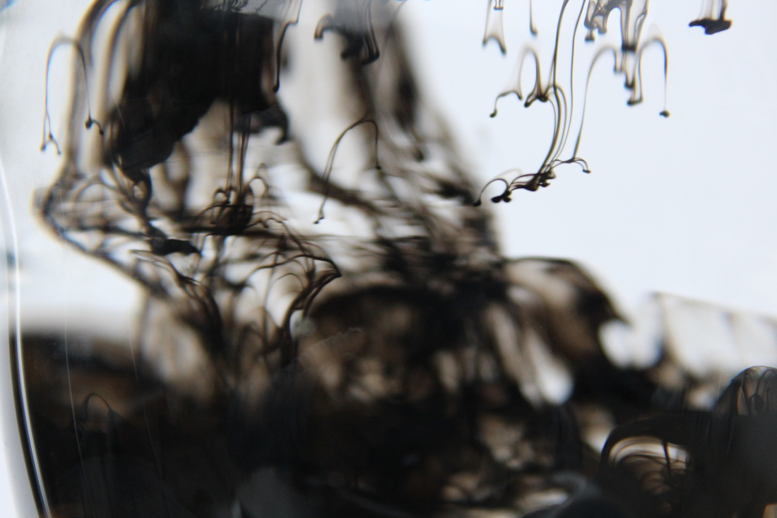
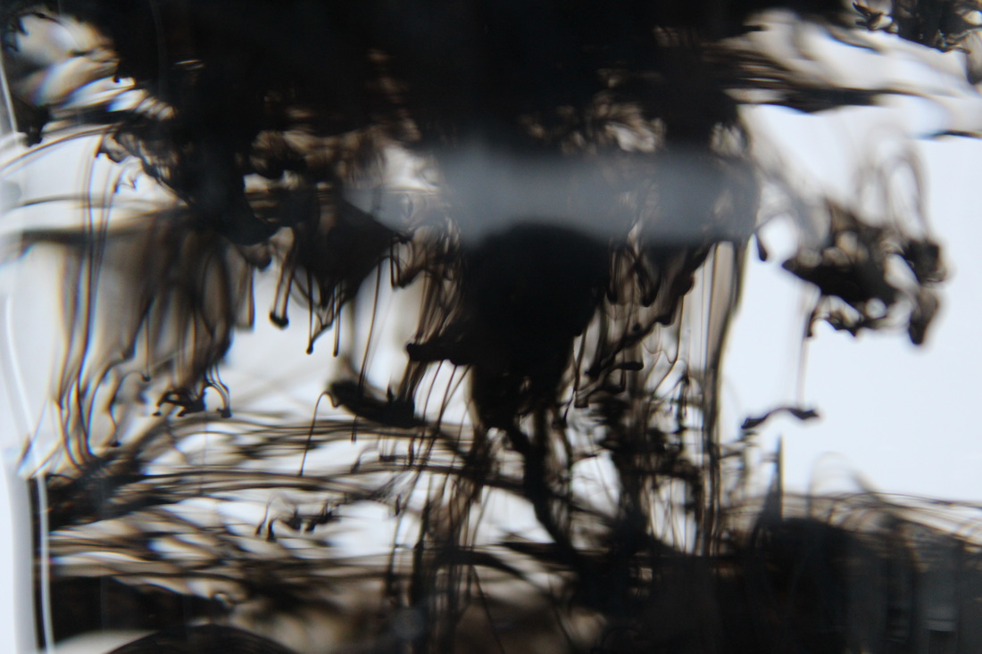
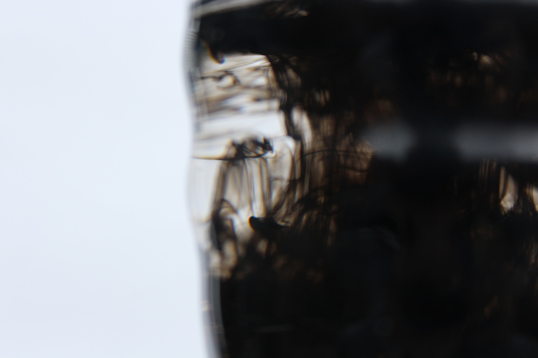
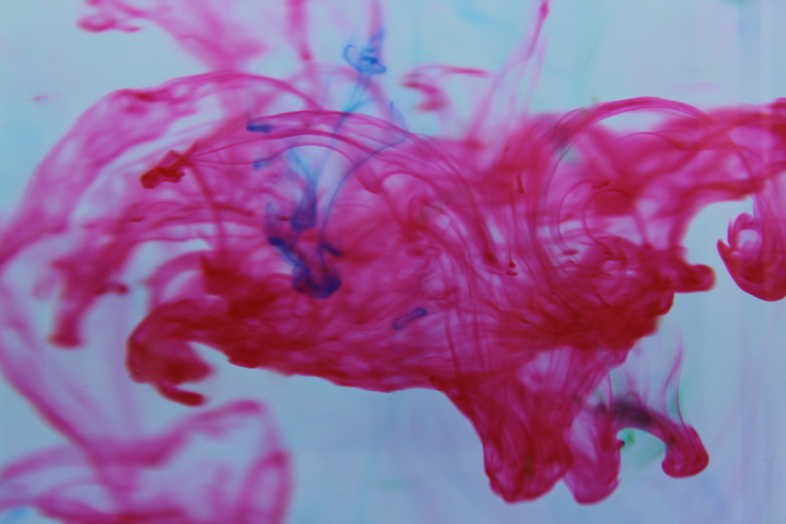
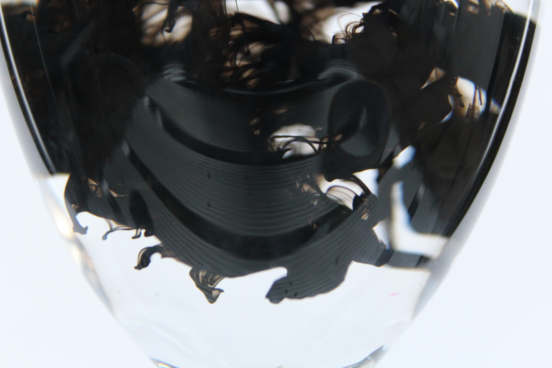
Mark Mawson
Mark Mawson is a British photographer who specialises in taking photographs of inks and other colourful substances and capturing how they naturally act in water. He often flips the photos around at the end so that it looks as though the colour is blooming upwards through the water like a cloud of smoke. He mixes different colours of inks and paints and he uses different coloured backgrounds to make the inks stand out differently.
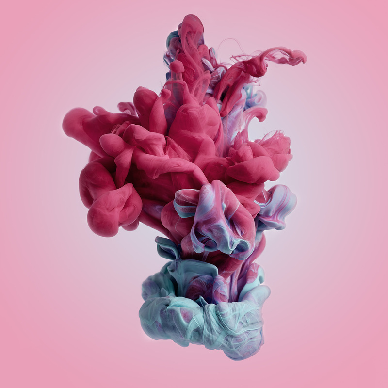
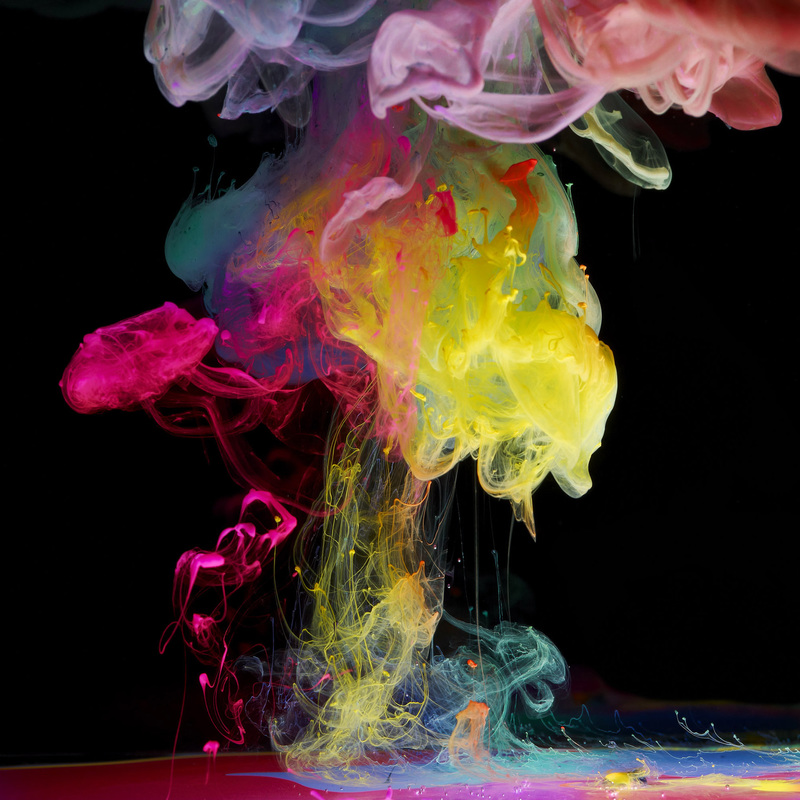
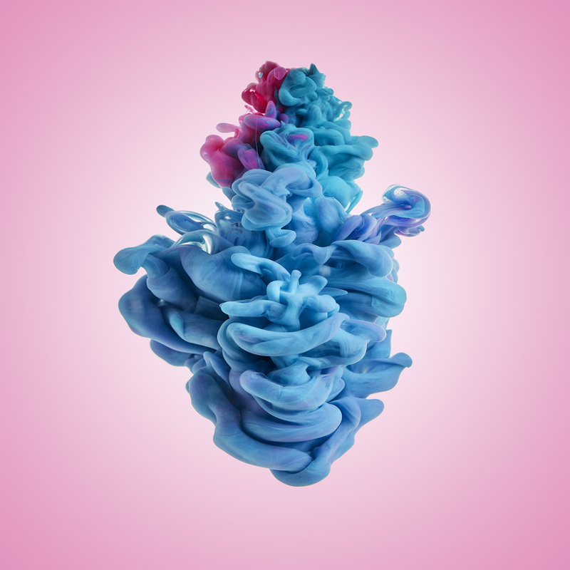
In my third strand inspired by Mark Mawson I attempted to take photos of drawing inks as i poured them into water. This idea links to the title abstraction because I can't control the shape of the 'blooms' of ink. I taped a piece of paper behind the glass so that the inks stood out against the background. I tried different colours of ink, different shapes and sizes of containers of water and different methods of tipping the ink in. I found that my results were best when I used a large, flat container without any shapes or curves to it because some of the shaped glasses distorted the image inside. To continue with this idea and improve it I would use a faster shutter speed, because some of the images were too blurry, to get the same sort of definition that Mawson gets. I would also use a wider range of colours and try to mix them/ use different types of coloured pigments to see how different substances act with water.


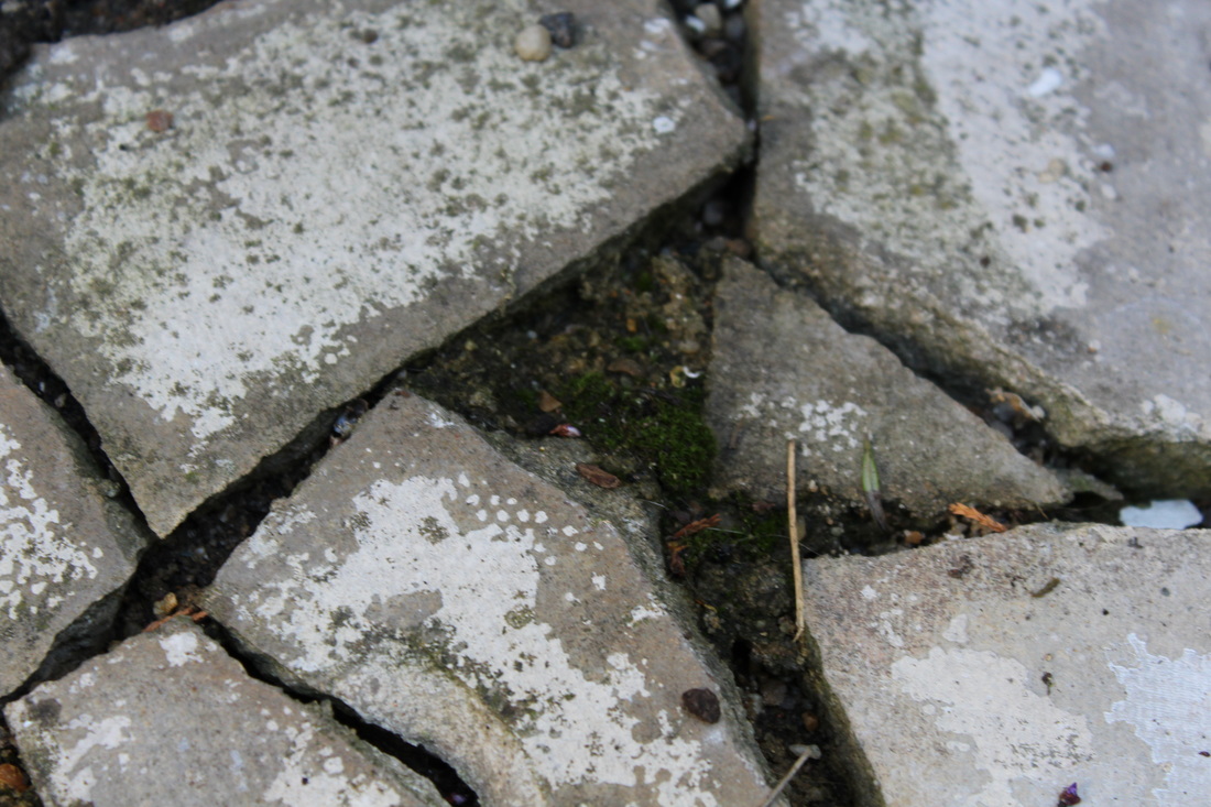
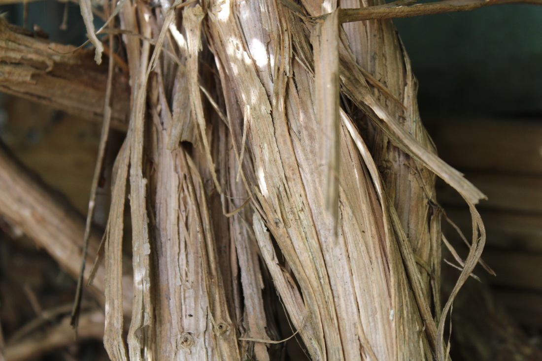
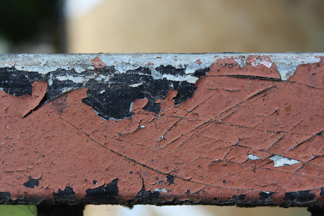
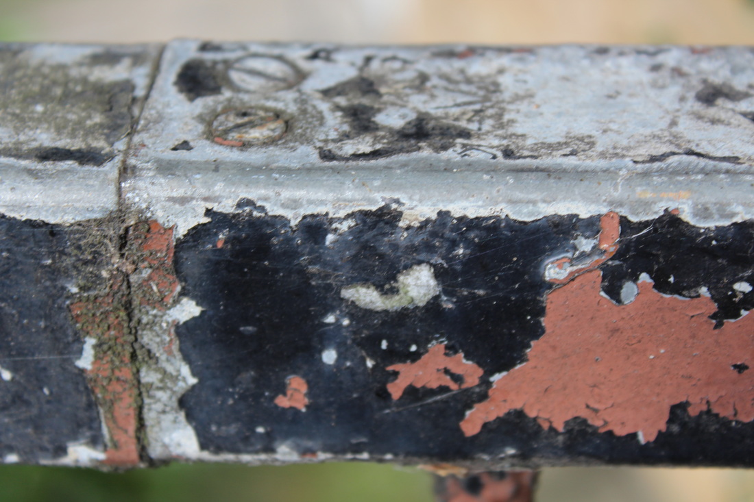
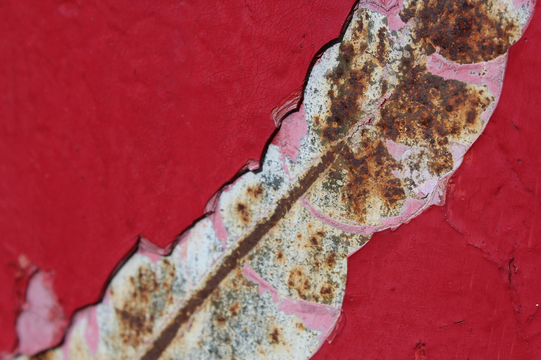
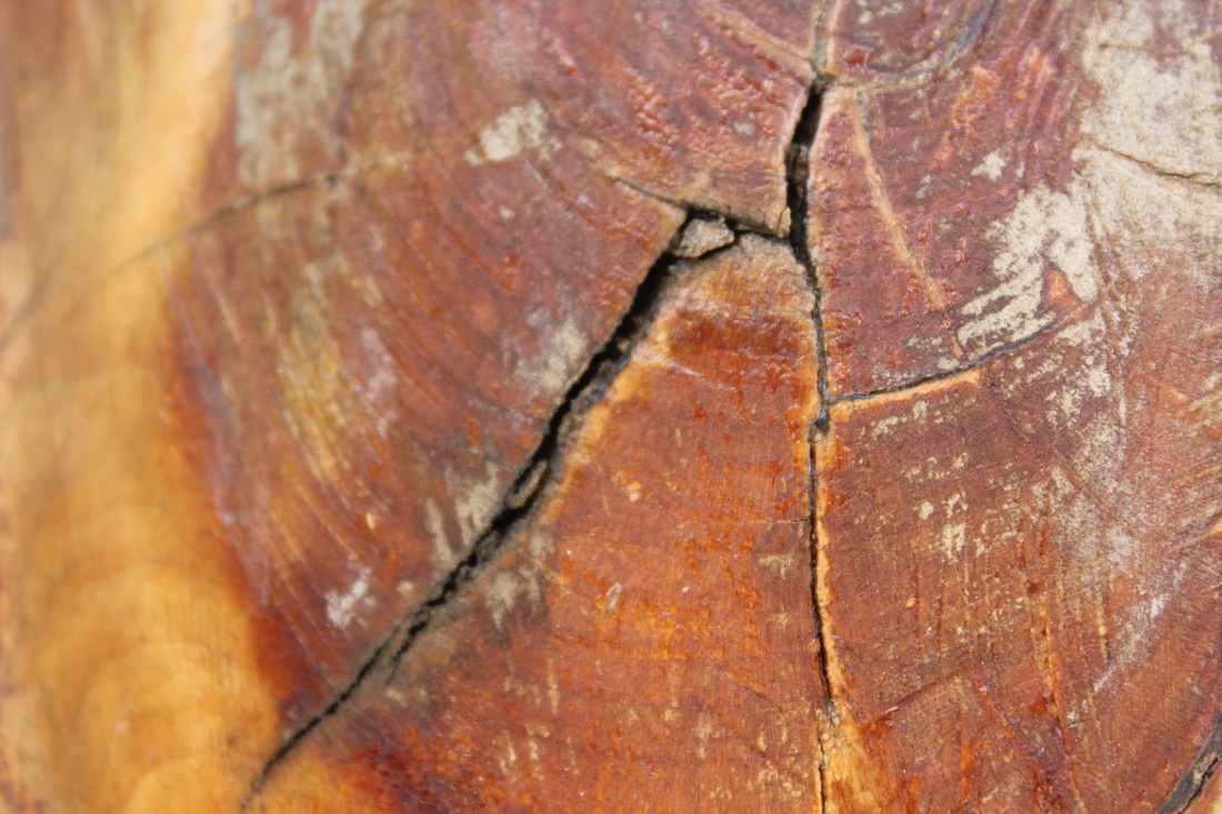
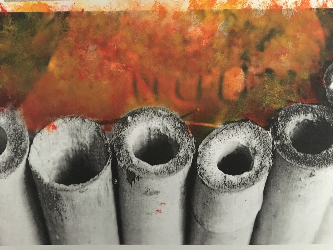
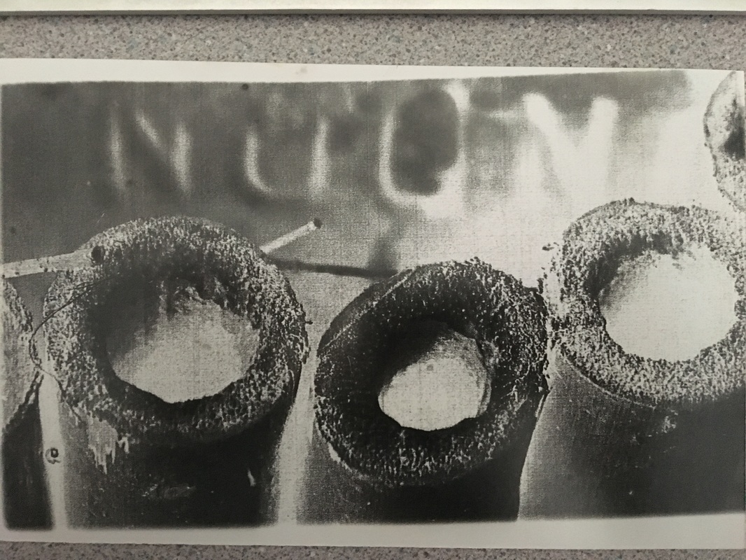
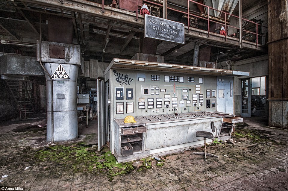
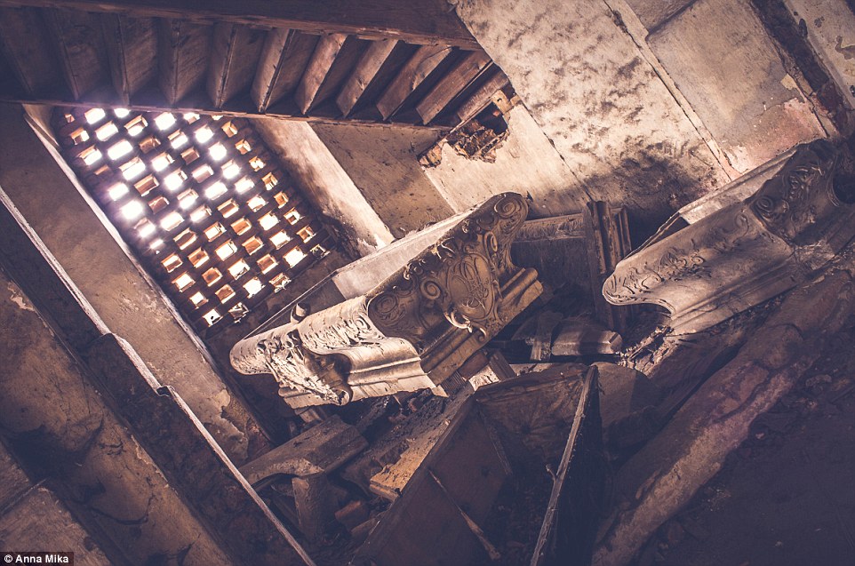
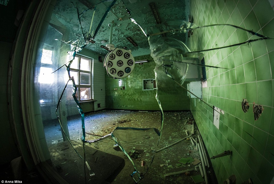
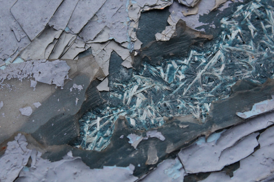
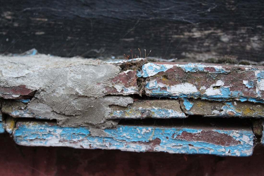
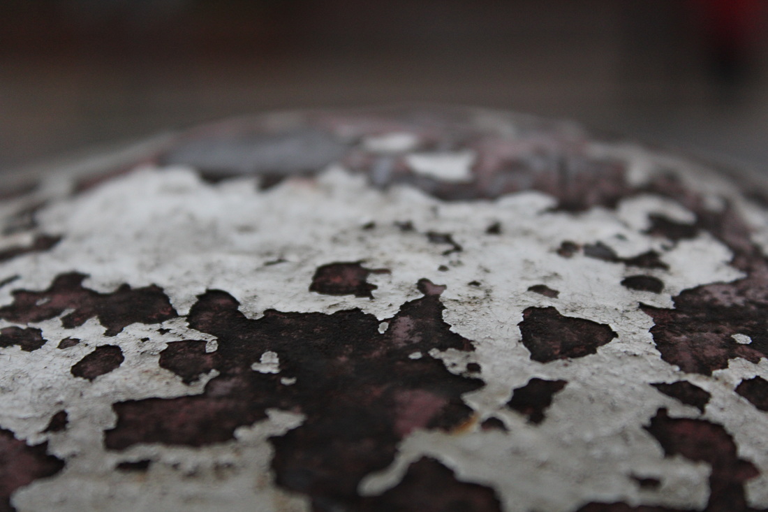
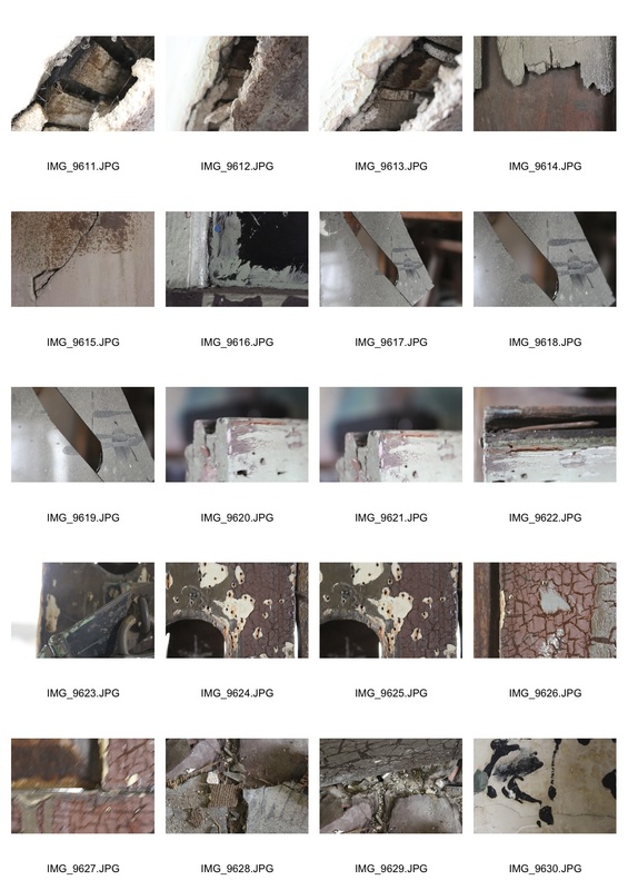
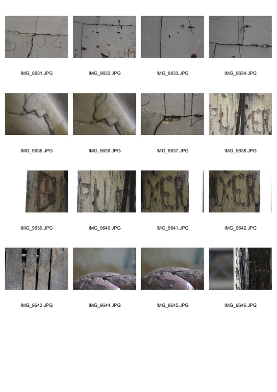
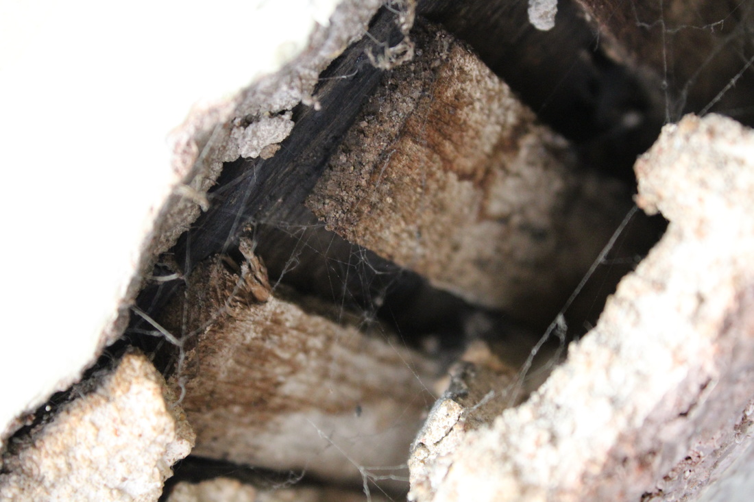
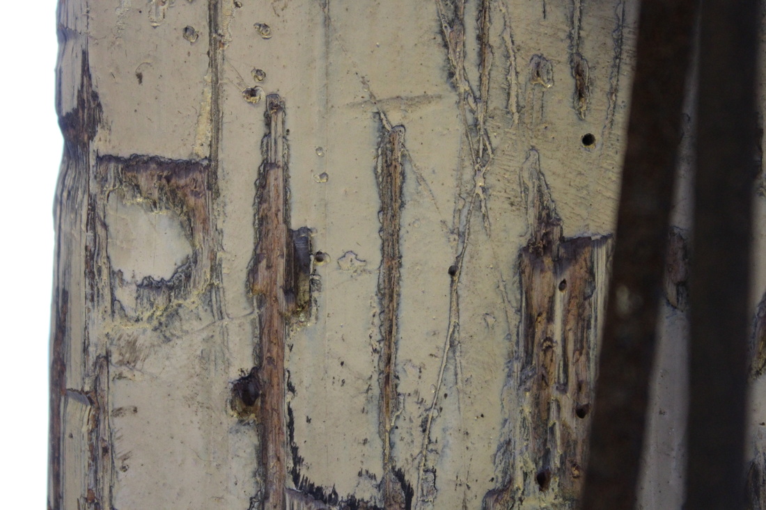
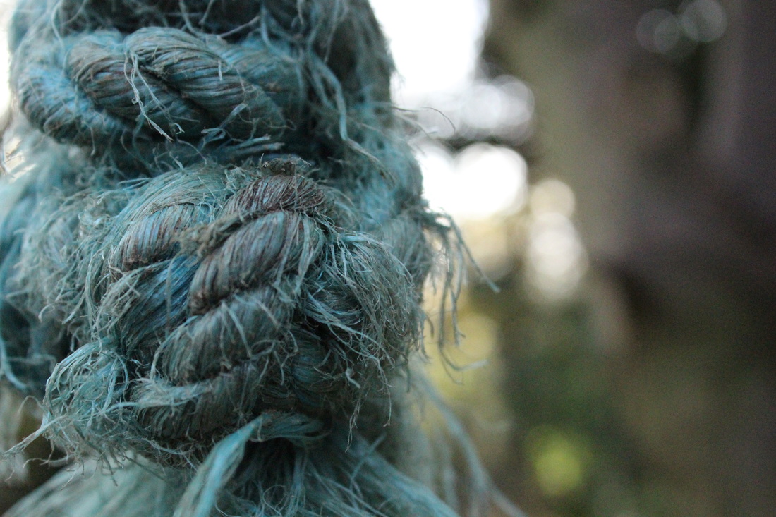
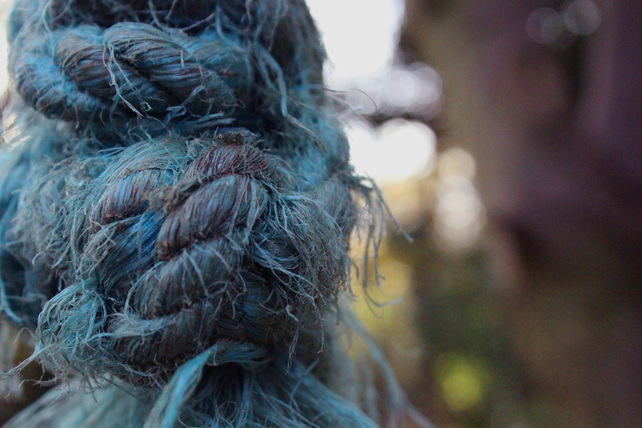
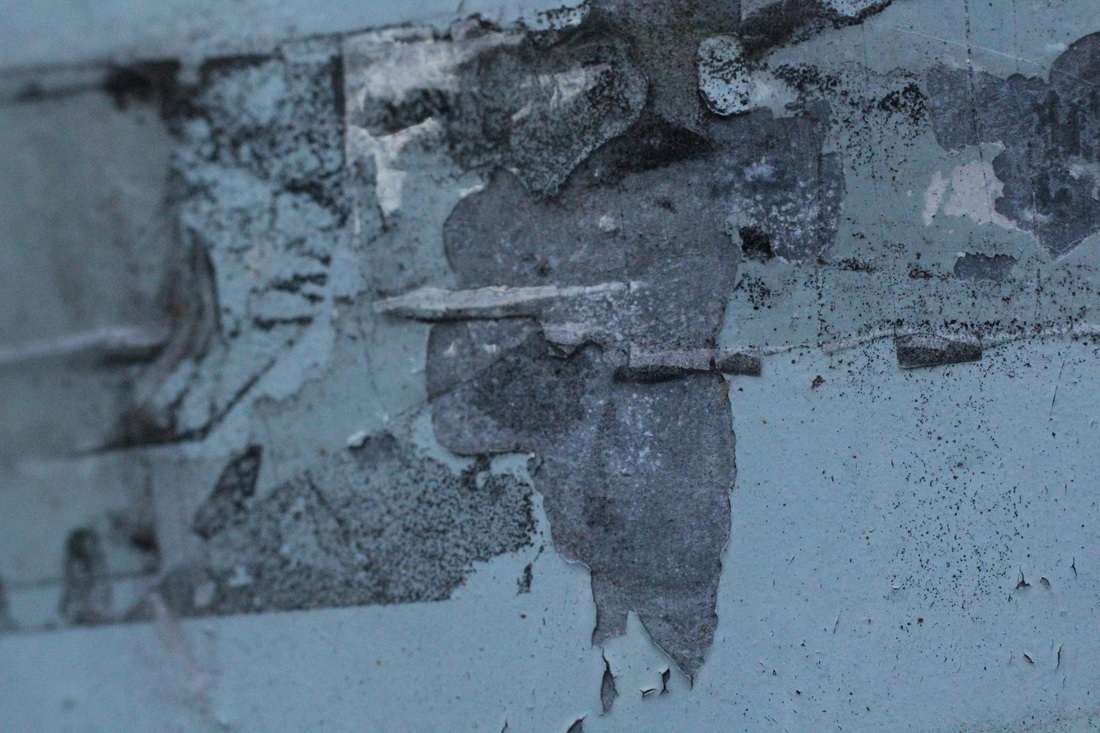
dereliction
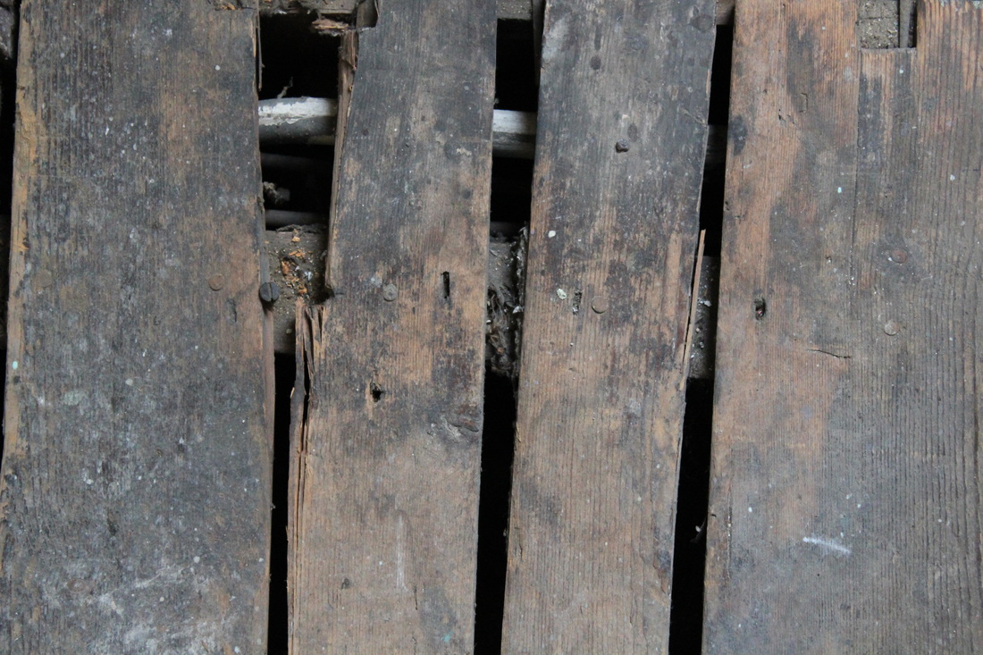
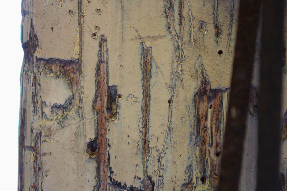
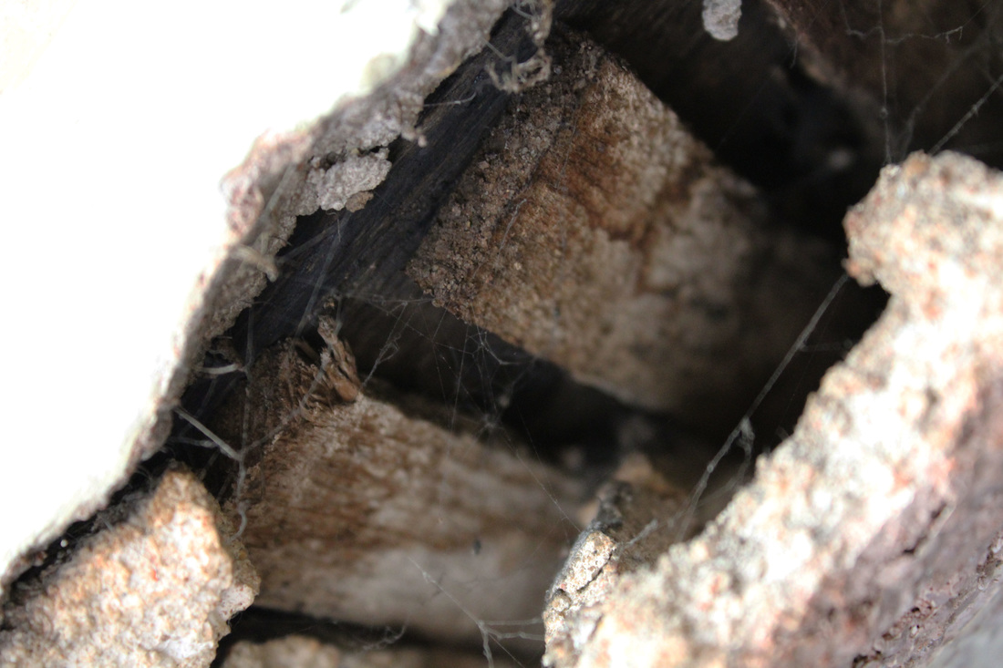
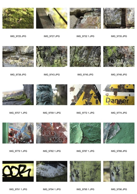
The strand that I chose to develop is Dereliction. I chose this because I can develop it in many ways and explore different aspects of it. For example I am going to experiment taking close up photographs of decayed and destroyed things so that you can clearly see layers and texture in materials, and I am also going to look at photographing whole sceneries of decay; a setting or a building.
In the photos below I went into an abandoned attic above school and took close-up photos of some of the decay and dereliction that I found up there. Although I like some of these images I think to continue with looking at close up dereliction it would be better if I used a lens that allows me to photograph small things in more detail because I found it difficult to focus on smaller details.
In the photos below I went into an abandoned attic above school and took close-up photos of some of the decay and dereliction that I found up there. Although I like some of these images I think to continue with looking at close up dereliction it would be better if I used a lens that allows me to photograph small things in more detail because I found it difficult to focus on smaller details.
|
|
|
|
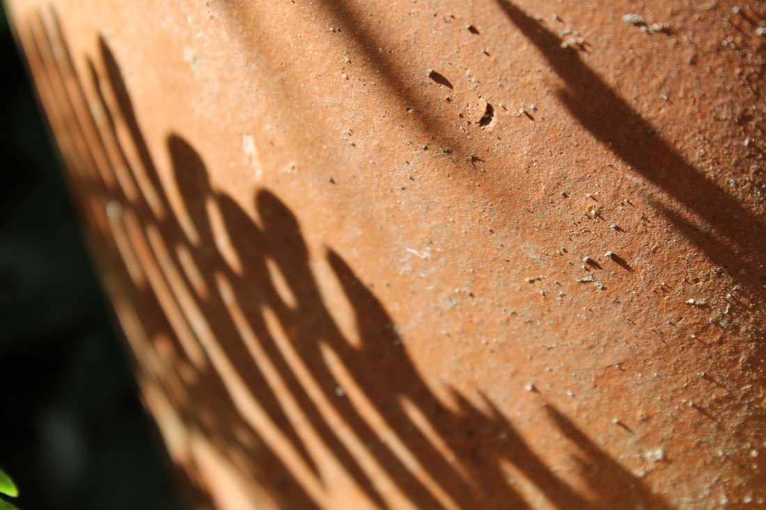
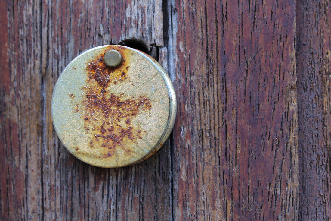
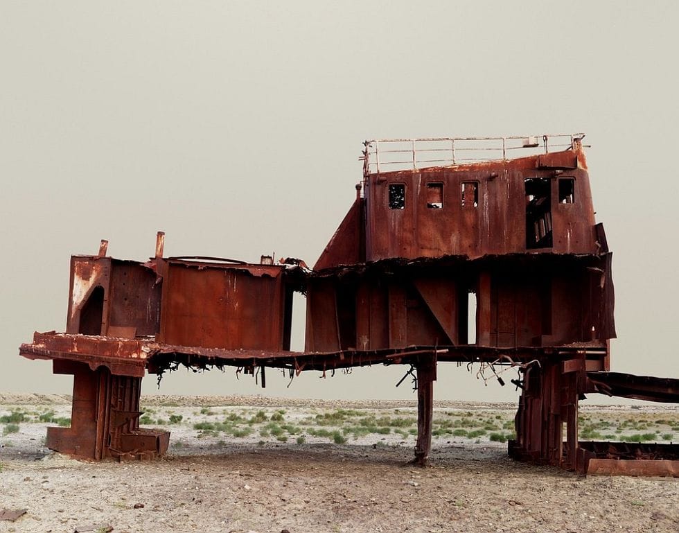
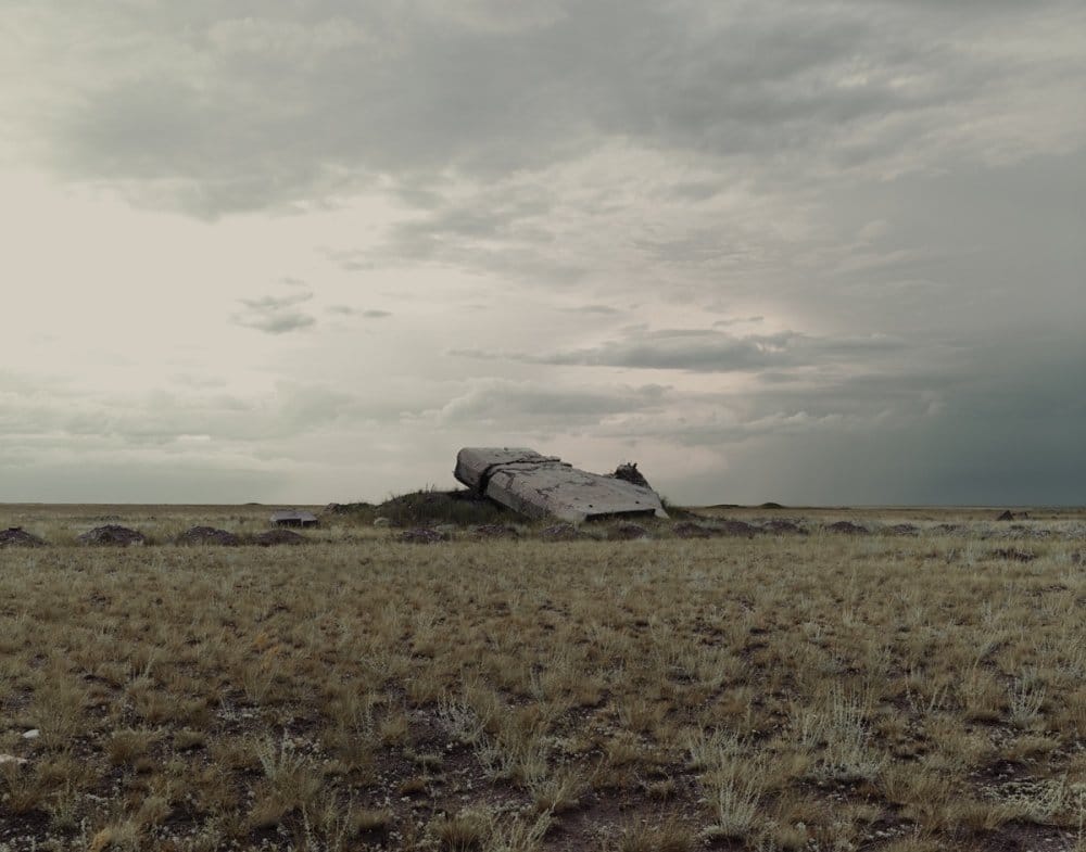
nadav kander
Nadav Kander is a photographer born in Israel, raised in South Africa and currently living in London. He was inspired heavily by the photographers Strand, Stieglitz, Weston and Atget growing up because he felt that their photography reflected each of their lives and individualities and he wanted to replicate this. In this series, Dust, Kander took photos of abandoned cities in Russia in an attempt to mesmerise whoever viewed them and capture the attention of people by showing them something forgotten and destroyed and present them in a beautiful way. He wanted to show 'the dark side of nature' and 'the combination of beauty and destruction'. I liked this idea so I took inspiration from it and went onto Parkland Walk and took photographs of naturally decaying things that I found along the way.

|
I could have improved these photos by taking a wider range of photos and not so many close ups of the same sort of thing. I think that there is too much green in the photos which creates the opposite of the effect that I want because it makes the content of the photos seem more alive than abandoned which isn't what I was aiming for. I think to continue with my project I will look at more urban decay and dilapidation because there are more brighter and different colours that I can photograph which will look more interesting. I think that after I changed the saturation and hues in the photographs they looked better because they were more interesting, but I only chose photos which weren't predominantly green which defeated the point of the photos a little bit because I ignored the more natural decay that I came across.
|
|
|
|
|
Klaus Pichler & Nadav kander- rotting
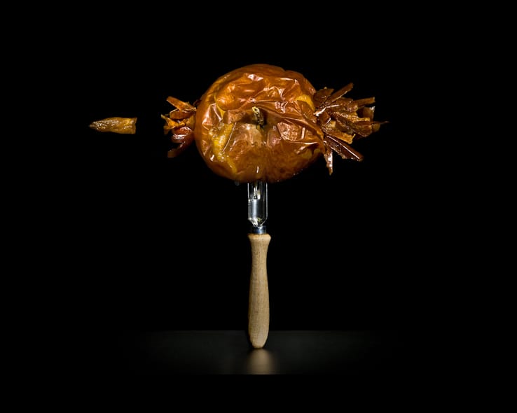
I wanted to explore another aspect of decay which wasn't vandalism or dilapidation, so I looked at rotting/moulding foods. Although it branches off quite far from my original ideas I didn't want to limit myself to only the decay of objects, but also living things.
The first photographer I took inspiration from was Klaus Pichler with his 'One Third' series of photographs which shows various rotting fruits, vegetables and other foods. The series was named One Third after he read a report from the UN that said one third of the world's food goes to waste. Each photo is presented with detailed descriptions of where and when they were produced and also their carbon footprint. This extra information is important to the series of photographs because it helps the photographer convey the message of the impact of food waste; when someone is shown all of the information behind one piece of produce which has just been left to go mouldy it emphasises the issue. Pichler says that the photos 'go past the sell by date in order to document the full dimensions of the global food waste'. Aesthetically, I chose these photos as inspiration because I like the abstract presentation of them and how Pichler managed to show something which is usually considered ugly and dirty in a way which is artistic and nice to look at.
The first photographer I took inspiration from was Klaus Pichler with his 'One Third' series of photographs which shows various rotting fruits, vegetables and other foods. The series was named One Third after he read a report from the UN that said one third of the world's food goes to waste. Each photo is presented with detailed descriptions of where and when they were produced and also their carbon footprint. This extra information is important to the series of photographs because it helps the photographer convey the message of the impact of food waste; when someone is shown all of the information behind one piece of produce which has just been left to go mouldy it emphasises the issue. Pichler says that the photos 'go past the sell by date in order to document the full dimensions of the global food waste'. Aesthetically, I chose these photos as inspiration because I like the abstract presentation of them and how Pichler managed to show something which is usually considered ugly and dirty in a way which is artistic and nice to look at.
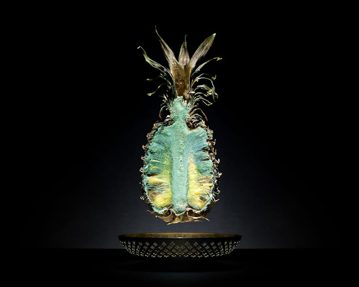
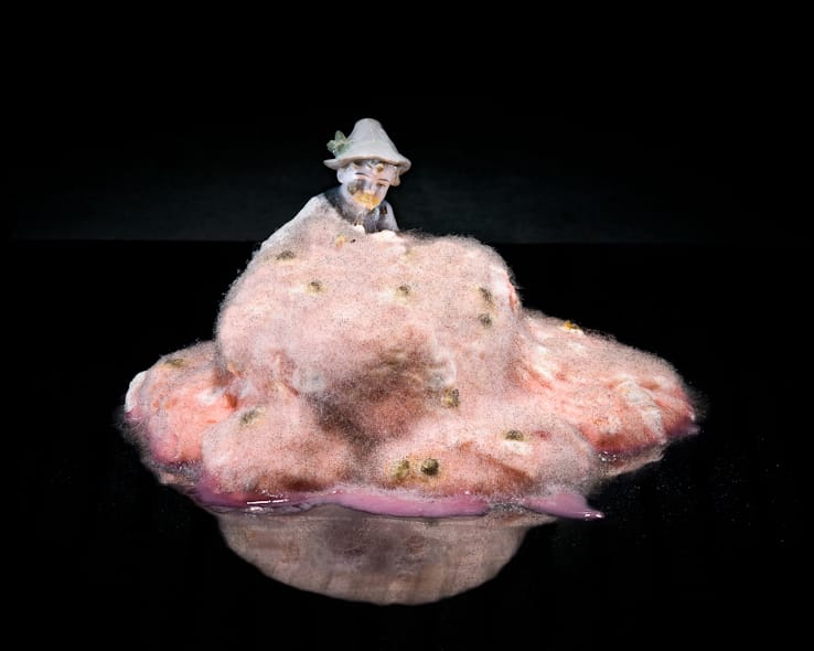
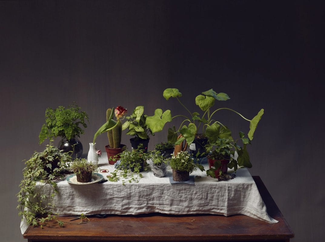
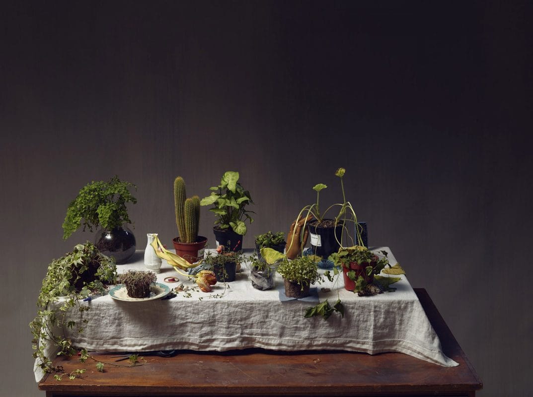
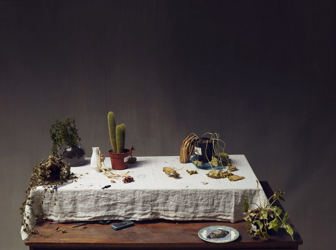
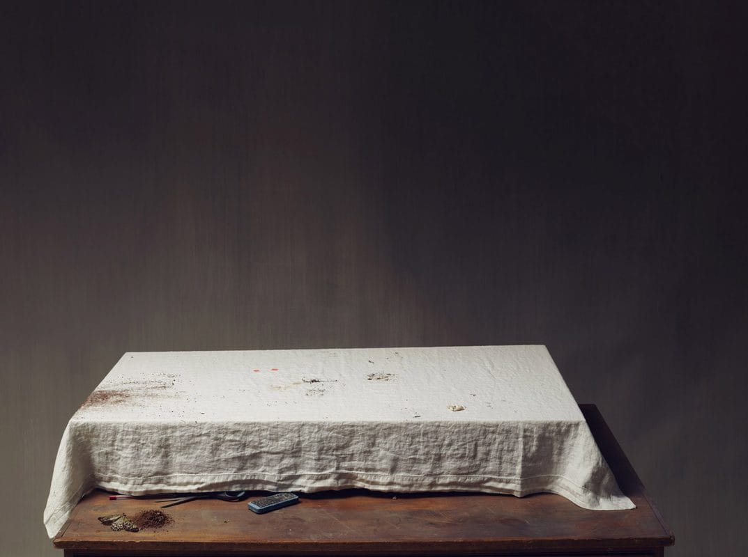
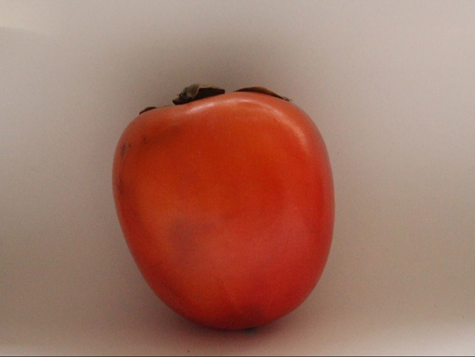
Nadav Kander's series of work called Nature Morte was another inspiration for this idea. Nadav Kander is well known for depicting things in their natural and raw state and making them beautiful, such as his Dust series which I previously looked at. 'Nature Mort' is a series of photographs taken over a period of time which shows a table of plants dying and becoming more sparse as more of them die. I couldn't find much information about these photographs such as the photographer's intentions when creating this series but I liked the eeriness of the photos, especially the last one where there is nothing left, because I think it shows the fragility of nature and how disposable life is.

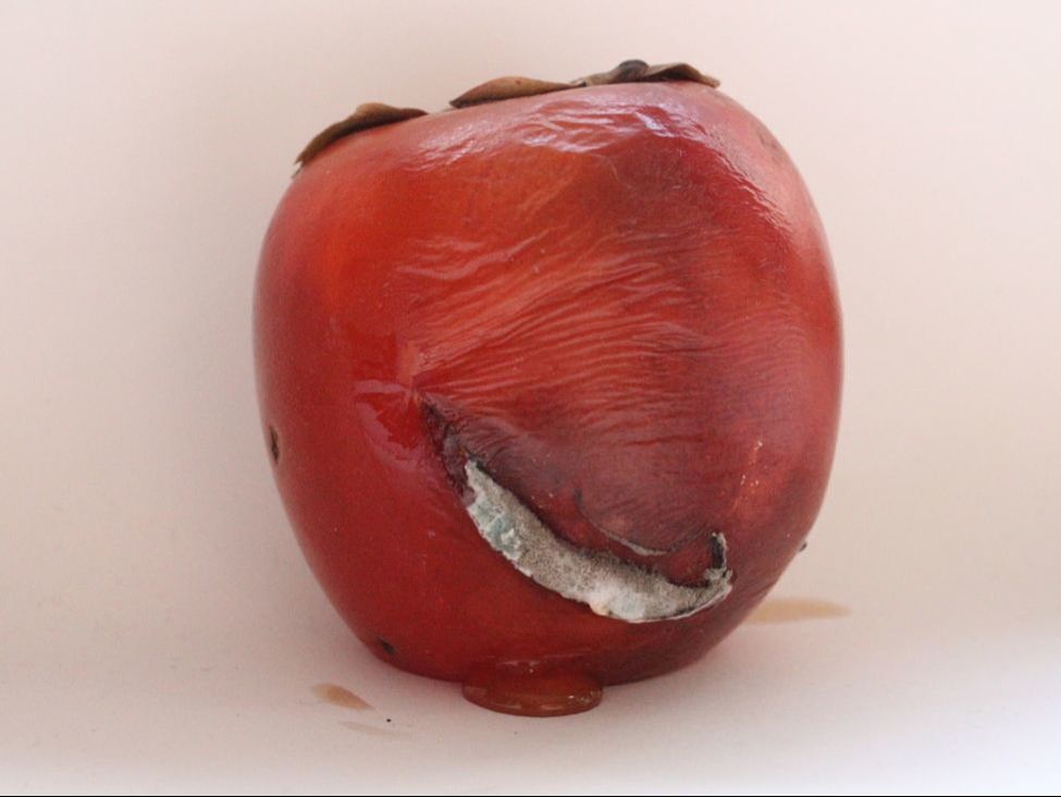
I started off with an apple, but after I left it for a few days I realised that I would need a fruit which had softer flesh so I found a persimmon, which I knew has very soft flesh and skin, and I put it on a piece of white paper in the warmest room in my house. I took a photo of it at the beginning using natural lighting and then a few weeks later when it was mouldy. I would have waited for longer but the process took a very long time and it decayed less than I expected it to in the time I had, considering it was already quite soft when I began. I would have preferred to have a black background to reflect both of the photographers work who I took inspiration from, but I didn't think about this until afterwards. Because my camera wasn't on a tripod for the first photo I found it quite difficult to take a photo in the same position as the first one, so it doesn't have the same effect as Nature Mort. I could have set up a tripod and taken a photo every day instead of just taking photos at the start and end.
I am not going to use this idea in my final piece because it was very time consuming and I don't have a good enough setup to make it look as professional as the photographers I took inspiration from. Despite this I am glad I experimented and branched out from my original idea because it helped me to learn more about what I should consider before starting a project.
I am not going to use this idea in my final piece because it was very time consuming and I don't have a good enough setup to make it look as professional as the photographers I took inspiration from. Despite this I am glad I experimented and branched out from my original idea because it helped me to learn more about what I should consider before starting a project.
|
|
barry lewis
Barry Lewis is a popular modern photographer based in London. His Visual Noise series of photographs consists of many different smaller collections titled things such as 'Covered', 'On the Road' and 'Signs of Time'. I have decided to focus on 'Decay' and 'Surface' because they portray dereliction and decay found in every day life, both close up and further away, which is what I am focusing on in my project. I like the way that his photos are vibrant and eye-catching. They make the viewer think more about what he has photographed; how it ended up in that way and the meaning behind it.
|
|
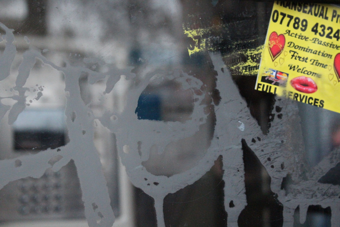
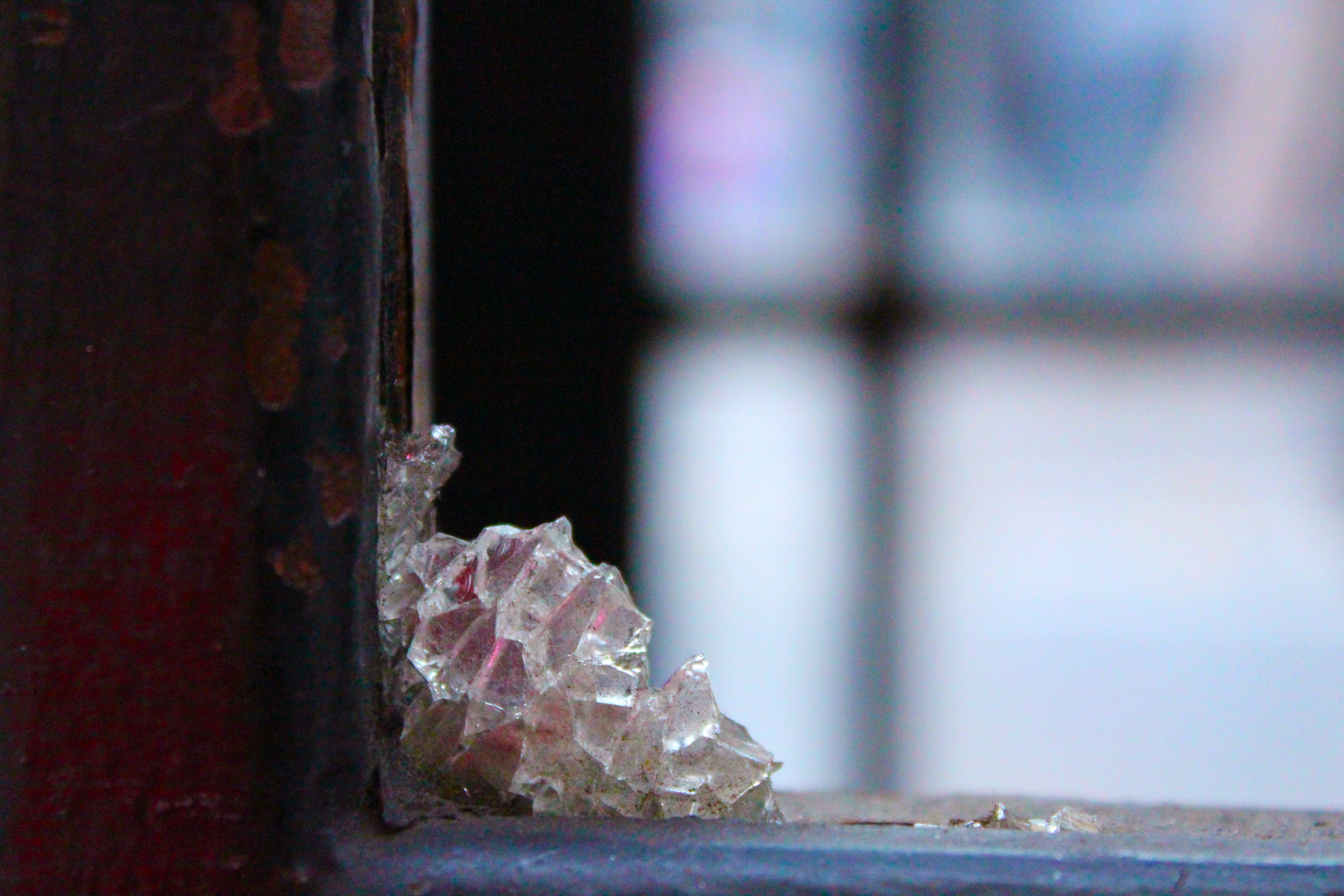
Being inspired by Barry Lewis, I went out into Leicester Square and took photos in an attempt to recreate the type of photos that he has taken. I think I achieved this well because compared to before when the photographs I took were of more natural dilapidation, the ones I took here show the sort of dilapidation that occurs in more public places due to vandalism etc. They include graffiti, peeling paint and smashed glass.

|
I chose the photos that I believe are the best of the three photographs and I edited them in photoshop. When editing I only adjusted the colour levels, saturation and exposure to make the photographs look more vivid and colourful like Barry Lewis' photographs are. I didn't want to edit my images very drastically to change the whole thing because I wanted to make sure it was clear what the photos are of and I wanted the focus to be on the dilapidation rather than my editing. I like how these photographs turned out more than any other series of photographs I have taken so far because they are eye-catching and portray a much more meaningful message than my other photographs. I also like the urban setting of them because it shows the reality of the decay and vandalism within one of the most expensive cities on earth.
|
|
|
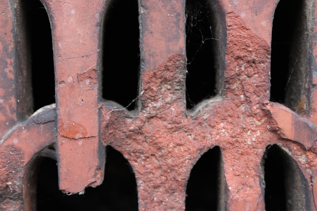
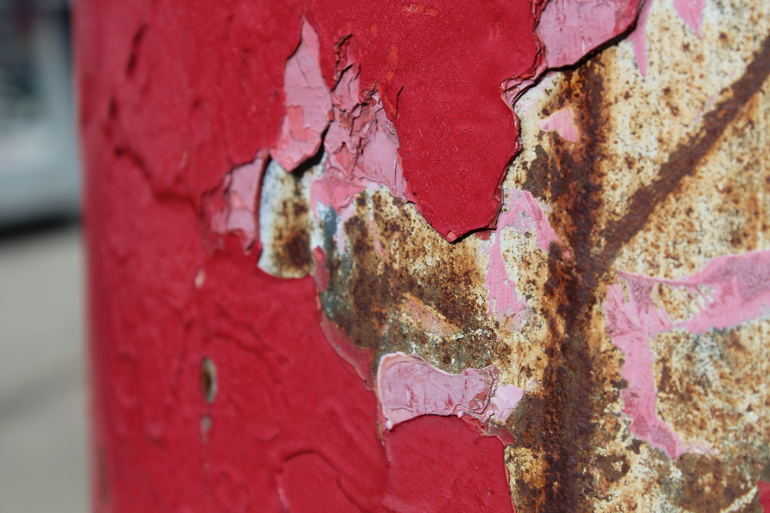
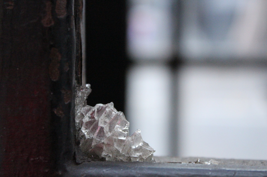
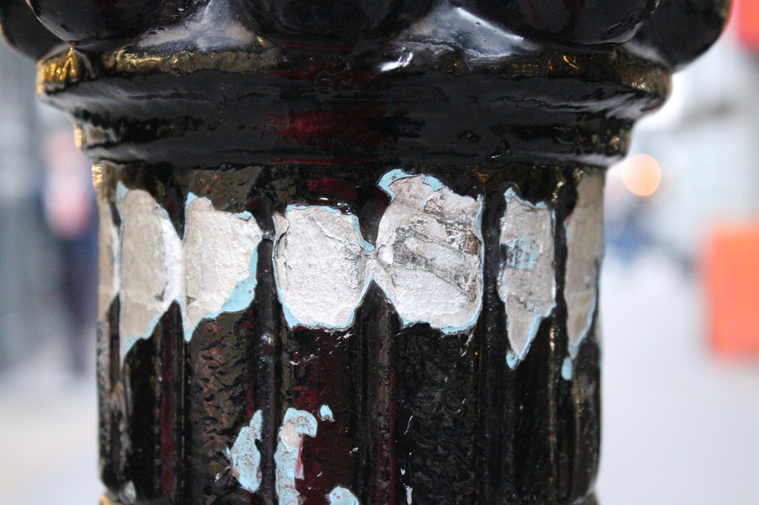
colin winterbottom
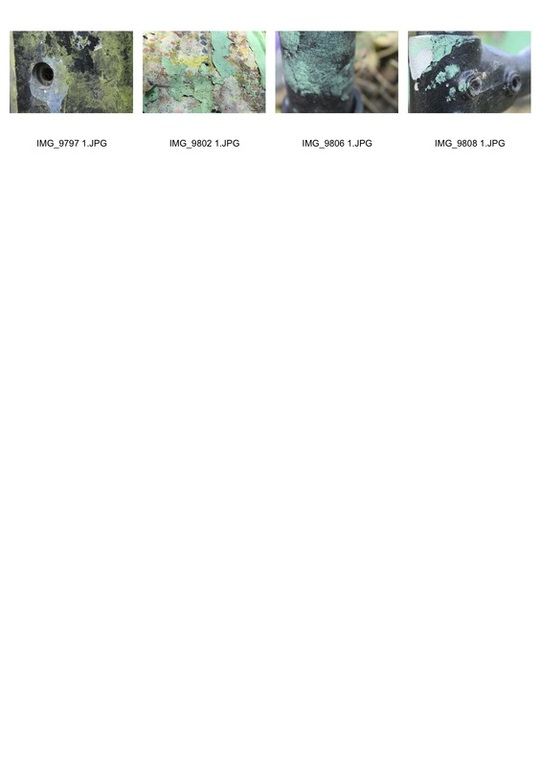
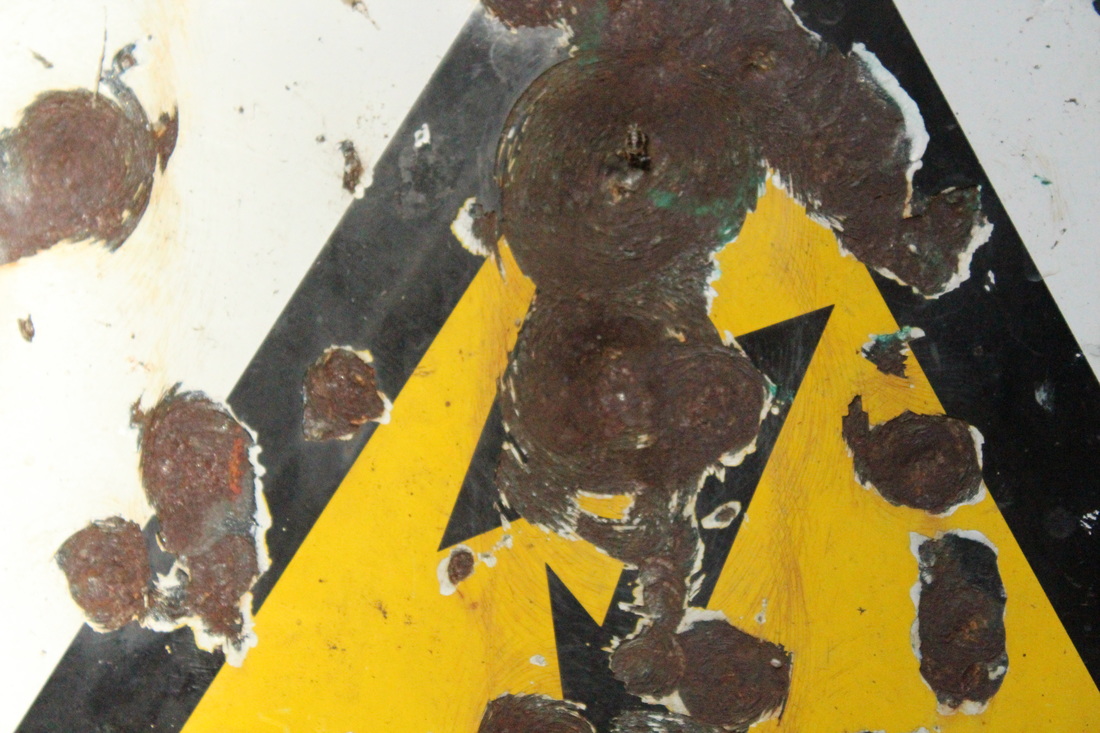
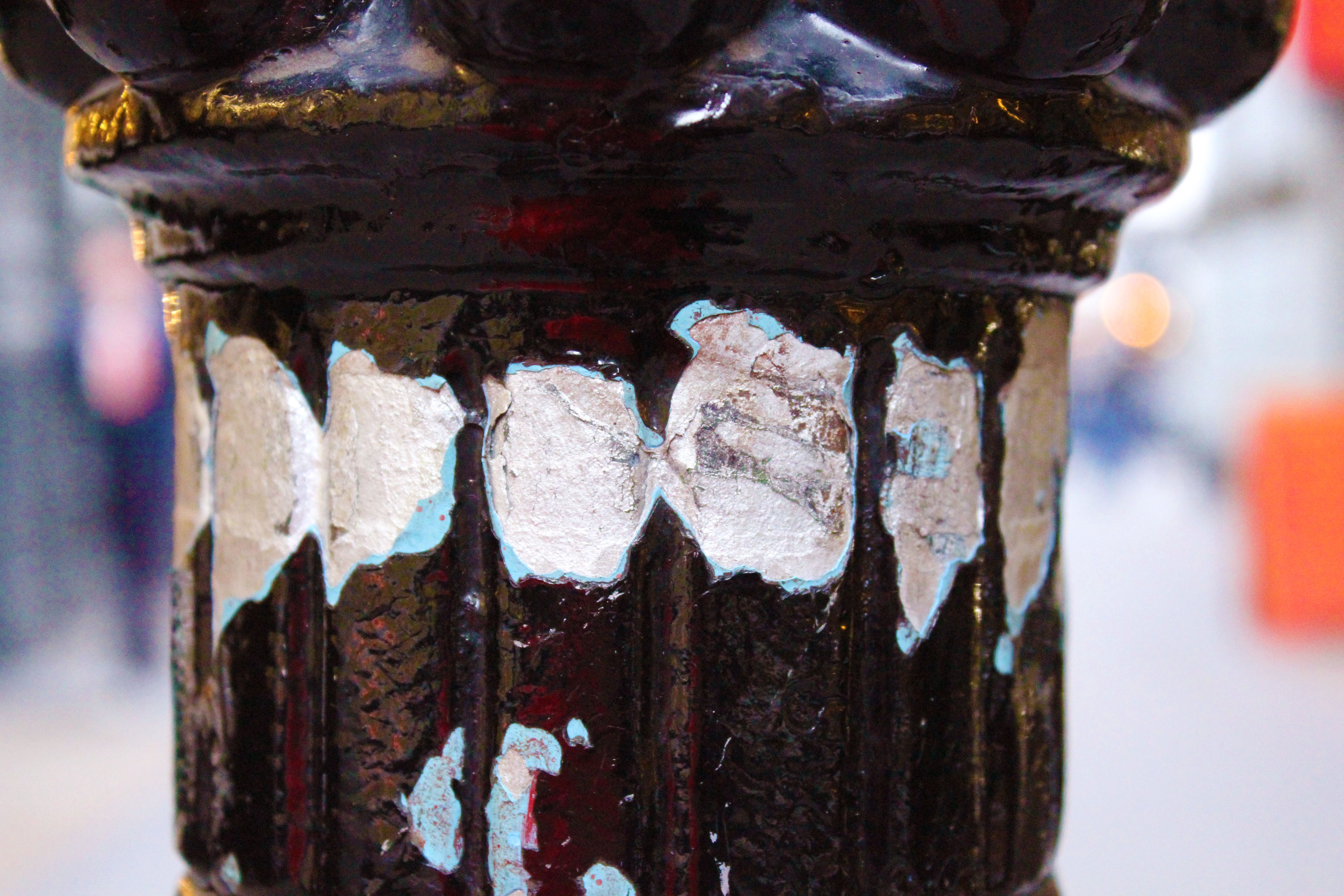
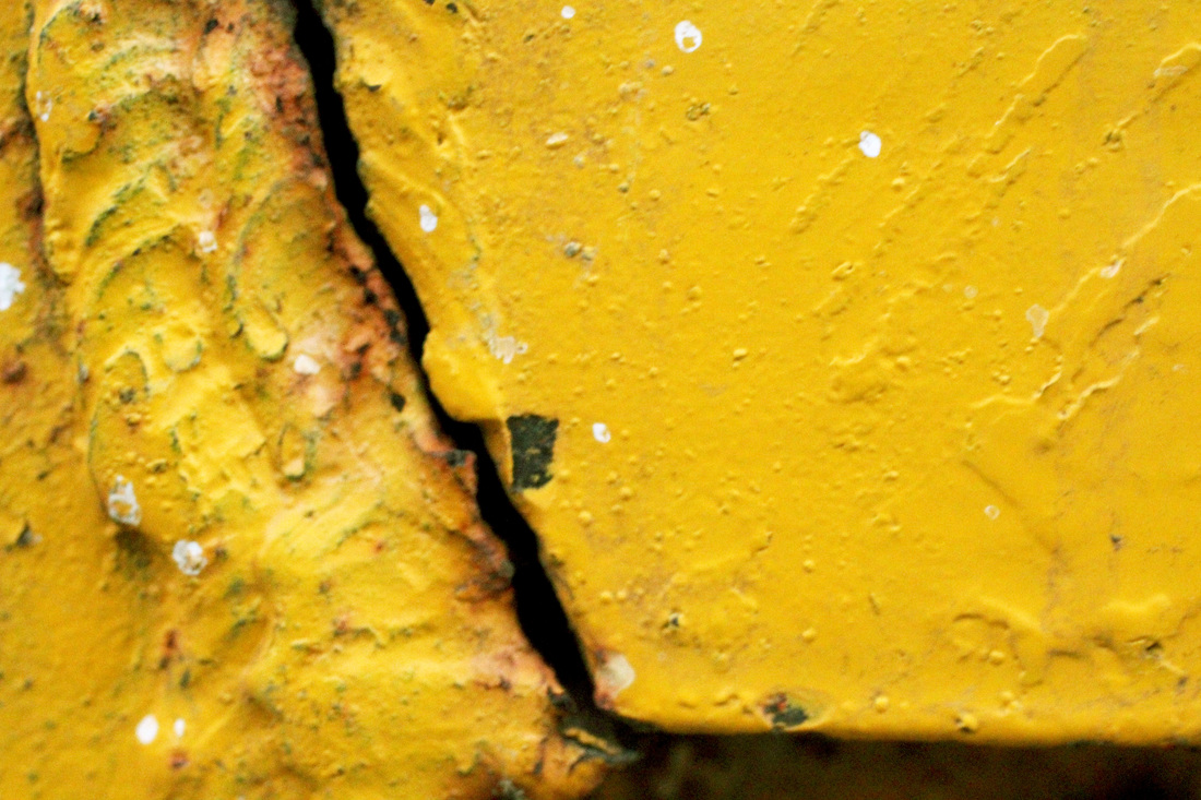
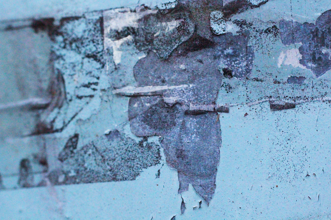
Colin Winterbottom is a photographer who mainly focuses on architecture. His aim in his photos is to portray how it feels to be there. In these photos of rust that he took, he focuses on the texture of the surface, allowing the viewers to 'feel' it with their eyes. I chose to look at these photos because I am exploring my dereliction theme by focusing more on close ups of decay and delapidation to capture texture.
Taking inspiration from Colin Winterbottom, I used a macro lens and took close up photos of delapidation such as peeling paint and rust as I walked home from school. Because I used a macro lens I didnt need to find a specific place to take photos because I could focus on very small sections of things. I like how these photos turned out but I dont think I will continue developing my project with a macro lens because I found it difficult to focus at some times and I prefer the photos which are less zoomed in.
|
|
|
After taking the photos I edited the ones which I thought had the most interesting texture and colour. I enhanced the vibrancy and made the colours in the photos as bright as I could in an attempt to make the photos more interesting and to make the decay and delapidation look livelier in constrast to the subject of the photos.
To continue with my project I will keep looking at delapidation on the streets of London etc, but I will take photos which are less zoomed in so that it is clear what the subject of the photo is and you get a w ider view of the delapiation rather than focusing on only one section. I also would rather take photos from further away because then i can include the streets of London in the background to show a contrast between the business of the city in comparison to the parts of the city which have been forgotten about. |
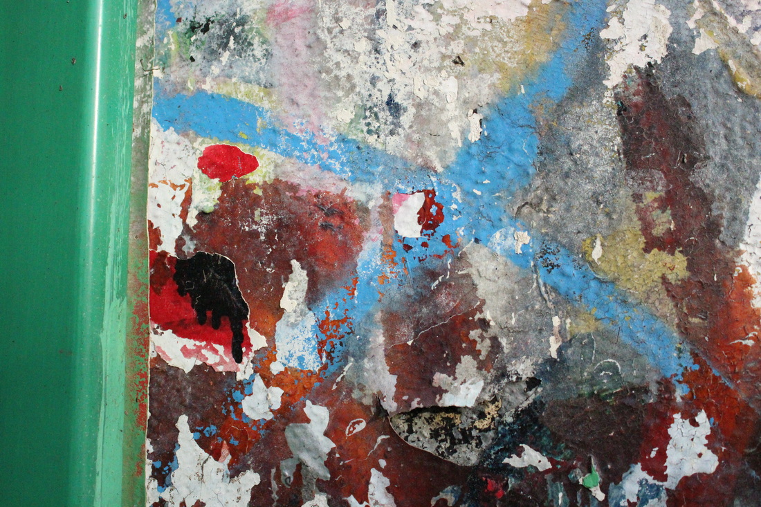
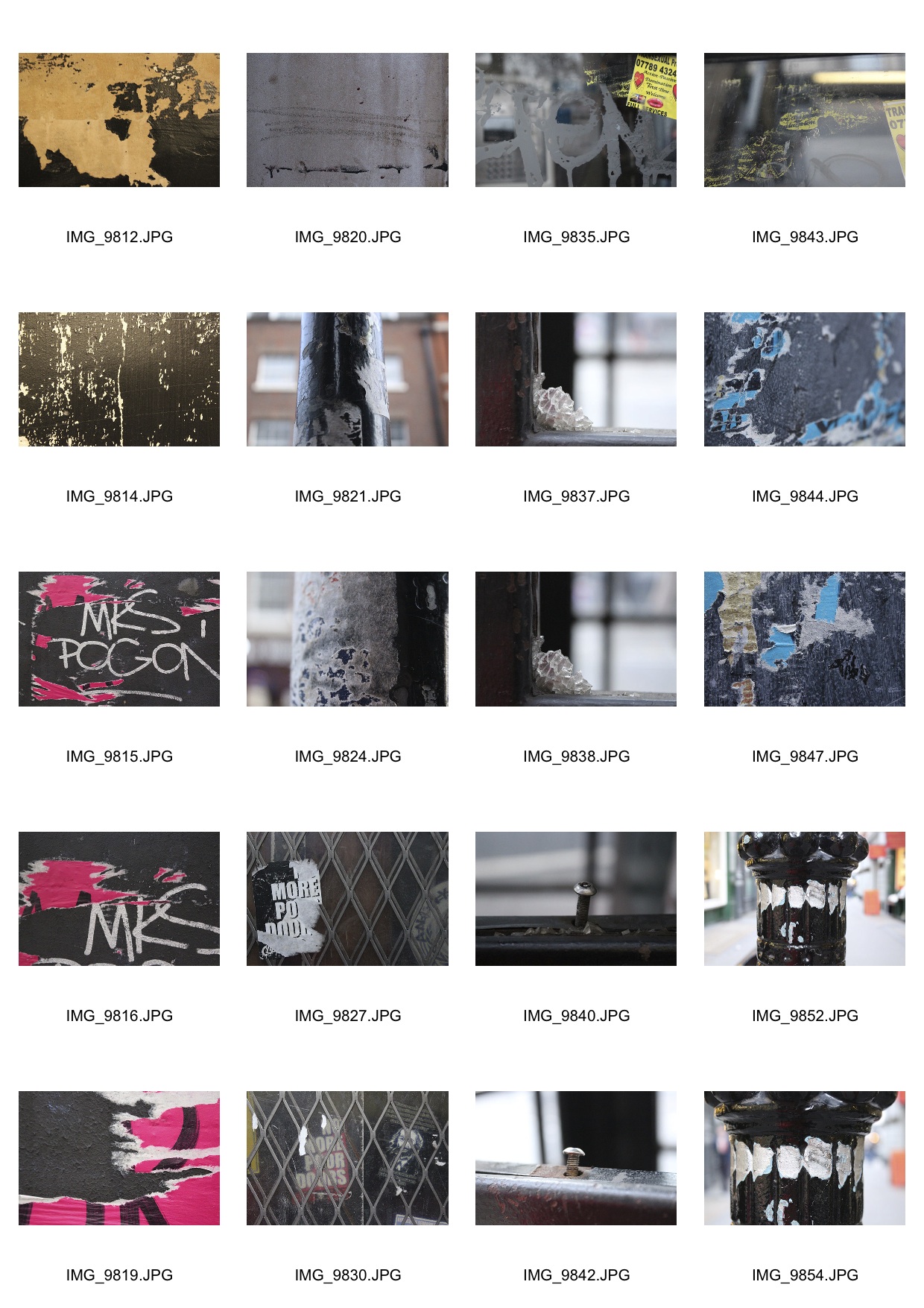
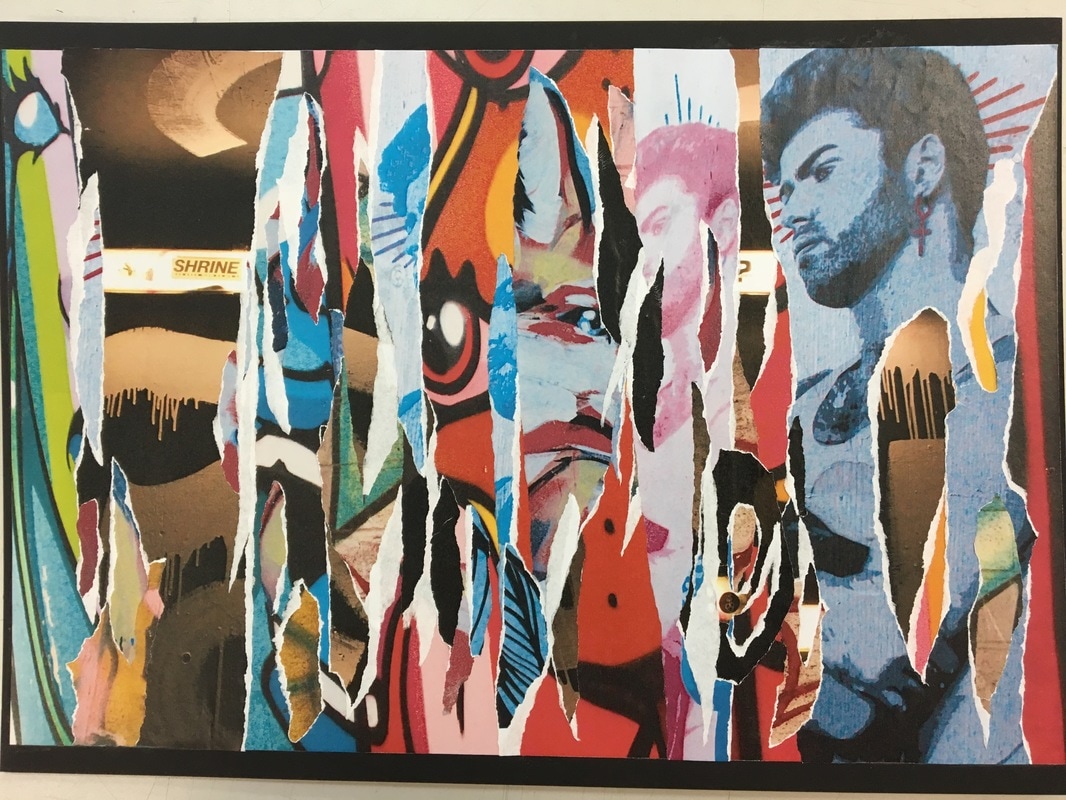
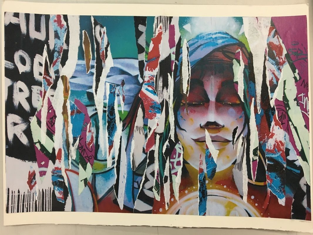
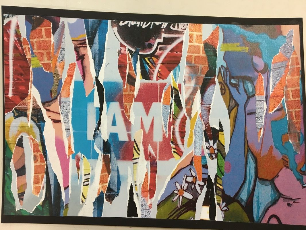
peeling
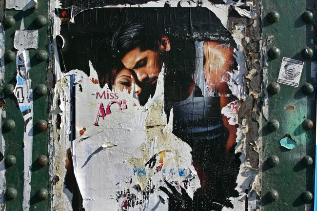
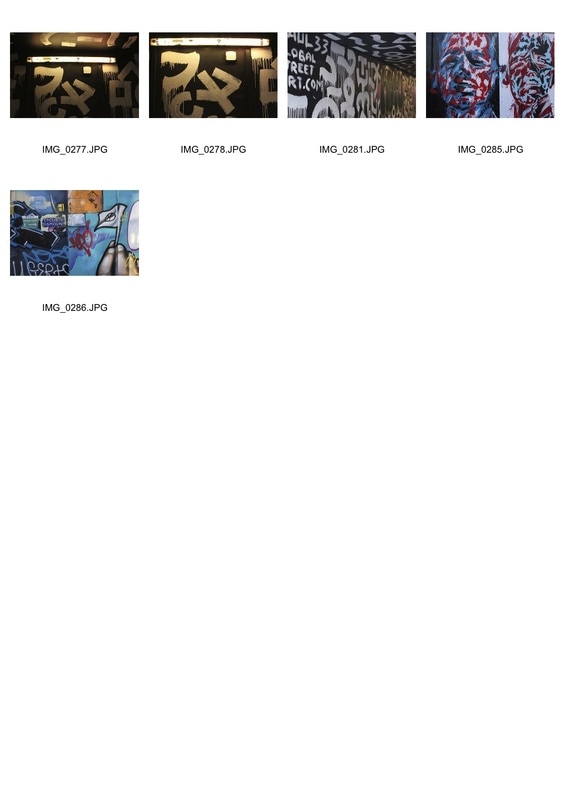
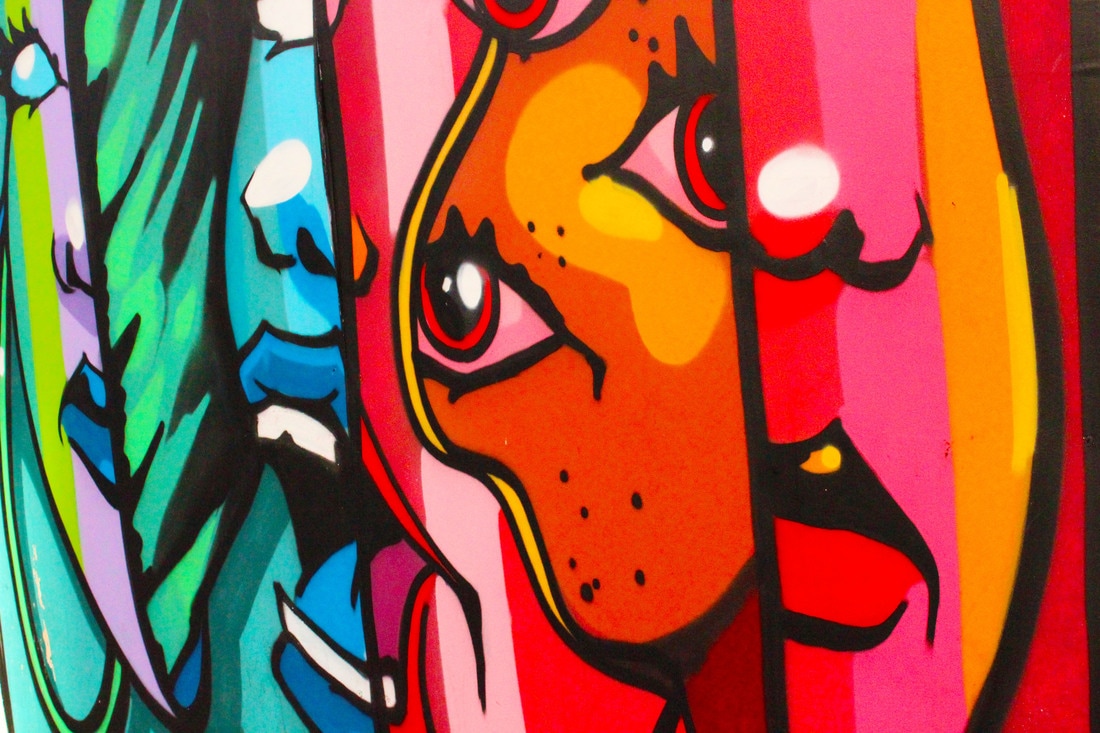
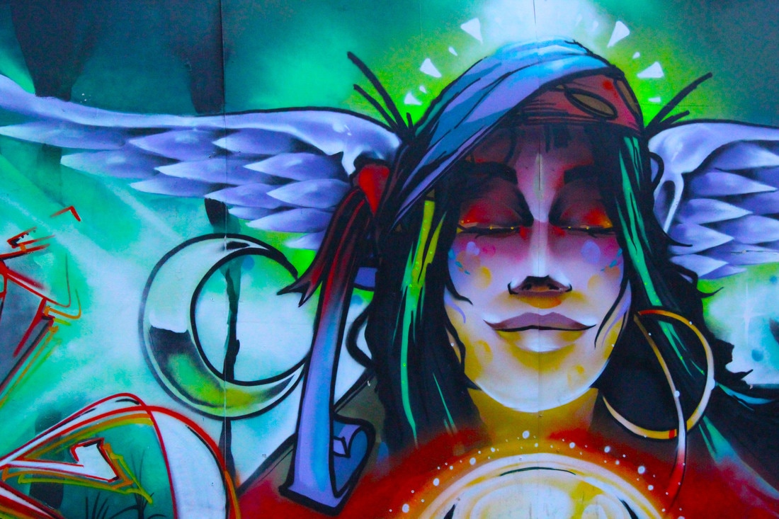
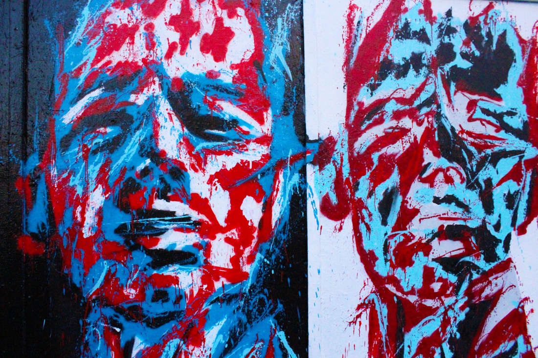
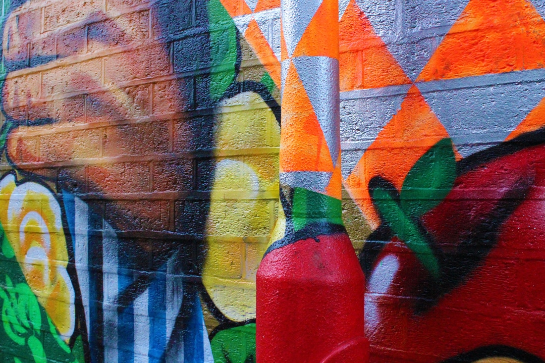
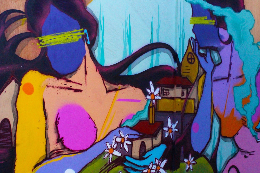
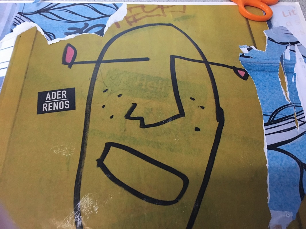
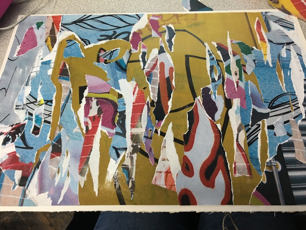
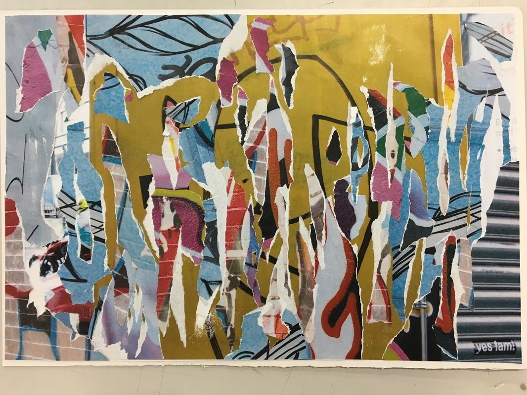
Although I developed my work in different ways I felt the most inspired by the work of Barry Lewis's Visual Noise series (Decay) and Nadav Kander's Signs That We Exist series that I looked at which showed the peeling layers of posters. I liked this idea because the ripped pieces of paper represented decay and dilapidation but were also vivid and colourful and had a sort of liveliness to them. I liked the contrast between these two things and I liked the idea of making something ugly beautiful. I thought that I could represent this ripped poster effect by ripping up photographs to reveal layers underneath. I wanted the colours of the photos to be vivid like the colours in the work of Kander so I went to Shoreditch, where I knew there was lots of graffiti.
|
|
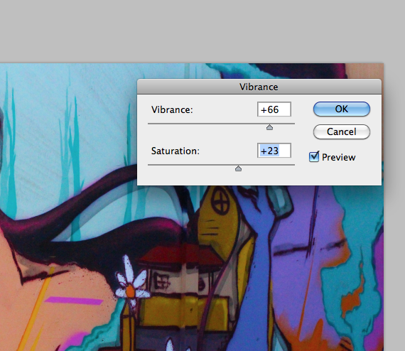
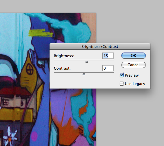
It was cloudy when I took the photos which meant they weren't as bright and vivid as I was hoping so I increased the vibrance and saturation of the photos, as well as the brightness in most of them. This made the photos more colourful and bright and this is what I wanted. For some of the photos I changed the colour balance completely to give colours that I thought would look nicer in the final piece.

|
|
|
|
|
|
|
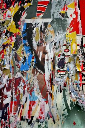
To create these pieces I separated my photos into piles by colours which I thought would compliment each other. I was originally going to glue them all together and then rip them up but I thought that this wouldn't give a clear enough view of the colours and patterns in the graffiti. I chose a base photo for each four pieces and i ripped up pieces of the other photographs and stuck them on top without any guidelines etc so that it would look as natural as possible. I tried to rip the pieces so they showed a white ripped side which I thought would create more of an effect that the photos had been peeled up and ripped back. I stuck them onto mount-boards for support. I used two white and two black because this is all I could get from the art shop at the time but in the end I think it worked out because I used photos I thought would stand out nicely against the black on the black boards.
|
|
|
|
|
|
